You’d think the United States, a country that hosts many of the world’s most powerful tech companies, would show off some strong design chops on its official websites. Alas, that is rarely the case; just look at the FBI’s page, which looks like it was pulled out of 2005.
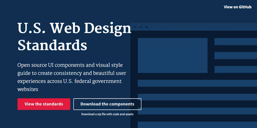
Thankfully, that should be changing soon. The US Chief Information Officer (CIO) Council – which itself has a pretty outdated website – has released a new set of guidelines and open-source components to help government websites get started on clean, flexible designs that look appropriate for the times.
More importantly, government websites should help you find the information you’re looking for quickly. The new design standards highlight four principles:
- Making the best thing the ‘easiest’ thing:
The new guidelines were made to help developers and designers take advantage of simple tools and to deliver high quality content. - Accessibility out of the box:
The standards were built to comply with accessibility standards, from color to code. - Flexibility:
Government pages should adapt to different screen sizes and form factors. They should also be consistent across different .gov websites - Reusing best practices:
The CIO says it’s reviewed and repurposed patterns, code and designs from government a private style guides to use established best practices.
The CIO also emphasizes using common UI components as well as 508-compliant colors and typography.

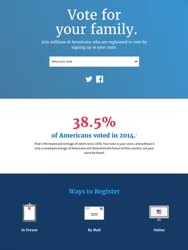
There are a few pages already using the new standards, including vote.usa.gov, and the US Digital Services Playbook.
Though it’s up to each individual site to implement the new standards, the examples so far are a marked improvement over the inconsistent and cluttered collection of current government websites.
To learn more about what to expect – or if you happen to work on a .gov website – the full set of standards can be seen here; you can also provide feedback on GitHub. Here’s to hoping websites move to adapt the guidelines soon.
➤ U.S. Web Design Standards [CIO Playbook via Huffington Post]
Get the TNW newsletter
Get the most important tech news in your inbox each week.


