Jerry Cao is a UX content strategist at the wireframing and prototyping app UXPin. For advice on how to conduct 30+ different types of usability tests, check out The Guide to Usability Testing.
Usability testing is a technique used to help discover problems or bottle-necks in your design. But there are different types of user testing that suit different types of goals. Scripted or un-scripted? Here we’ll explain the differences between the two and how you can make the most of them.
A scripted test is the most controlled type of usability testing, and is recommended for testing specific use cases, like whether or not the user can find/access a certain feature (or how long it takes to do so). Scripted tests tend to produce more quantitative data, beneficial for usability metrics, but can also generate qualitative data as well, depending on the how tight or controlling the script is.
Source: Normal Modes
Before we get into the specific types of scripted tests (tree testing, benchmark tests, and hallway testing), we’ll first discuss a crucial decision in how you conduct your test: whether to moderate it or not.
Moderated vs. Unmoderated Tests
Physicists understand well the observer effect — the idea that the presence of an observer changes the behavior of what’s being observed, negating the whole point of observing it. This may apply to photons, but what about people?
As described in The Guide to Usability Testing, whether or not you choose to moderate your test depends on your specific goals and what you need to accomplish. In some instances a moderator will help facilitate the process and aid it in going smoothly, while in other instances they will only interrupt, not to mention the extra costs of an on-site staff. Below we’ll talk about the pros and cons of each, so you can decide which will work best for your user test.
Moderated Tests
The payoff can be significant if you have the time available for a moderated study. A moderator can help probe the participant to delve deeper, creating data that is fuller and more complete, plus keep users on track and clarify any confusion. Not only that, but user reactions and even body language can provide useful data as well, but only if there’s someone present to document and interpret them.
Source: An Introduction To Website Usability Testing
As you can guess, moderated testing is not appropriate for all tests. Moderated testing is recommended for the following situations:
- Early stages in the development process — Specifically in the prototyping phase, where features may be incomplete or not even work, a moderator can help answer questions and explain the unclear parts.
- An advanced, complicated, or high-level product — As with a prototype, if there is a great chance for confusion or misinterpretation, a moderator will help keep things on course.
- Products with strict security concerns — In these cases, a moderator can keep the user where they’re supposed to be and keep them from accessing sensitive information.
On the other hand, moderated tests require a knowledgeable moderator, their time, and usually a specified location, as opposed to remote usability testing. Coordinating the schedules of moderated tests can be problematic, and only one can be done at a time, unless more moderators are hired. More importantly, moderated tests can take participants out of their comfort zone, so special care must be taken to avoid the various kinds of biases.
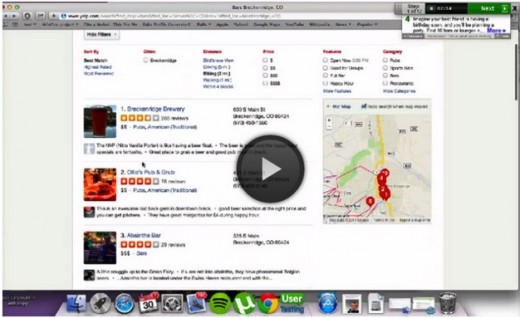
https://www.youtube.com/watch?v=QABgvgz-qXA
Source: Moderated Usability Testing
For a moderated test, you could also let your testers participate from the comfort of their own home. For example, Evernote actually ran a remote usability test that was moderated in which the testers were in different locations, but the moderators were all in the office. This offers the benefits of moderation at lower cost (since you don’t have to worry as much about equipment setup), but it may not be suitable if you need a controlled lab environment due to information sensitivity. Nonetheless, this tactic is effective and Evernote gained insights that helped them improve user retention by 15 percent.
If you have any of the special needs listed above, moderation may be the right choice. If you do choose this route, make sure you follow these 20 tips for moderated usability testing.
Unmoderated Tests
While moderated testing allows for instantaneous give-and-take feedback, there is still no substitute for letting users interact with a product in its natural environment. Kyle Soucy, Founder of Usable Interface, explains in an article for UX Matters that unmoderated tests provide tons of benefits that greatly outweigh the drawbacks — namely that they make remote usability testing a lot easier. Unmoderated testing benefits include:
- Time savings — Simultaneously testing hundreds of participants. You can also test multiple products at once, including competitors.
- More natural product usage — Because remote usability testing allows participants to remain in their natural environment, their use of the product will more closely resemble real-world scenarios. If you’re testing a tablet, it’s hard to replicate someone kicking their feet up on a couch after a tough day at work to watch movies for two hours.
- Cost savings — Costs are usually quite low since you don’t need to pay for moderators or equipment setup. With usability testing tools like UserTesting and Userlytics, tests can run as low as $49 per user. Unmoderated tests are also scalable depending on the testing tool used.
- Simpler coordination — With unmoderated tests, you really only need to think about cost of testing, cost of reimbursement, and user schedules.
Source: User Testing & Design
As you’ll find when looking at our User Testing & Design e-book, you can get maximum value for minimum cost when the tasks are written as clearly as possible. Users are encouraged to think out loud, and you record their on-screen interactions. When the test is done, you can then use the video clips that are most insightful and present them to your team for design changes.
There are downsides, however. The lack of a moderator means less control, less personal observation, and a higher risk of confusion. Additionally, conducting high volume, unmoderated tests using an online tool opens you to the risk of attracting participants looking only for the incentive without putting effort into the tasks. On the bright side, such participants can be filtered, especially by looking at their time-to-completion or open-ended feedback.
Nonetheless, if you choose unmoderated testing, make sure you know the criteria for picking the best usability tool. As the Nielsen Norman Group advises, you’ll want something that offers same-day results, audiovisual recording, and offers a broad demographic for recruiting testers.
Tree Testing
Tree testing allows you to test the information architecture by stripping out the visual elements. With a tree test, you examine only the labelling and hierarchy of your content. Martin Rosenmejer of Webcredible names it as one of the most important steps early in the web design process. And we all know the importance of information architecture — if the content isn’t structured logically with a simple flow, it might as well not exist. That’s why an early tree test can help identify and solve the problems before they actually become problems.
Source: User Testing & Design
In a nutshell, a tree test tasks participants with finding different information on a clickable sitemap (or “tree”). Using a usability testing tool like Treejack, you then record task success (clicking to the correct destination) and task directness (certainty of users that they found what was needed). This shows you the effectiveness and clarity of your information architecture.
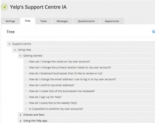
For example, in this Yelp redesign exercise, we provided a tree representing the support site and then gave users 10 tasks (such as finding information on what to do with bad reviews). Because the overall task success rate was 53 percent and directness was 46 percent, we knew that the IA needed changing — luckily, our software showed us exactly where people were confused.
The importance of tree testing (and especially information architecture) is uncovered by Raluca Budiu, Senior Researcher at the Nielsen Norman Group. Simply put, a site search bar (or a three-line hamburger menu) is just not enough if the navigation is poor because users won’t know what is available to search. Search also requires users to recall from memory, which increases cognitive strain and can kill the experience.
If tree testing seems like something that could benefit your project, Jeff Sauro, Founding Principal of MeasuringU, goes into details about how to properly run them. He explains that tree testing is used primarily for two reasons:
- Determine a product’s searchability — How well can users navigate the site, and what areas cause the most problems with navigation?
- Validating a change — Did a recent update correctly fix the problem, or are further revisions necessary?
Because tree testing examines the success rate of a specific task, more participants will give you more accurate results. Check the chart below to find the smallest margin of error within your means (we recommend aiming for 5% error or better).
Source: MeasuringU
One distinct benefit of tree testing is that you can test hundreds of navigational items (if your site is even larger, just prioritize the most used navigation items).
Usability Benchmark Testing
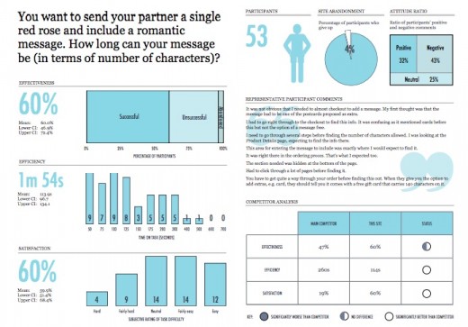
Usability benchmark testing is the only test discussed in The Guide to Usabiltiy Testing that measures the overall usability of a product. As its name suggests, a usability benchmark test is a high-level report of the overall ease and success rate of completing tasks. You can check out this benchmark report from UserFocus and follow the discussion below.
Source: Benchmark Report
In an essay on his website, bestselling author and speaker Scott Berkun points out that, while other usability tests focus on specific aspects, the usability benchmark test measures only user performance without regard to the why. In fact, participants should even be discouraged from explaining their thoughts, as explanations would impact the time and focus spent interacting with the product.
Because benchmarks require more time and effort, Berkun outlines the optimal times in which to run the test:
- The product is stable — To get the most out of the benchmark, make sure the product is stable, i.e., all the errors you already know about are fixed and it’s running at peak efficiency.
- After a major release or update — At this time, a benchmark can test how effective the changes were, or if unforeseen problems arose in the process.
- Preceding a major release or update — In order to understand how the next change impacts usability, it’s best to have a measure from which to compare. Additionally, you may notice some areas that should be improved before the next round begins.
Publicize your benchmarks as much as possible so that everyone involved in the product is able to evaluate their work. In particular, he suggests holding a large presentation two weeks before the test, explaining what exactly is happening.
When conducting this type of test, there are a few factors to consider. Nadyne Richmond, Researcher at VM Press, gives 5 tips for planning out your benchmark test:
- Select the most important tasks to the product overall — While it’s tempting to select tasks related to the newest or experimental features, this is not the correct test for that. A benchmark measures usability as a whole, not in a specific area.
- Use standard metrics — The most reliable data comes from success rates, time-to-completion, error rates, and satisfaction rating.
- Do not disturb the user — Little to no moderation should be involved in a good benchmark test. Any distraction will bias the results, so avoid asking for feedback or explanations of their behavior — or at least wait until they’re completely finished.
- Using your target audience is essential — This is especially important for usability benchmark testing since this is a broad assessment of how your target users perform with your product.
- Use a large number of participants — Due to the quantitative nature of this test, using a large number of participants will reduce the margin of errors and give you feedback that’s more accurate, and therefore more useful.
The important thing to remember about usability benchmark tests is that they are different than other usability tests. Think of them as a dashboard of your product’s usability. If you’re looking to workshop a specific feature or area, you should look elsewhere.
Hallway Usability Testing
Hallway usability tests are the bare minimum for worthwhile usability testing, so if you’re on a tight budget or don’t want to invest a lot in usability, this one is for you. Joel Spolsky, CEO of Stack Exchange, describes it like this:
“A hallway usability test is where you grab the next person that passes by in the hallway and force them to try to use the code you just wrote. If you do this to five people, you will learn 95 percent of what there is to learn about usability problems in your code.”
Of course you don’t need to literally grab people from the hallway, but the idea is that any small number of random users (from within your target audience) will give you a sufficient amount of data for your usability goals.
Source: MeasuringU
The test itself doesn’t have to be that complex. Corinna Baldauf, Web Developer and UX Blogger, suggests setting up a station with your product in a public venue — she used an office break room, while others suggest Starbucks. When someone comes by, ask them to test the system, perhaps even adding some incentive (don’t underestimate the power of chocolate). Give them instructions, then step back and watch. Don’t forget to take notes, particularly on what is not going as expected.
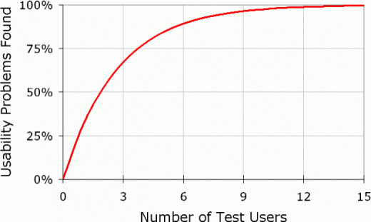
If you do this with five people, that should give you data that’s accurate enough. Why five? Jakob Nielsen, co-founder of the Nielson Norman Group, created a formula for the amount of usability problems found in a usability test:
N (1-(1- L ) n )
… where N is the number of users and L is the proportions of usability problems found by a single user, typically 31 percent. When graphed, the formula looks like this:
Source: Nielson Norman Group
You can see clearly that five people gives you all the data you need, while anything more seems superfluous.
Hallway usability testing is one of the most popular forms due to its simplicity, low cost, low resources, and high output. If you’re interested in conducting your own hallway usability test, the USAJOBS Team gives these tips:
- Choose the right time and place — choose a location with a lot of foot traffic, at a time when you’re not inconveniencing people.
- Come prepared — make sure you outline your plan ahead of time, and set up 30 minutes before you’d like to start.
- Good greeters — use greeters who are outgoing and charismatic, and who can identify your target audience.
- Reward your participants — it doesn’t need to be much, something like a free coffee, or chocolate — just to show you appreciate their help.
- Look for ways to improve — learn from your experience and keep an eye out for ways to improve your testing process.
While not recommended to solve specific or complicated problems, hallway usability testing is the perfect way to go for if you’re looking for something simple and easy.
Takeaway
When it comes to usability testing, unmoderated tests give you a closer idea of how the product might perform “in the wild”. On the other hand, moderated tests are more appropriate if the product is technologically complex (so that moderators can guide users and answer questions).
Tree testing focuses specifically on navigation, usability benchmark testing determines a product’s overall usability, and hallway usability testing is great for a simple and low-cost usability test. Figure out what your needs are, follow this list of 234 tips for recruiting users, and then get testing.
For explanations and practical tips for 30+ different types of usability tests, check out free 109-page Guide to Usability Testing. Best practices are included from companies like Apple, Buffer, DirecTV, and others.
Read Next: The art of error: 12 clever 404 pages
Get the TNW newsletter
Get the most important tech news in your inbox each week.


