Instagram has released a brand new collage app — Layout — that lets you use your iPhone to combine up to nine photos in a single shot. In a way, the real question is not why Instagram has now launched a collage app, but why it took the company so long.
One reason could be that there are so many great iOS collage apps out there — like Fuzel Collage (free) and Diptic ($.99) — that another one from the king of mobile photography might just provoke a “meh” from the community.
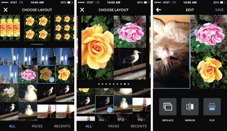
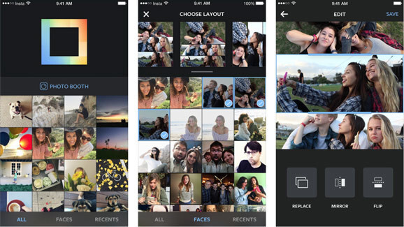
As it stands, Instagram took the time to construct an easy, quick and intuitive tool, piling most options into the front end of the process and providing ample revision opportunities. Immediately upon launching the app, you get nine layout choices. You can order a special effect with one photo — such as mirror or flip — or add in different photos.
As you add photos to the mix, you can cycle back and forth between layouts before committing to one; as each layout is adjustable, you can alter composition on the fly. Other collage apps also let you make adjustments in the collage template though the flexible ability to change patterns can vary.
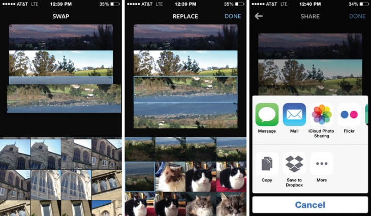
A simple drag and drop within each template quickly changes the position of the images and lets you adjust relative size even further to personalize generic layouts. You can also adjust images inside the layout with the pinch or zoom gesture.
Another feature that can hasten collage creation is dividing images between All, Faces (using face detection technology) and Recents (30 of the most recently used photos) from the potentially vast store of photos in your Camera Roll. A countdown timer lets you shoot on-the-the go selfies and other immediate shots.
Saving your image is similarly easy, as is sharing with Facebook, Dropbox, iCloud Photo Sharing and Messages. If you want to share via Twitter, there’s an additional hoop to jump through. You must save it to Instagram first before being able to post on Twitter.
One advantage of saving to Instagram is — you got it — filters. There are no filters or image editing of any kind, in Layout. The ability to focus on pairing and matching shots is its own process and would be made slower and more complex with an added filtering in the function of the collage app. Then too, if you want to filter a photo, most people would prefer it to look consistent, which means you’d want to complete your composition first, anyway.
I would have liked to see more creative layouts based on alternate shapes, something that can still be easy and fast, but which would lend more variety to the resulting collages. Given that Instagram’s whole identity is based on the square, perhaps that was too great of a conceptual leap.
While I get that Instagram is mobile and phone-based, collages are an artistic work that would benefit from having a larger screen. I had a positive experience using Instagram on my iPhone 5, but I suspect that it would be even better with some of the newer, larger phones. A universal app, also targeted to the iPad, would have been a great move in this case.
Layout is free — unlike some collage apps. You do not need an Instagram account to use it and no log in is necessary. It’s also easy to use and works seamlessly with Instagram — those things combined will give the entire ecosystem, including the extremely impressive Hyperlapse, a great advantage for users.
Lauout requires iOS 7 or higher, and Instagram promises an Android version in the coming months.
➤ Layout
Get the TNW newsletter
Get the most important tech news in your inbox each week.
