The popular debate that made skeuomorphism a household word among a certain class of people started around the release of iOS 7, when the iPhone interface switched from a rich, metaphorical design with iconic references to analog objects to a flat design aesthetic.
The civilian dinner table conversation (as opposed to the desktop, video chat and office discourse — which, no doubt, raged for far longer and in more technical depth) centered around the difference between what was commonly viewed as Steve Jobs’ vision — user interfaces referencing familiar objects that people understand and that are drawn in a detailed, often realistic way, and the same objects rendered in a flat, minimalist, almost symbolic way.
One example, widely considered as going too far with the theme, was Apple’s iCal app, with its faux stitched leather interface that many people deeply detested.
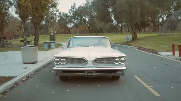
This clip is a segment from an upcoming documentary, App: The Human Story, due for release this year, which features a series of interviews from assorted app development luminaries and experts. In this video, designer Neven Mrgan compares skeuomorphism to a classic car — and strikes a fascinating chord.

The 💜 of EU tech
The latest rumblings from the EU tech scene, a story from our wise ol' founder Boris, and some questionable AI art. It's free, every week, in your inbox. Sign up now!
Like skeuomorphism itself, much about the topic still appears open to interpretation, but this is a simple and friendly analysis of the concept.
It’s not that they look real, but they looked rich, like a lot of work had been put into them. That’s what people latch on to. [as opposed to] You end up with some designs that are stunning in their minimalism but not as friendly anymore. And when they age, they will age in a way that people say, “Oh, that’s when we went simple with things rather than, “isn’t this incredible.”
Get the TNW newsletter
Get the most important tech news in your inbox each week.