Jo Plumridge is a British writer and photographer, who specializes in design, travel and comedy pieces. This post was originally published on the Shutterstock blog and has been reprinted with permission.
The origins of graphic (and Web) design owe much to the photographic field. The man responsible for what is arguably one of the central mediums of modern graphic design was László Moholy-Nagy.
After joining the Bauhaus school in 1923 to teach, Moholy-Nagy became instrumental in developing the concept of “typophoto” — a set of aesthetic principles that governed the integration of typography and photography in graphic work.
Moholy-Nagy defined typophoto thusly: “Typography is communication composed in type. Photography is the visual presentation of what can be optically apprehended. Typophoto is the visually most exact rendering of communication.”

The 💜 of EU tech
The latest rumblings from the EU tech scene, a story from our wise ol' founder Boris, and some questionable AI art. It's free, every week, in your inbox. Sign up now!
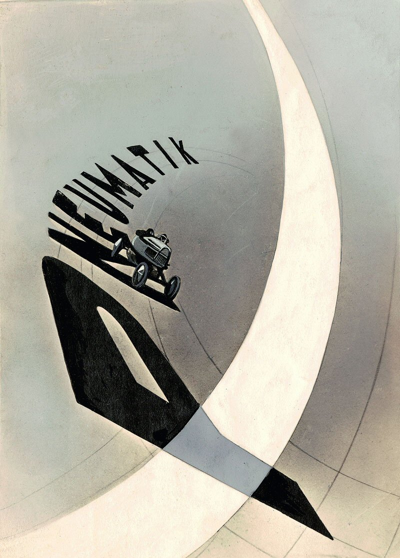 Image by László Moholy-Nagy
Judging Moholy-Nagy’s work against modern designs makes a lot of his design look almost simplistic, but at the time it was revolutionary. This was partly due to the lack of options with photography and the limited supply of images. His work often used very simple geometric shapes, but the basis of advertising and design work was present. He started to instill the notion that images could aid the message that the words were trying to convey. Today, typophoto remains as effective as ever.
Another school of design that played an important part in combining type and photography was Swiss Design (often called the International Style), which originated in Switzerland in the 1940s and ’50s. Swiss Design stressed the combination of typography and photography as a valid means of communication. Work was primarily developed as posters, as these were seen as an effective means of communication. The method also developed the use of sans-serif typography, grids, and asymmetrical layouts.
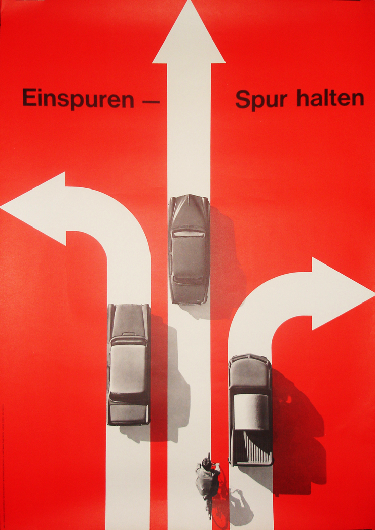 An example of Swiss Design
Swiss Design relied heavily on the use of cutouts placed on a simple background to emphasize the importance of the image. The use of perspective was also important to draw the viewer’s eye to the message being conveyed. The photographs used were placed on a plain, brightly colored background, which added to the 3D effect of the posters.
Swiss Design follows a very precise format, which is easy to replicate using the right imagery. Consider the photos below:

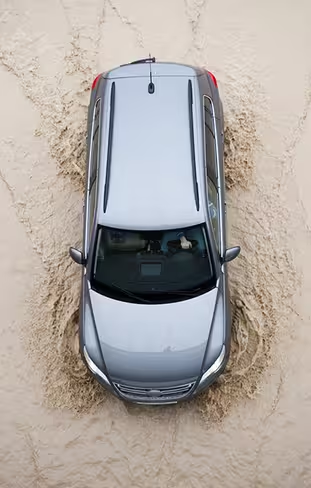
The emphasis behind Swiss Design is that two different, but very similar images, can convey very different meanings. The second shot is an aerial shot and would work well to relay a feeling of direction or power. The car is cutting through the water in a way that could be used to convey a dynamic purpose.
The first photo is similar in subject (in that it shows a car driving through a flood), but it doesn’t carry the same message as the other, it could still be used quite effectively in a Swiss Design poster as a secondary image to support the strength of the primary image.
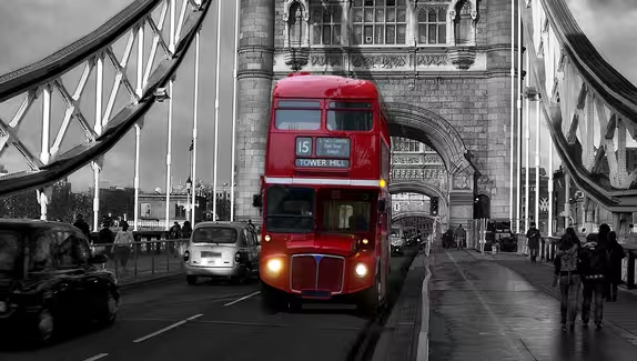
Now, consider the premise when used with a famous landmark, such as Tower Bridge in London:
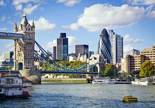
It’s easy to see from just two shots of the same landmark how a photograph can be used to convey different design points of view. The first image, showing part of Tower Bridge with the City of London in the background, is dynamic, showing the growth of London and its modern buildings.
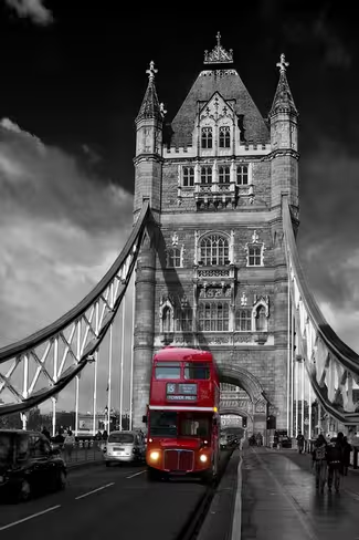
The second image, a classic Routemaster bus crossing the bridge, is mostly black and white and conveys a more classic view of the city. So, the first image could successfully be used in a design campaign to promote growth, whereas the second could be very successful for a tourist or historical campaign.
When we combine the tenets of Swiss Design with modern photography, the possibilities are endless. And modern design still owes much to the early pioneers by helping us create stylish campaigns that stand the test of time.
Get the TNW newsletter
Get the most important tech news in your inbox each week.