Jordan Roland is a staff designer/illustrator for the Shutterstock blog. You can follow him on pretty much any social site via username drawjordan. This post was originally published on the Shutterstock blog and has been reprinted with permission.
This is the first summer in a long time without a Pixar film, because the latest — The Good Dinosaur — was halted and restarted halfway through production when the pacing wasn’t up to the studio’s standards. Pixar makes beautiful films, that’s a given, but it’s also meticulous.
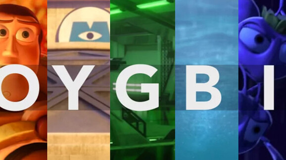
The studio balances the childlike wonder of a kids’ film with adult topics and themes (I’m talking to you, first three minutes of Up!), and every single detail is thought through. So of course Pixar creates color-palette based storyboards to help work out the tone of each film.
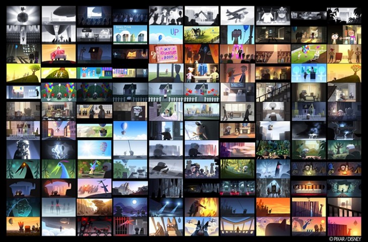
The folks over at Slashfilm turned us on to a great video super-cut created by editor Rishi Kaneria that shows the color themes used throughout Pixar movie history (watch it below). It’s stunning to see more than a decade’s worth of films through the lens of color hues and tones, and to know that every second of it was planned on purpose.
If you’re a designer, color is one of the biggest tools you have at your disposal — even making the choice not to use any colors is just as powerful as using a series of them.
We’re constantly looking at opportunities to utilize color in our daily lives, and always trying to figure out cool new ways to introduce color discovery into how people add images into their work.
Insights like this are wonderful reminders to pay attention to palettes, whether it’s as a designer or visual artist, or even in your personal style.
Get the TNW newsletter
Get the most important tech news in your inbox each week.
