Most people watching the World Cup 2014 competition in Brazil have their eye on the ball. But a pair of designers–Guus ter Beek and Tayfun Sarier of Tribal Worldwide in London–cast a critical gaze on the event’s televised graphics and found them wanting.
Together with Jordon Cheung and George Grace, the pair are debuting Redesigning The World Cup 2014 Brazil, which gives the World Cup graphics a flat face lift. They tackled such elements as the clock, the formation screen, in-game infographics and notifications.
“The abundance of clumsy gradients actually makes the score harder to read (certainly from far in a crowded pub), as well as the unmatching color combinations, which Sky Sports, BBC Sports and many others are guilty of.” ter Beek stated in his blog.
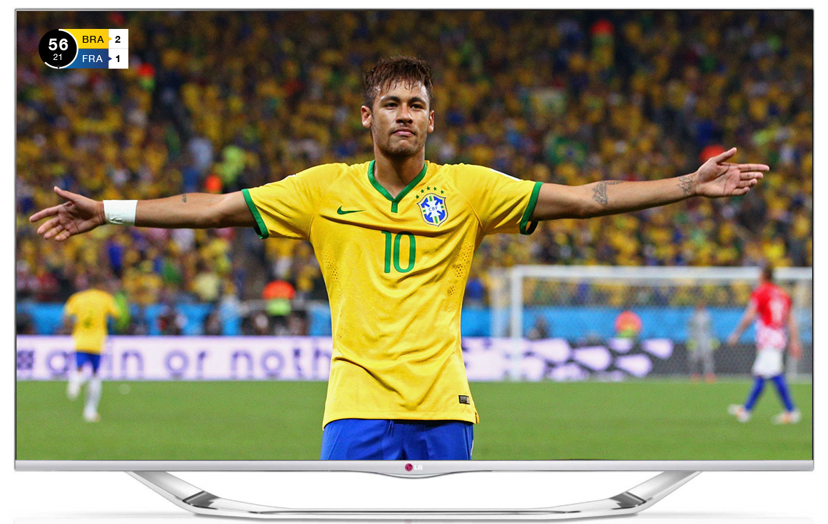
 Old score
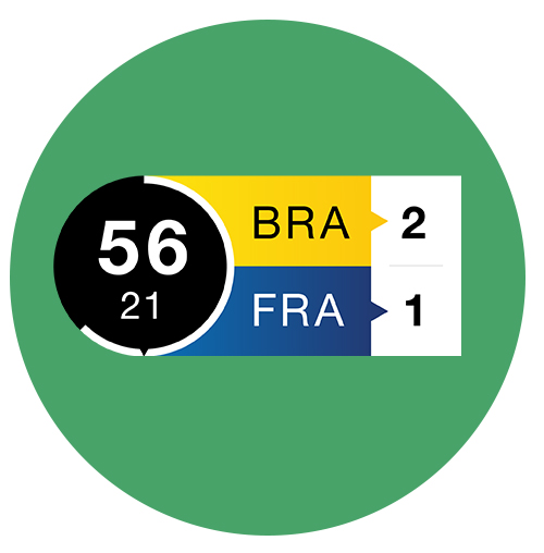
New flat style score
 “How many times did it happen to us to tune in on a match and have no clue who’s who,” ter Beek said in his post. “Most sports channels just show a national flag, but this can be rather confusing as some national colors can be represented in both teams’ outfits.”
First up was the clock. “We noticed that it’s very hard to create a unique design which is both appealing and clear at the same time. It shouldn’t be taking a lot of space on the screen.”
The designers chose Helvetica as the typeface, and that might generate some controversy of its own in design circles. In an attempt to make the clock somewhat interactive, the designers featured an animated timeline in red to express the urgency of final seconds of the game, in addition to a static white timeline.
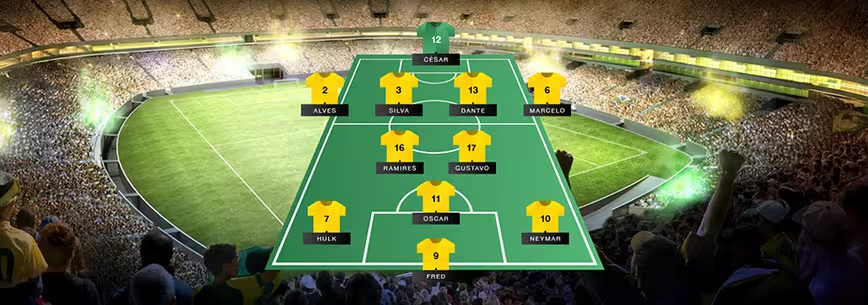
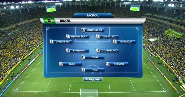 Old formation screen
 New formation screen
Indeed, there’s so much information to interpret in watching any sporting event that making it all graphically legible is the biggest challenge.
 Stadium overview featuring simple line-drawing icons.
From simple line drawing icons to animated GIFs, the redesign gives the whole event a different look. What do you think of the new interpretation? Let us know in the comments.
➤ Redesigning The World Cup 2014 Brazil
Get the TNW newsletter
Get the most important tech news in your inbox each week.