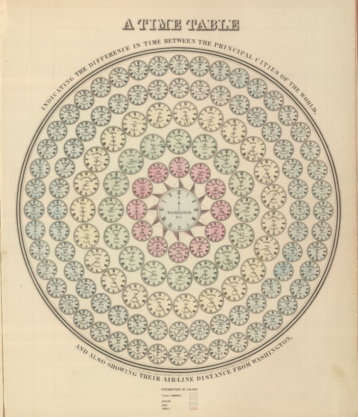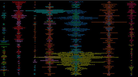
Data visualization — data viz — is equal parts art and science with a splash of auto-generated visual voodoo. This technology is gaining in popularity as a way to quickly interpret and disseminate complex information at a glance. Dadaviz, a new community-curated feed, aims to be its YouTube, with new entries posted daily.
“Dadaviz is an addictive feed of data visuals; we want to be the YouTube of data viz,” says co-founder Leon Markovitz. “There are no sites or apps out there being updated daily with the best data viz from the Web. And our full-screen interface struck a chord in the community.” Markovitz sees such visualizations as unique content with special advantages that should be marketed in their own right with independent distribution.
That’s because visuals haul in huge traffic. It’s estimated that posts with images receive 94 percent more page visits, with sharing rates up to three times higher than those without visuals. And now that Twitter, Facebook and Google+ all showcase expanded previews, visual posts get an average of 18 percent more clicks.
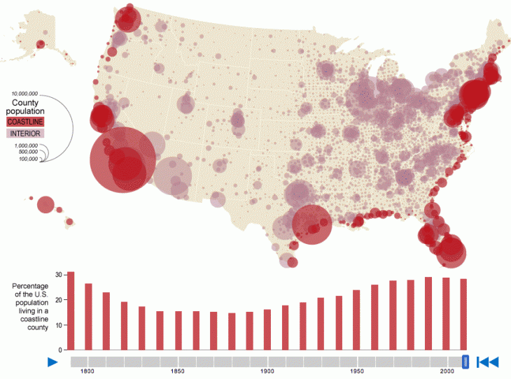
Dadaviz helps editorial and entertainment operations publish, distribute and track their visualization content by providing a discrete discovery and viewing platform.
Another advantage is that with this platform data visualizations will generate leads back to the original source article, which helps publishers understand how well a visual is performing. At the same time, the platform facilitates easy sharing via social networks and entry into new markets.
Dadaviz also provides assistance in the form of services, if needed. You can create and upload a datavisual yourself or rely on the Dadaviz team to build one for you.
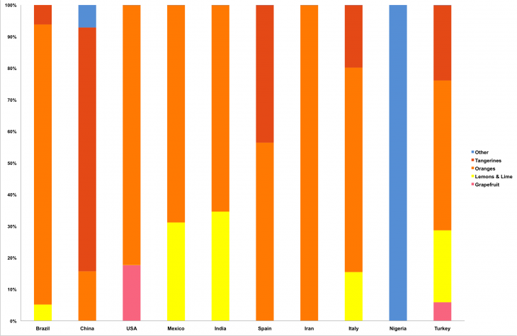
Then, use it to illustrate or supplement an article, add it to your content via an embed code or upload it independently without the embed code.
Visualization vs. infographics
Markovitz differentiates data viz from infographics. From the Dadaviz perspective, infographics depict information with an artistic rendering generated in a painstaking manner by a human artist using a program like Adobe Illustrator.
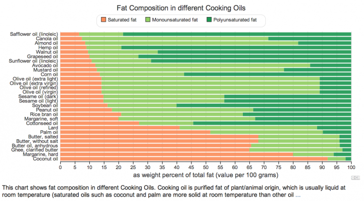
Data visualizations are auto-generated from data and thus dynamic. Artists must go back to an infographic to change it according to shifting data, but with a data visualization, the rendering will change by itself. Says Markovitz, “There is a real fight by datavizers to create a separation between dataviz and infographics. In essence, data viz is less labor-intensive and more data-intensive, whereas infographics are more labor-intensive and less data-intensive.”
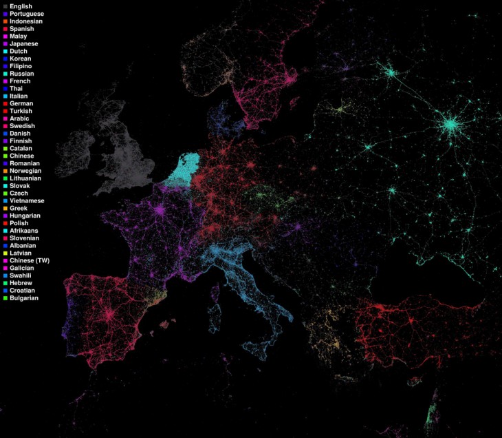
A Reddit definition elaborates this point: “A good test is that swapping out a dataset (e.g. to a different year or different location) should require little to no manual intervention. A visualization can just be regenerated, whereas an infographic has to be remade manually.”
To get started in constructing a dataviz, you can use common tools like Excel, Google Docs, or or Plot. In addition, creators can use free tools like Tableau Public and StatTrends, among others. Programmers can check out d3.jsR with RStudio or MatPlotLib.
Joining the community
Right now, Dadaviz is in closed beta for quality control, thus limiting content to that produced by skilled practitioners. There is no set time frame for the beta to expire. However, Dadaviz is still accepting new members.
Markovitz notes that not only will the community curate, but “likes” (which are open) and time of upload also affect how high on the feed the visuals appear on the Dadaviz site.
If you’re interested in contributing, send an email to info@dadaviz.com to request access.
➤ Dadaviz
Get the TNW newsletter
Get the most important tech news in your inbox each week.

