
Jess Bachman is the Creative Director at Visual.ly, a visual-content marketplace that connects designers, journalists, animators, and developers with clients. This post was originally published on the Shutterstock blog and has been adapted with permission.
Infographics are a powerful means of connecting with an audience when done right. But coming up with great ideas to visualize on a regular basis can be difficult. If you’re short on inspiration for developing your visual communications, consider some of these infographic stalwarts.
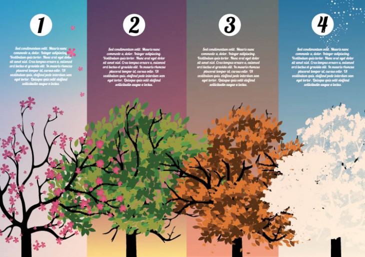
Seasonal themes
Publishers are always looking for relevant content and the calendar is something you can bank on. What holidays are a month out, and how can you apply those to your brand or message? St. Patrick’s Day coming up? Anything related to drinking, being lucky, Irish people, or the day itself can work well.
How about Thanksgiving? Maybe your brand has nothing to do with it, but that’s okay; just get creative about it. Among the topics creatives have tackled as a spin-off on Thanksgiving are etiquette, obesity, and even football.
Pro tip: Often, the major holidays will be flooded with related content, and infographics are no exception. So it might be wise to search the calendar for something more obscure. How about Nikola Tesla’s birthday, or the 50th anniversary of Doctor Who? If you can get out in front on an event, you’ll have a huge advantage over those playing catch-up and rushing content because they didn’t start early enough.
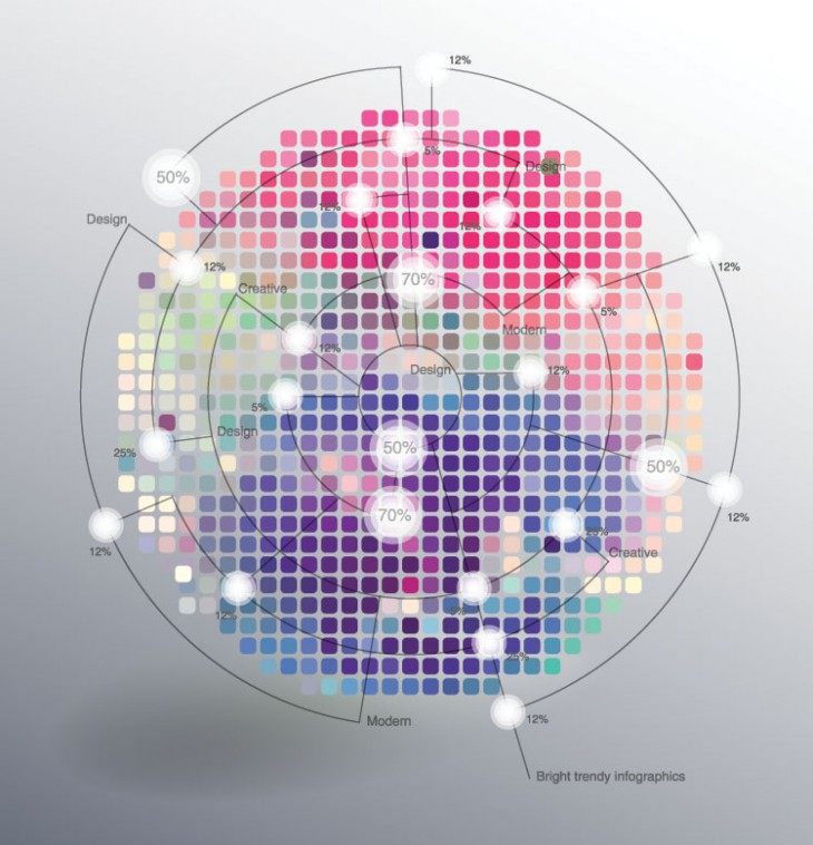
By the numbers
This infographic favorite has been around since 2007, and is still going strong. It’s one of the easiest formats to research, since it’s really just a collection of numbers and facts. This format can be applied to any topic, from wildlife to student loans, and can even be combined with a seasonal idea for added impact.
Pro tip: Make sure you do a search first to see if the topic has been covered — and if it has, decide if you can do it better. The key to success is to connect the seemingly disparate numbers. An editorial or visual narrative can make everything feel more composed and less like a haphazard data collage.
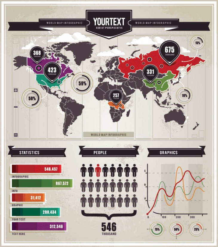
The handy-dandy chart
Some infographics use data to tell stories; others are just meant to be used for reference. The reference chart is always a safe bet, no matter the topic: history, vegetables, or even something as simple (yet incredibly useful) as formal dining settings.
The key here is to keep it simple and not over-complicate the design; reference is about getting to information quickly. It also helps if the graphic looks like something a person might actually put up on their wall.
Pro tip: Is there any aspect of your business that could use a reference chart? The opportunity to attach your brand to an industry reference source is a valuable one. Just one caveat: it’s easy to take the periodic-table format and adapt it for your content. However, “periodic table” charts rarely, if ever, actually depict something periodic, and are thus inaccurate. There are likely much more creative formats you can come up with.
Get the TNW newsletter
Get the most important tech news in your inbox each week.
