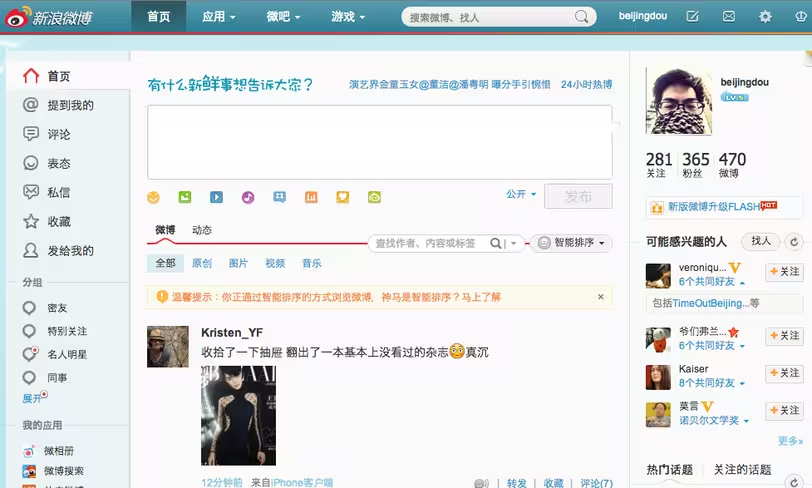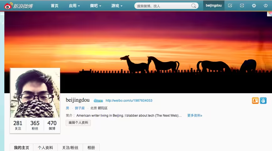
Chinese microblogging service Sina Weibo has begun allowing users to switch over to a new version for the Web that adds an option for selective sharing similar to the Circles feature in Google+.
The site is prominently advertising its new version with banner ads that, when clicked, will take users through the process of upgrading. The new site can also be accessed at http://weibo.com/new. Though we’d already seen leaks of early versions of the redesign, I’m still quite impressed with the interface.
A lot of the changes are aesthetic. For instance, profile homepages can now add wide banner photos similar to Facebook, and profile photos are now bigger.
One of the most-talked-about features is the addition of limited sharing. When sending a Weibo, you can choose to send it as a public message, private, or shared to a select group.
Weibo has been on an absolute tear over the past three years, climbing to a userbase of over 360 million users as of last quarter. However, Sina is still figuring out how to profit from the active community that has built up around the service.
The rise of the service has also attracted interest from companies outside of China. The recent addition of Weibo support to Hootsuite, for example, is a big win for Sina.
Get the TNW newsletter
Get the most important tech news in your inbox each week.


