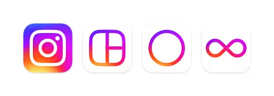
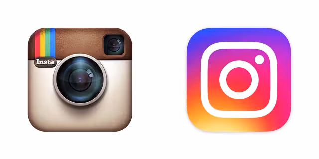
Instagram and its suite of apps have gotten an icon refresh. Instead of the brown Polaroid-esque square we’ve all come to know, the Instagram logo is now bright, colorful, and embraces the flat design trend.
The same look applies to its Hyperlapse, Boomerang, and Layout apps as well, tying all four apps together.
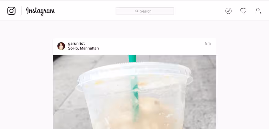
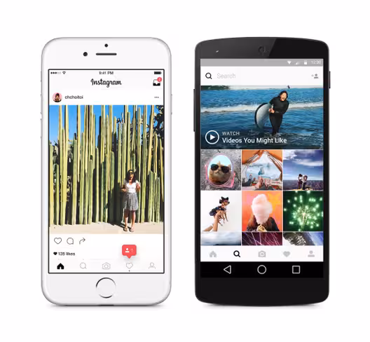
Inside the Instagram app and its Web version, things are the total opposite: There are small UI changes, such as a white top bar and black selected icons instead of blue. The company says it’s designed to make the layout more simple, so you can focus primarily on the images being shared.
The rainbow-themed icons are supposed to represent Instagram’s diverse community, which it says brings all sorts of life and color to the platform.
“Color has always been a huge part of Instagram — you see it in the classic app icon, filters, and the community’s photos and videos,” Ian Spalter, Head of Design at Instagram, wrote in a Medium post.
“When we started reimagining the rainbow, we looked at more minimal options, but ultimately we needed more warmth and energy to complement the glyph.”
This is the first logo redesign since Instagram first emerged five years ago. The move away from a blue UI also separates it from its parent company Facebook, which bought Instagram back in 2012 for $1 billion.
Personally, the new icons remind me of some standard iOS apps. What do you think?
The new Instagram logos: https://t.co/JosEGoQbyr
😍 or 💩 ?— TNW (@thenextweb) May 11, 2016
Get the TNW newsletter
Get the most important tech news in your inbox each week.