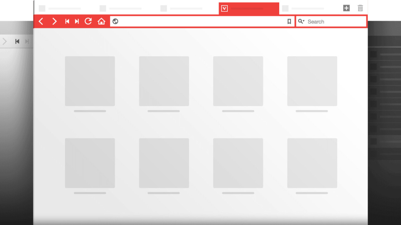
Vivaldi – a browser created by the founder and ex-CEO of Opera – made waves when it was announced a year ago. Unlike popular choices like Chrome and Firefox, which depend heavily on extensions if you want to do anything beyond basic browsing, Vivaldi was built as an all-in-one solution for “the Web’s most demanding users.”
After a long preview period and “millions” of downloads, the browser is finally hitting version 1.0, meaning the company finally thinks the browser is stable and useful enough for general audiences.
That said, if you didn’t try out Vivaldi’s beta, and all you’ve ever used is Chrome, Firefox or Safari, the sheer breadth of Vivaldi’s default features can be overwhelming:
- Tab stacking allows you to organize your open pages into groups.
- Tab tiling and web panels help you see multiple pages at once – particularly useful for three or more pages, or for reading feeds while browsing other sites.
- There’s a built in note-taking tool, which includes support for images – for research and annotations.
- A ton of mouse gestures and keyboard shortcuts for specific features.
- Speed dial on the new tab page for quick access to your favorite pages.
- Save all your currently open tabs and open them in a later session.
To name a few. One of my favorite features is an aesthetic one – Vivaldi automatically colors itself to suit the webpage you’re currently visiting. You can disable it if you prefer, however, and you can switch between a light and a dark overall theme.

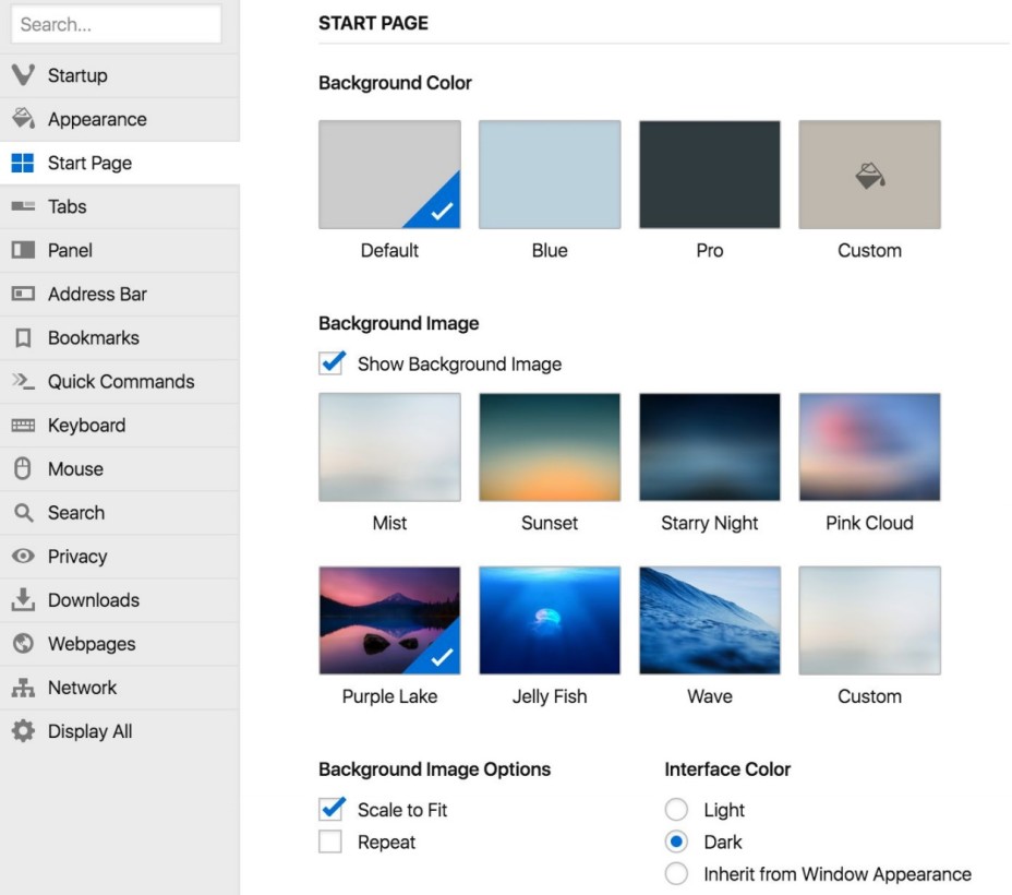
In fact, the ability to customize so many of the browser’s features without needing multiple extensions is a big part of Vivaldi’s appeal. You can do anything from changing your tab bar’s position, to setting a background image on a new tab page, to modifying virtually all the keyboard shortcuts to your liking.
If those built-in features aren’t enough, the browser supports most Chrome extensions too. The browser runs on a Chromium core, meaning most things that work on Google’s browser should work fine in Vivaldi as well. However, I did find scrolling to be a bit choppier than in Chrome, and there doesn’t seem to be any touchscreen support.
It’s a decidedly different approach from most other browsers on the market; instead of building a lightweight browser that can become more powerful (and bloated) with extensions, Vivaldi hits you with a ton of native features, giving you less reason to look for any add-ons.
It’s hard to say whether Vivaldi will be able to catch on with more casual users who don’t see anything wrong with Chrome, Edge or Safari, but this isn’t really aimed at them. If you miss the power-user browsers of years past, then you’ll probably want to give Vivaldi a look.
Get the TNW newsletter
Get the most important tech news in your inbox each week.


