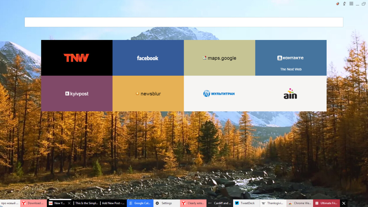
Russian internet giant Yandex has launched an alpha version of its new Chromium-based browser for Windows and Mac OS X that incorporates a few interesting ideas of how a modern browser might look. The main difference from the interface of Chrome or Firefox is the ultimate minimalism and the fact that the tabs are moved to the bottom of the page.
Explaining its new approach in a blog post, Yandex stated that it treats each website as a standalone application rather than a few linked pages of content. That’s why the tabs are moved all the way to the bottom to resemble launched app icons in Windows or Mac OS X.
It’s all about tabs
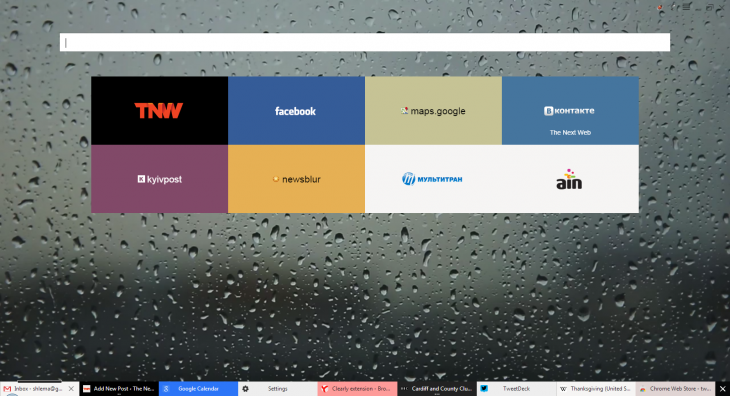
When launched for the first time, the alpha version of Yandex.Browser automatically imports bookmarks and other user data from other browsers installed in the system, so the first thing the user sees is a so-called Tableau with a list of favorite websites.
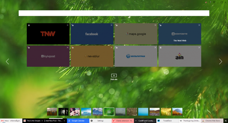
Links and their order can be easily changed by right-clicking anywhere on the Tableau. User can also choose one of the 12 beautiful animated background images for new tabs, or stop the animation by pressing the pause button.
Tabs that contain pages from the same websites are automatically put next to one another and given the same background color. When inactive, these tabs are grouped into one with a line of dots indicating the actual number of opened pages.
Ultimately uncluttered
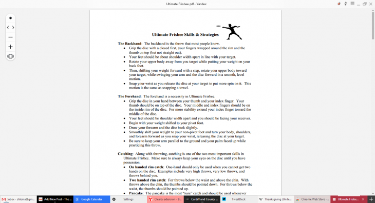
There’s not much to see in the browser except for the tabs. Trying to get rid of all the distractions, Yandex decided not to show the address bar and bookmarks bar all the time. What can be seen is the title bar with settings menu and the “smart” back button that returns you not only to a previous page but also to the application from which you opened a link, like Skype or a PDF viewer.
The title bar is semi-transparent, which helps it to mimic to the webpage’s layout and almost become a part of the website, which is apparently the goal Yandex was after.
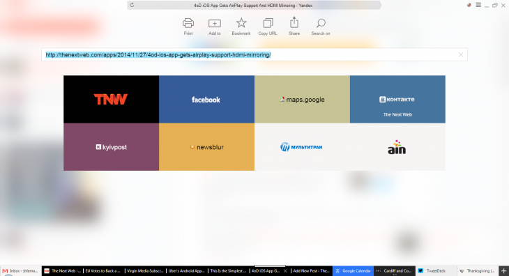
By clicking on the website’s name at the top of the window, user can get to the so-called “Flipside” that consists of the URL and search bar called SmartBox and a few basic functions like printing a page, sharing it in social networks and finding text on it.
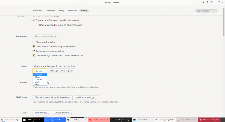
In the international version, the SmartBox uses Google search by default, while Yandex is not even in the list of possible search engines to use on the settings page. For the Russian version, however, the default search engine is obviously Yandex.
In addition to basic functionality, Yandex.Browser is capable of working with extensions. There’s a list of a few of them written by in-house developers, including Turbo mode that Yandex received from the Norway-based Opera browser, which is still quite popular in Russia. Turbo mode reroutes traffic via Yandex’s servers that compress it and allow faster browsing for users with poor bandwidth.
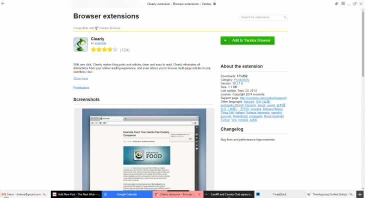
Low number of native extensions is compensated by the fact that users can install any apps and add-ons intended for Chrome and Opera right from the respective web stores.
The only problem with installing apps from Chrome Web Store is that it appears that the only way to launch them is through the SmartBox, as they’re nowhere else to be found. However, that’s a minor thing you’d expect to see in an alpha version.
At the moment users of Yandex.Browser are also unable to reorder tabs or pin them as they would in Chrome. Moreover, sometimes it’s hard to understand at a glance, which of the brightly colored tabs is active at the moment.
But all in all, the browser seems to be good to go as an option for daily internet activities. Its additional features include mouse gestures, notifications from Facebook and Twitter, document/e-book viewer, safe browsing, and webpage translator, which puts it on par with today’s alternatives. It’s hard to tell how long it can take to get used to the tabs’ position, though it shouldn’t be much more than a few days.
➤ Yandex.Browser [Windows | Mac OS X]
Get the TNW newsletter
Get the most important tech news in your inbox each week.
