Flipboard just launched v3 of its popular news aggregation app for iOS and Android devices, with a new UI and a host of smart new features to make it ‘more personal and more magazine-like’ than ever.
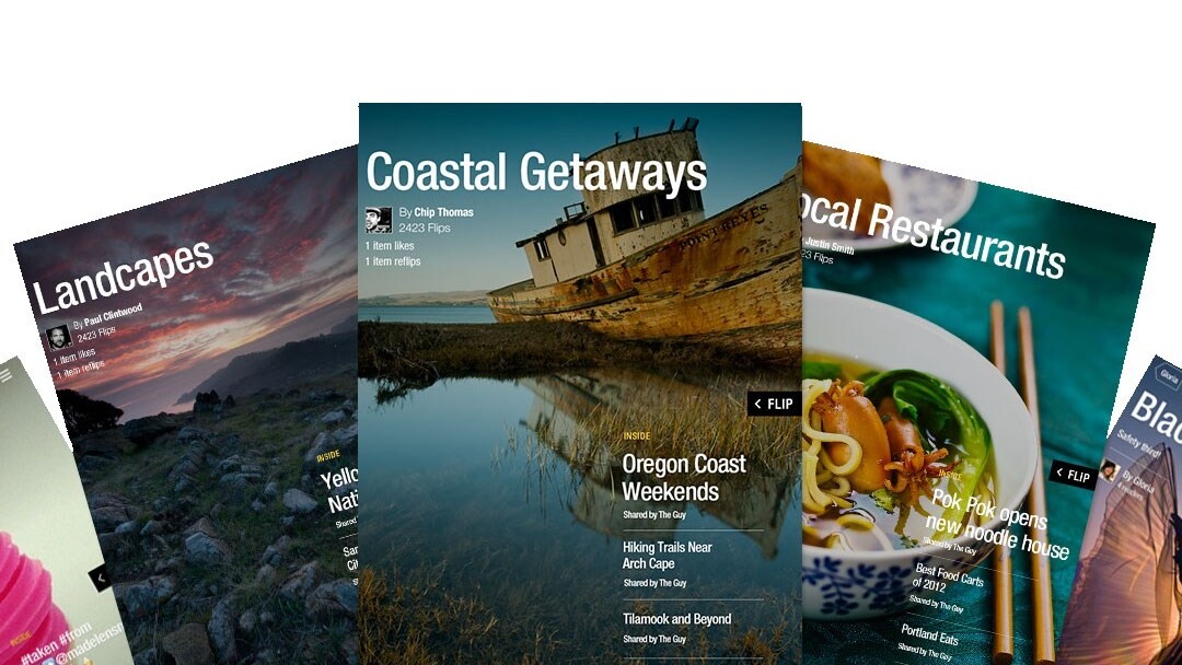
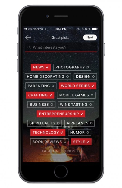
The redesigned app now includes over 34,000 broad and specifc topics (like jazz, product design, and HDR photograpy) powered by Zite, for readers to add to their personal feeds, and content is pulled in from a range of publications, RSS feeds and social networks, and also ‘magazines’ curated by Flipboard users.

There’s also a new Daily Edition: a specially curated roundup of the day’s top news stories spanning global affairs, business, technology, sports and pop culture, as well as opinion pieces and a special section with a rotating topic for each day of the week. There’s even an audio track for the day and a ‘parting GIF’ to round out the daily read.
The Daily Edition allows Flipboard to step up against the likes of Yahoo! News Digest, another app that curates important news stories into a compact edition twice a day.
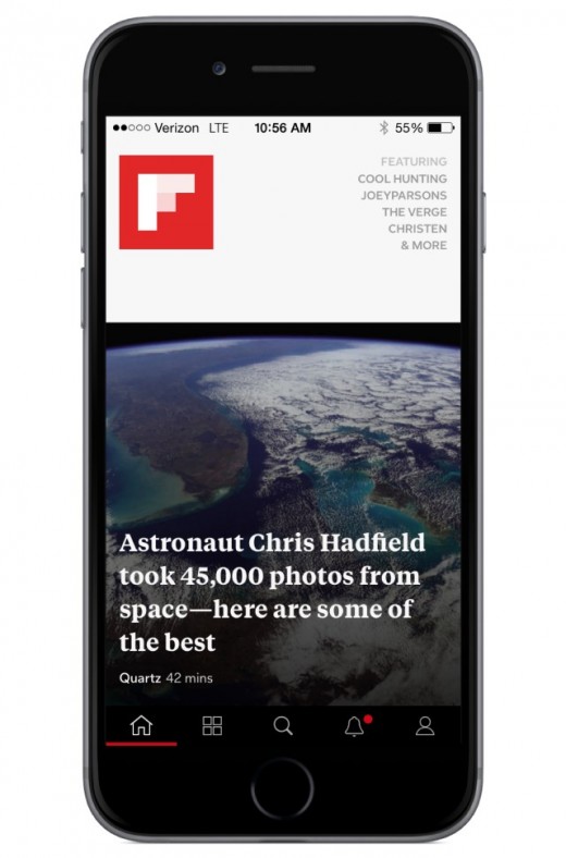
Version 3 also brings a new design for phones, with elegant typography, full-screen images for magazine covers and a new navigation bar to get to your home feed, tiles, search, notifications and profile quickly.

Additionally, MagMakers, or users who curate magazines on Flipboard, can now see how their magazines and articles are received by users in My Analytics, a new dashboard available in the Flipboard editor on the Web.
With these new features designed to improve the user experience and further empower curators, Flipboard seems poised to rule the roost in the world of personalized news apps — but with so many destinations for aggregated news, including social networks and RSS readers like Feedly, the battle will be long, bloody and possibly headline-worthy.
➤ Flipboard [Android / iOS / Windows Phone / Blackberry]
Get the TNW newsletter
Get the most important tech news in your inbox each week.


