In one of its boldest moves to date, Foursquare is today launching a revamped and reimagined version of its original mobile app. After removing the check-in functionality for a new app called Swarm, Foursquare has refocused its core app on location-based recommendations.
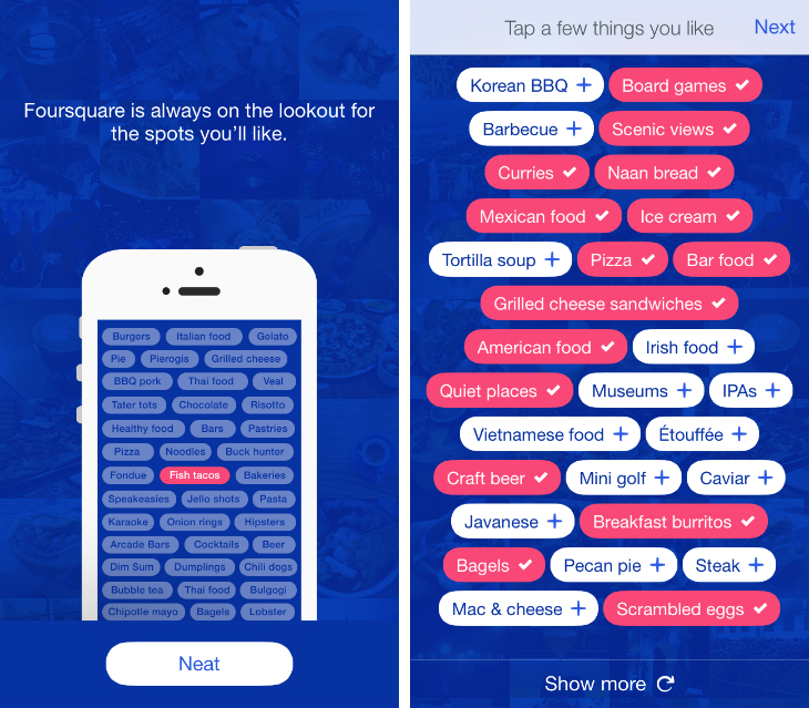
One of the biggest changes is a new tagging system called “tastes.” From the initial on-boarding process, you’ll be able to choose specific food, drink and venue types that you’re interested in. Foursquare throws up a huge list of suggestions based on your prior check-ins, but you can search for new ones too.
The company says there are over 10,000 to pick from and it’ll be using them to improve its suggestions. Whenever you see watermelon-colored text throughout the new Foursquare app, you’ll instantly know the place aligns with your tastes.
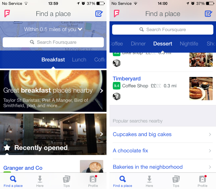
The design has also been completely reworked. A home feed (of sorts) is maintained under the ‘Find a Place’ tab and is designed to be your first port of call when finding a new place to check out. A figure at the top lists your current distance from most of its recommendations, with a search bar underneath and a horizontal carousel for categories such as Breakfast, Lunch and Nightlife.
Each category then reveals a photo or two that point to curated lists, such as “great dessert places nearby,” establishments that your friends have recommended, or related search queries When you’re stuck for ideas, this feels like a faster and more enjoyable way to find some inspiration.
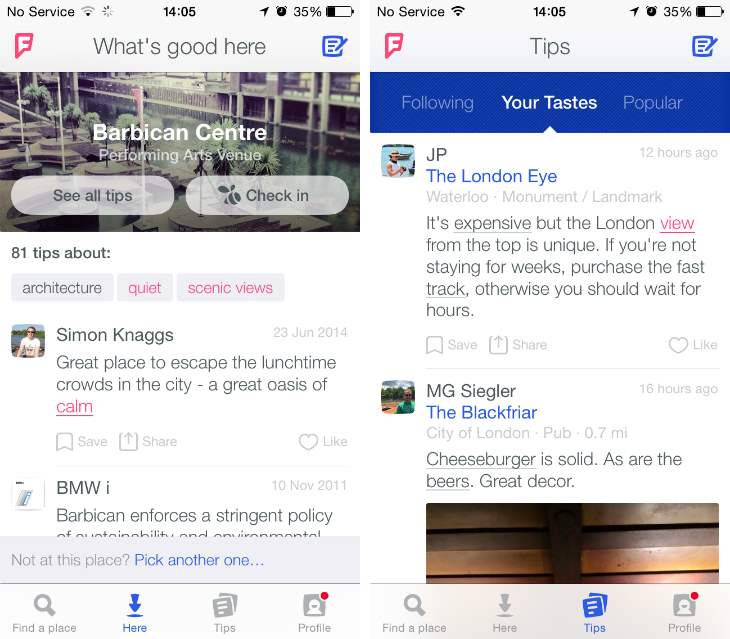
The second tab, labeled Here, uses your current position to show relevant information, advice and tips about your current location. If you have the Swarm app installed, there’s also a shortcut here to quickly check-in.
The third, Tips, separates a plethora of Foursquare reviews into three columns: the people you follow, tips that include some of your tastes, and comments deemed most popular for your surrounding area. While the check-in points system is no more (much to my editor’s dismay), Foursquare hopes to rekindle its competitive edge with a new metric called expertise.
“Every time you add a tip, you’re working towards becoming an expert in certain categories, and you’ll become an expert more quickly if people like or save your tips to their to-do lists.” the company says.
Finally, there’s a redesigned profile tab where you can review saved places, settings, notifications and the people you follow. At any time, you can also tap the new “F” emblem in the upper left-hand corner to add new tastes or the paper and pen icon in the upper right corner to leave a new tip.
Foursquare is taking a huge risk. At the time of writing, the company’s Swarm app has a one and a half star ranking in the App Store; the prior version of the Foursquare for iOS app held just one star. The decision to unbundle its services has left many fans unhappy, but clearly Foursquare thinks it was a necessary move in order to push forward with its new strategy; location-based discoveries.
Whether the new Foursquare app can reassure disgruntled check-in fanatics remains to be seen. The redesigned mobile app is clearly targeting Yelp’s market share though and with that in mind, it’s a much better product. The trick for Foursquare will be maintaining its core user base, while subtly shifting its branding, messaging and ultimately how the public perceives its services.
The new Foursquare app should be available later today. The company says it’ll be releasing the updated iOS and Android versions at 11am ET/8am PT/4pm BST, with full availability by 12pm ET/9am PT/5pm BST.
Read Next: Foursquare says Swarm for Windows Phone is coming ‘in the next few weeks’ / Foursquare reveals a new logo and previews its overhauled discovery app
Get the TNW newsletter
Get the most important tech news in your inbox each week.
