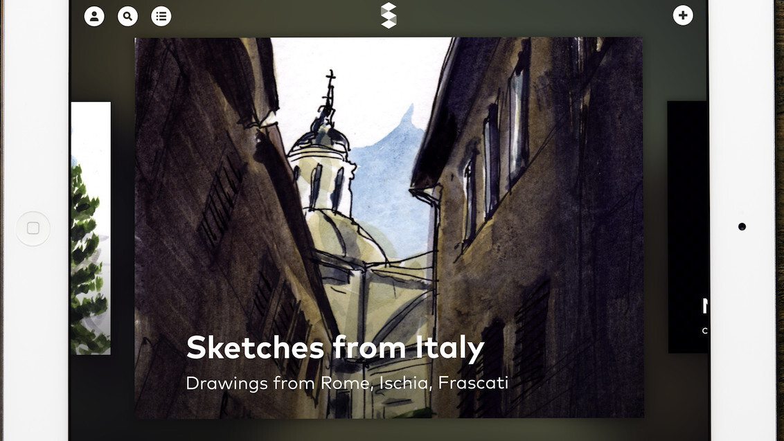
Apple’s former user experience evangelist and UI designer Mark Kawano has launched Storehouse, an impressive iPad app that lets you quickly lay out and publish photo, video and text as shareable stories.
Kawano’s design and UX credentials, which include iPhoto, Aperture and Photoshop, are evident in Storehouse. The app is minimalist, intuitive and relies heavily on gestures.
Storehouse is full of the kinds of little details that make an app feel polished. When looking at the cover video for a post, for instance, it will keep playing even while you pinch, twirl and throw it. After you release, it naturally shrinks or swells back to fill the screen. It’s a minor feature, but it makes the story feel like a real, tactile thing that you can manipulate.

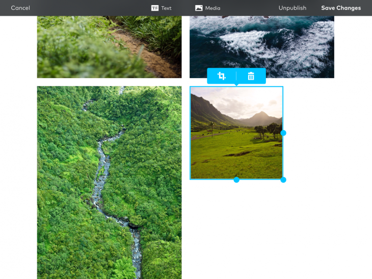
Once you’ve signed up on the app, you can browse other users’ stories or create your own. Storehouse integrates with your device’s photo library, Dropbox, Flickr and Instagram. After choosing a few photos and videos, you’ll import them onto a post draft. You can drag images to rearrange and resize them and add chunks of text.
Storehouse doesn’t include a lot of formatting options. For instance, there are only three text styles: normal, header and quote.

When you hit publish, the story goes out on Storehouse’s own network and you can share a responsive Web version to Facebook and Twitter.
I threw together a couple of sample stories on Storehouse and was really happy with the results. Using an Instagram video as the cover image made the story feel alive. I also enjoyed being able to just drag and drop elements to rearrange them.
The whole experience reminds me a lot of Medium. Both companies are trying to help lay users tap into good design without having to use professional-grade software. However, Storehouse places a higher emphasis on images and less of a focus on the long-form reads that Medium has become known for. Storehouse is also a mobile-first product, while Medium is Web-first.
“Storehouse is really about using images as the primary focus for any story,” Kawano said in an interview. “The atomic unit of content for our stories is very different [from Medium].”
Kawano said in an interview that the inspiration for the app was to capture the trend of images becoming a universal vernacular by offering an open publishing platform for users to connect with their unique audiences. He was careful to note, however, that Storehouse is not a photo sharing service.
Storehouse arrives first on the iPad because Kawano felt that using a touchscreen to compose the stories made the process more “playful and engaging.”
Kawano said that while developing creation software for the desktop, he found that users tend to have a pre-conceived idea of what they want to accomplish.
“What we find with Storehouse is it’s more akin to the experience where you’re laying out a bunch of images or photos, rearranging them intuitively until you see something that makes sense,” he added.
Moving forward, Kawano plans to add more ways to communicate on the service and discovering relevant content.
Storehouse needs to attract a critical mass of creators in order to mature into a full platform, but even on day one, it’s one of the most beautiful and intuitive ways to combine and share your photos, video and text.
➤ Storehouse for iPad
Get the TNW newsletter
Get the most important tech news in your inbox each week.


