| This is an advertorial brought to you in conjunction with GetResponse: create stunning newsletters and landing pages in minutes. |  |
You’ve probably heard about how important responsive design is when building websites, but it’s even more important for email.
Email is such a personal medium that tailoring your marketing message to the recipient’s screen size can be vital for making an impact. According to research by Google, 82% of mobile users check their email on mobile devices, while a GetResponse survey shows that 42% of subscribers delete emails that don’t display correctly on mobile phones.
Email marketing software company GetResponse recently became first to market with the ability to create truly responsive emails. A designer can create one email that will look great whether viewed on a desktop or mobile device. What’s different about GetResponse is that all its predesigned templates are responsive, and that it makes it possible to create responsive emails from scratch with no limitations.
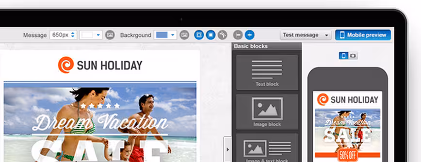
GetResponse’s drag-and-drop Email Creator interface lets you get on with building your email the way you like it, while in the background it automatically adds tags to make your template mobile-friendly. So you can be sure that your recipients are getting a truly responsive email, you can test your design in Mobile Preview mode, right from the app.

The 💜 of EU tech
The latest rumblings from the EU tech scene, a story from our wise ol' founder Boris, and some questionable AI art. It's free, every week, in your inbox. Sign up now!
All elements of your email — images, texts, graphics, and column layout — are resized and rescaled to fit screens of any size or shape without you having to do anything.
“Up until now, designers were faced with the daunting task of creating a separate mobile design for each newsletter using HTML specifications or pre-designed mobile-friendly templates, typically offered in a limited selection” says GetResponse Founder and CEO Simon Grabowski. “Responsive Email Design is a perfect solution to help marketers keep pace with current mobile-use trends.”
GetResponse serves more than 300,000 customers in 183 countries. It manages and delivers 12 billion permission-based emails per year, so it knows how to get it right.
➤ GetResponse
Get the TNW newsletter
Get the most important tech news in your inbox each week.