As Foursquare continues its evolution from being the simple geo-location and check-in app it once was to the hub of local information and recommendations intermixed with Foursquare user reviews that it now is, a desktop app was always going to be the logical progression.
With today’s launch of its first foray onto the desktop in the form of a Windows 8 app, we thought we’d go hands-on for a quick overview of some of the highlights of Foursquare on Windows 8.
Download, install
After downloading the app from the Windows 8 Store, Foursquare detects your location and then opens up a home screen prompting you to log-in.
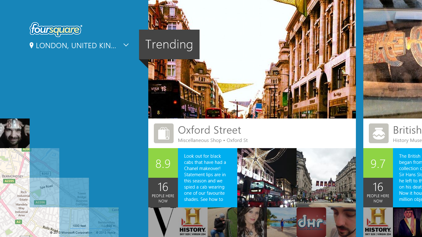
Once done, your profile photo (providing you have one, of course) will be on the left-hand side of the screen and clicking it will take you to your profile information, showing things like how many lists you are on, your friends, etc. On the right-hand side, trending locations are shown.
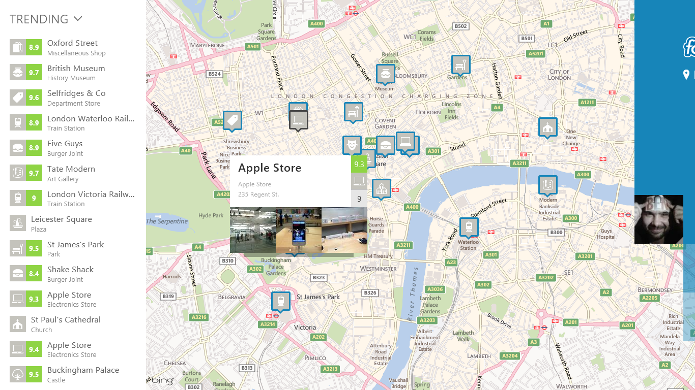
From this main screen, scrolling left shows you businesses and other locations of note on a map. Clicking on a listing will pop-up a little more information.
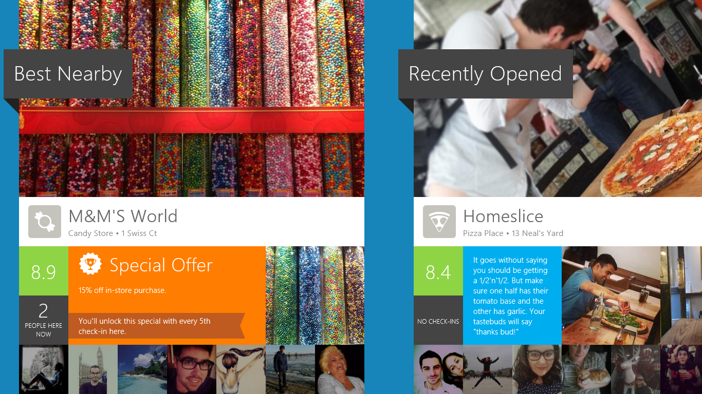
Scrolling right from the main screen shows you other categories of locations alongside trending, such as ‘Best Nearby’, ‘Recently Opened’ and ‘Nearby’. As well as showcasing a few locations in each category, it gives an overview of the number of Foursquare users currently there and any special offers that are available.
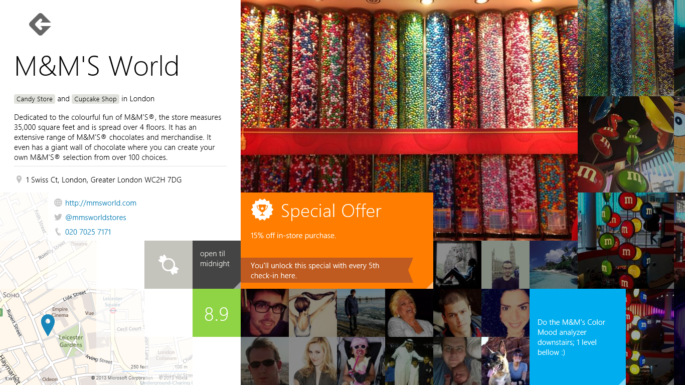
Clicking on an individual listing, in this case M&M’s World, takes you through to details about your chosen venue…
In addition to the usual contact details, it also shows you comments from other Foursquare users if you scroll to the right.
Here, as throughout the app, I particularly like how Foursquare has designed the Windows 8 desktop UI to aid discoverability and a natural progression by allowing the content from other ‘sections’ to spill over a little into the main screen.
For example, in the image above the essential information about the shop and a few photos are intermixed with some user photos and comments in the lower-right corner. Therefore, scrolling to the right is the natural progression, as it is in most Windows 8 apps.
Doing so, brings up more comments, tips and photos and also give the option to click through for even more.
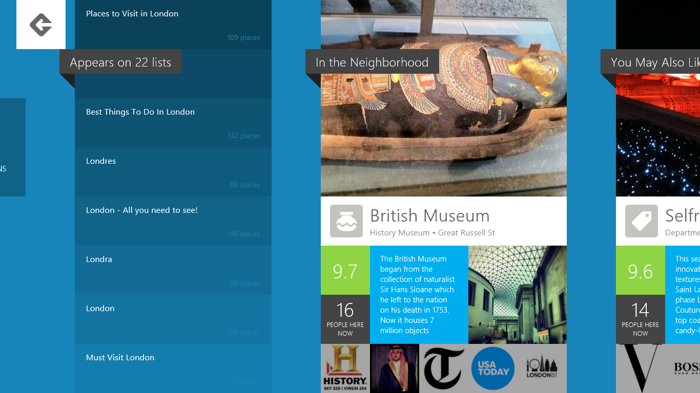
Continuing to scroll right brings you to lists that the location appears on (if any) and other suggested locations that are nearby or similar.
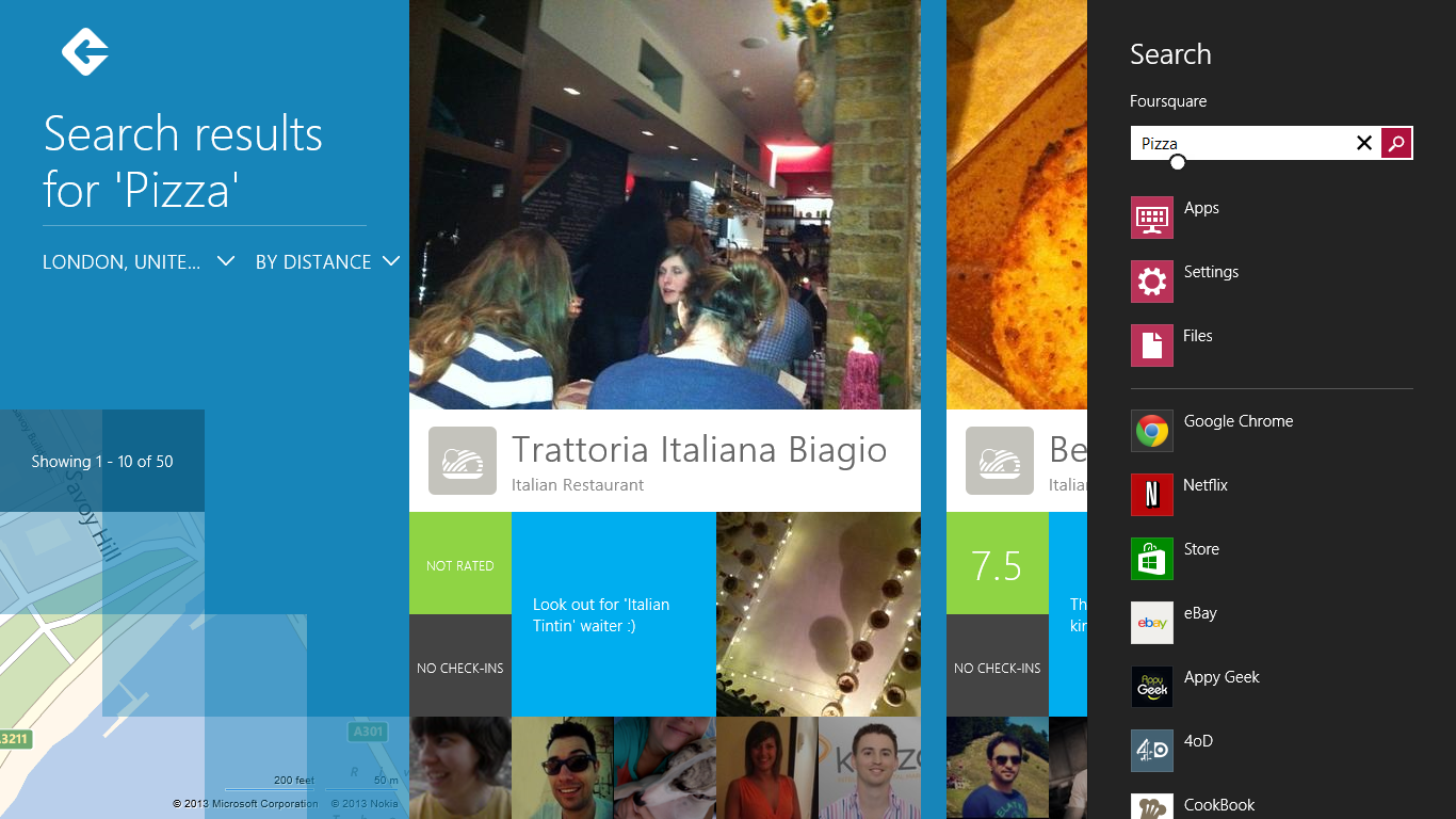
As well as scrolling around for recommendations, you can obviously search for anywhere you know the name of, or go for a more generic search for something like ‘pizza’.
One of the truly handy things about this Foursquare app is that the company has baked its search into Windows 8, meaning that you’re only ever a swipe away from searching Foursquare using the Windows 8 Search ‘charm’.
Search results are consistent with the rest of the app too, meaning that a swipe to the left will show you them all on a map and a swipe to the right will show you more of them.
Initial thoughts
The Foursquare app is a slick and easy to use way to find out about recommended, new or otherwise notable restaurants, shops and all sorts of other locations in your local area. While perhaps lacking in some small ways, it does exactly what you’d expect it to do, and delivers it in an attractive package.
With less emphasis on the check-in side of things, mashing up its previous primary function with a way to find out about local businesses is a good way to keep it relevant in a sea of other ‘local discovery’ platforms.
Get the TNW newsletter
Get the most important tech news in your inbox each week.
