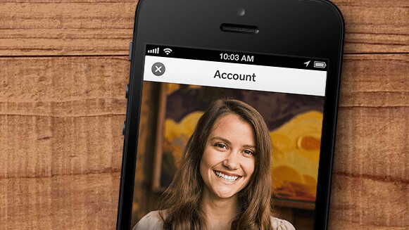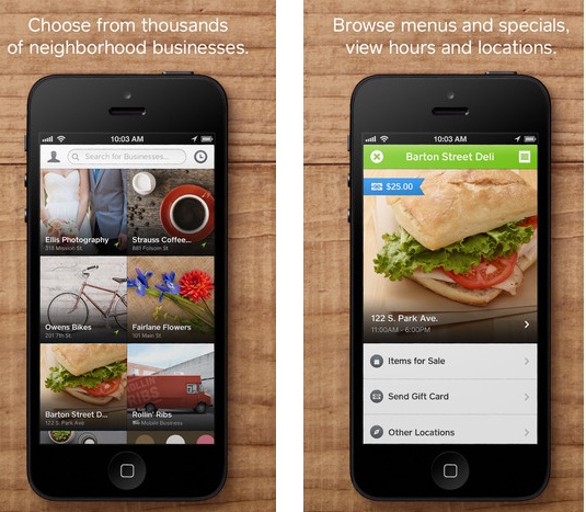
Mobile payment service Square has updated its Wallet app for iOS to version 3.0, introducing a redesigned interface, various speed improvements and other changes that streamline the checkout process.
According to Square, this release makes the app a “sleeker, snappier payment experience.” Indeed, the new look places emphasis on imagery, and overall, it polishes the previously decent-looking app to a level of quality you’d expect from a design-focused company.
As 9to5Mac notes, Square did more than improve the technical performance of the app. This iteration cuts out a step for customers checking out, and so users no longer have to tap “Pay Here” to be added to the customer list of a store. They simply have to tap the store they’re in.

This release comes just two months after Square added the ability to send gift cards to friends from within the app. Unfortunately for Android users, this update is iOS only for now.
Disclosure: This article contains an affiliate link. While we only ever write about products we think deserve to be on the pages of our site, The Next Web may earn a small commission if you click through and buy the product in question. For more information, please see our Terms of Service.
Get the TNW newsletter
Get the most important tech news in your inbox each week.


