
The Financial Times (FT) has launched an all-new iPad-focused Web app today, representing its first major overhaul since it launched almost two years ago.
Just to recap, the FT introduced its Web app way back in June 2011, and two weeks later it had notched up a fairly impressive 200,000 downloads.
If you recall, the main reasons given by the FT for dropping its native iOS app was that it had expressed concerns about the lack of data Apple made available around user activity from the App Store. Not to mention the 30% cut Apple takes from any in-app revenues generated.
The FT’s new look
When you go to access your usual FT Web app shortcut today, you’ll be directed to the new incarnation which will indicate two distinct editions – ‘Morning’ and ‘Live’.
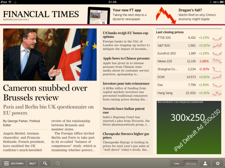
When the main screen launches, you’ll notice a new look and feel, as well as navigation. It’s easier to shift between stories, and you only have to swipe left/right to turn the page to the next article.
But at the bottom right, you’ll see two new tabs, which let you access a morning edition for those who want to know what was originally in the newspaper at the dawn of the day…
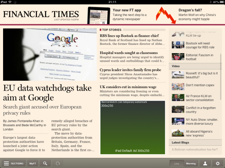
…while the live edition continues to update throughout the day.
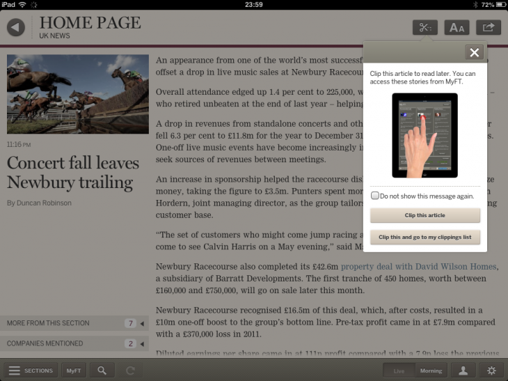
When you’re on a story page, it’s easy to ‘clip’ an article to read later, which will now be accessible through a whole-new area.
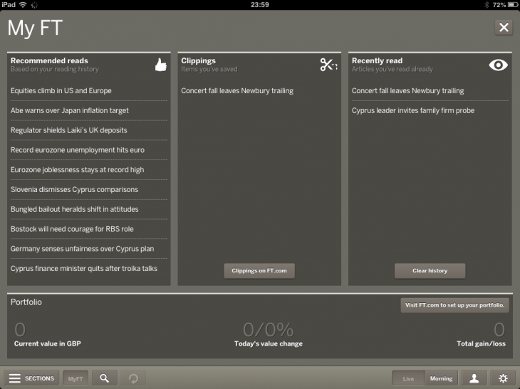
The MyFT hub (via the MyFT tab at the bottom left) is essentially a personalized repository containing your saved articles, and a list of what you have read most recently, as well as recommendations based on what you have already been reading.
This latest launch falls a month after The New York Times – often lauded for its efforts in the digital space – launched a prototype of an all-new NYTimes.com, with a cleaner app-like design. This was in addition to its experimentation with an HTML5 Web app. And earlier this year, The Atlantic Wire also launched a new HTML5 iPad Web app, as it sought to move away from “expensive and restrictive native iOS development”, though it did stress it wasn’t ditching native iOS (as did The New York Times).
In the two years since launch, The Financial Times has stuck to its guns on the iOS Web app front, and with this latest launch it has gone some way towards creating a much more dynamic incarnation for its digital subscribers. The FT says that those on Android and other devices will be getting some Web app loving in the coming months, so we’ll be sure to revisit this when they arrive.
Feature Image Credit – Thinkstock
Get the TNW newsletter
Get the most important tech news in your inbox each week.


