As a long time user of Instagram, I have come to loathe a certain thing that people do on the service. No, it’s not duckface or Throwback Thursdays. It’s not even the fact that most people will never know that tilt shift was originally about fixing perspective, not decreasing depth of field.
No, it is the people that insist on publishing photos in their standard, rectangular 3:2 ratio to Instagram. Instagram is a service that is designed completely around the traditional 620/120 square medium format film that used to shoot through the vintage cameras that its filters emulate. Yet, people insist on choosing an image and zoooooooming out so that you can see the whole thing left to right, creating two big black bars along the sides of their image.
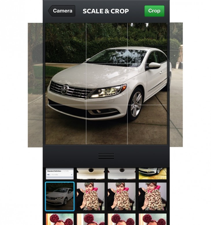
Like this:
I detest this. It defeats the whole purpose of Instagram. If you do this, I apologize for offending you but stop doing it anyway. If you want to publish rectangular images, use Twitter, or Flickr or Facebook. Instagram is designed for and institutionally bound to the square format.
The square format has a long and storied history that stretches back to the early days of photography, long before 35MM came along because it was faster and cheaper. It frees you of a format that was generated for sports and news photographers who needed to shoot hundreds of frames very quickly. It’s the format of artists, of those who like to craft worlds inside a frame without a push towards the vertical or horizontal.
Now, the latest Instagram update actually forces you to adhere to this square tradition. And people absolutely hate it.
Previously, you could pinch an image to zoom it out to its longest dimension. Now, the app snaps your images to their shortest dimension automatically. This means that you can’t ‘shrink’ it in, you’re forced to post a square image. Wonderful.
I’ve demonstrated the behavior with a composite image above, forgive the poor photoshop job.
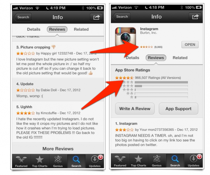
So, how is this going over on Instagram’s App Store listing? Not very well. Ouriel Ohayon breaks down the negative affect that it’s having on the app’s rating in a post here (there are some bugs that are contributing as well). But I think that these listing screenshots tell the tale pretty well:
The current version of the app is plummeting in ratings.
In the end, today’s furor over the Instagram’s new terms of service will probably drown this out, but I found it quite funny. Instagram likely didn’t do this to pay tribute to photographic history, the fact of the matter is that non-square images look crappy in the stream and they look bad in the web view, so it’s trying to make a product that looks the best it can.
But either way, people are seriously not digging the fact that they can’t post their stupid uncropped images to Instagram. And I’m loving it.
Image Credit: My brother-in-law who does this all the time. Love you bro, but stop.
Get the TNW newsletter
Get the most important tech news in your inbox each week.


