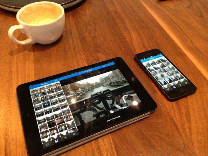
Dropbox is updating its mobile app today with a fresh new look and a much refined photo browsing experience on iOS. I was at Dropbox HQ this morning and had a look at the new apps for iPhone and iPad, and they’re impressive — a significant improvement on all fronts.
When I asked Product Designer Morgan Knutson and Product Manager Aseem Sood why Dropbox is putting such a focus on photos in this release, the answer was simple: give the users what they want. Over the past few years, the folks at Dropbox have noticed that people, especially on mobile, are using its service for photographs, more than anything else.
Though Dropbox began as a service for syncing data, it has become a repository for memories. And those memories deserve the best experience possible.
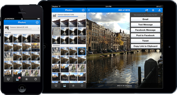
To that end, the apps on both iPad and iPhone are getting a huge update today that makes the way that they upload, organize and display photos that much better. The interface as a whole has been trimmed and cut down to put the focus on photos. A tap removes all of the chrome, so that the photos jump to the fore, the gallery browsing is smooth and powerful, without a hiccup as you jet through hundreds, or even thousands of photos.
Sood says that this was inspired by the fact that there has been enormous uptake of the automatic uploading feature Dropbox introduced a couple of versions ago. The feature, if you’re unfamiliar, allows you to automatically upload every photo you shoot to your Dropbox, creating a shared repository and backing up those images as you go.
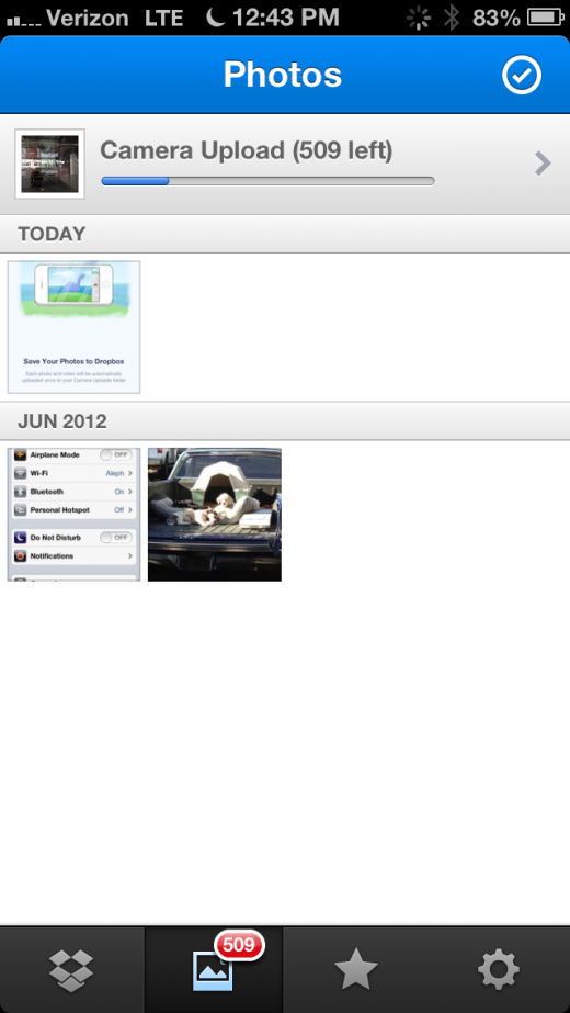
The new interface has improved integration with this camera upload feature as well, with a slide-down bar that displays how many uploads are remaining out of your current batch. That upload bar drops out of the way when not in use and reveals itself in the standard ‘pull-to-check’ motion. In a nice touch, there is a slight delay before it hides itself, allowing you to quickly tap a thumbnail without fear that it’s going to snap back and cause a mis-tap.
In the latest version, the upload feature is still promoted heavily, but the splash screen has also been updated with a WiFi+Cellular button. This option was previously buried in the settings of the app, but fronting it on the introduction screen will encourage adoption. This adoption is important if Dropbox wants to continue down this path of being the repository for all of your photos.
The photo browser itself has some great details. I asked Knutson about the choice to eliminate the ‘gutter’ that normally appears when you scroll, and he confirmed that this was just another way that they were helping to emphasize the photo content over the ‘chrome’ of the app. In the iPad app, instead of a standard scroll bar, you’re presented with a small round grabber that shows you where you are, while simultaneously revealing as much as possible of the column that you’re looking at. The grabber itself is even slightly transparent. It’s a very slick item that I think we’ll see pop up in other apps as people see it.
A full gallery of photos with quick-loading thumbnails and a full-screen view of your image just a tap away is a far cry from how Dropbox handled photos before. The photo viewer features decreasingly granular headers, allowing you to see photos shot today, yesterday, this week, this month and then monthly thereafter. It’s an interface that’s built to handle a lot of photos and to do it well. With so many people making use of the product for saving their images, it only makes sense to refine and improve this experience.
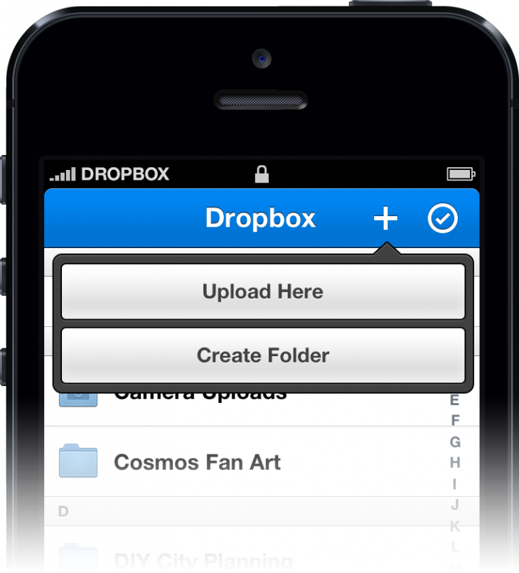
The upload procedure has also been revamped, with a new streamlined popover that allows you to upload items directly to your current location or to create a new folder on the fly. This is a big leap over the previous editions of the app, where drilling down in the upload procedure was a bear, and could be very confusing.
The interface is less…shiny, overall, which Knutson says was a very conscious decision. It mimics the way that iOS 6 has been buffed down as well, but takes it even further. It’s flat, but not too flat, and quite pretty. The icons have been stripped of their text, trimming down on the extraneous noise surrounding the viewing and organization of your files. Much of the descriptive text throughout has also been minimized, making for a cleaner experience. It retains a certain quality that Knutson’s wife says is ‘feminine’, and I tend to agree. It’s softer than other hard-edged work like the new Instagram, but still very bold.
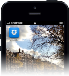
The icon has also gotten a refresh, with what I feel to be a stronger, more…iconic…if you will, look. The open top of the box feels like you’re being invited to drop something inside. It’s an enormous improvement over the last version, which reflected Dropbox’s ‘sketch’ artwork style, but didn’t work as well on a crowded home screen.
Today’s update is for iOS only, though the Android app was updated recently and Sood and Knutson say that the desktop and web experiences will continue to be refined to keep parity between the various options.
As we end up living more of our lives on mobile devices, and those devices increasingly have excellent cameras, it makes sense that much of the data that we have to save and sync would be images. Making the process of saving, viewing and sharing those photos better is a good way to make your product indispensable.
Get the TNW newsletter
Get the most important tech news in your inbox each week.
