Welcome to the mapping wars, it would seem. As Microsoft burnishes Bing, Google cements its market advantage with its own tool, Apple works to right its own ship, Nokia is diving into the ring, taking its maps product everywhere all at once through a new effort called HERE.
TNW’s first take on the product can be found here. HERE will be available on iOS as an application, an API for Android, a tool for Mozilla OS, and an HTML5 application for everyone and everywhere else. TNW took that HTML5, cross-browser experience for a spin on both an Android device, and Chrome.
Nokia also announced “LiveSight,” a tool that leans on 3D views of the world to provide what the company calls “the most precise and intuitive augmented reality experience” available. LiveSight will first launch in Nokia City Lens, which is only available on the company’s Lumia handsets.
This post is a short collection of our take on what we found using HERE. As always, your mileage will vary.
Chrome
HERE is a complete mapping solution, albeit one that has a chunky interface that needs to be sharpened. This transcends the experience in Chrome, as we will see, but we begin here.
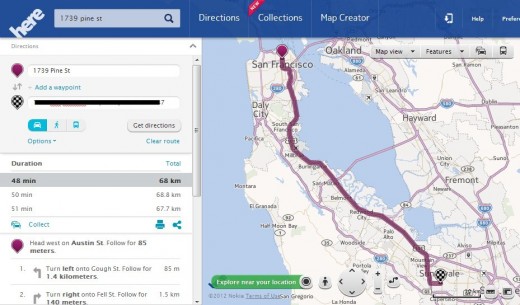
Here’s a shot of HERE showing how to drive from my house, to my sister’s house in Sunnyvale:
Now, let’s spark a menu, just to add to the general clutter. Please note, I’m not running these screenshots at the full 24″ range of the specific screen; there is always room on a screen that large. Instead, I’m using what Chrome is showing to be the auto-sized new Chrome window for a fairer look at the interface.
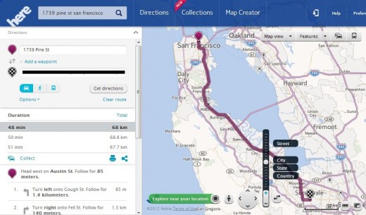
It’s very busy. However, the direction listed are accurate. The interface is both fast and responsive, and the data truly global. As a feat of technology, HERE is quite capable, even if its interface is a bit lackluster.
Happily, with less selected and in use, the maps do clear up nicely:
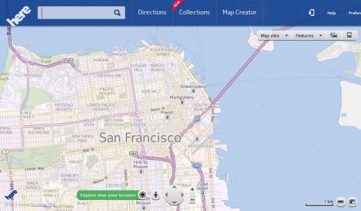
If you look closely, the various neighborhoods are in fact color code with a light purple, or soft yellow. This helps you navigate the city with your eye. It’s a nice touch.
Now, to a heat map of what to eat and drink, in my neck of the woods:
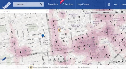
How complete is the data? I’d give it a B+, after my quick testing. I noted a few places that are not listed, but major spots were placed, and accurately on the map. The heat map interface is more for fun than practical use, but could help new folks to a city identify hot spots.
Do take a peak at the top bar in all these shots: It’s massive. That along with the left hand menu – which arrives when needed – and the other UI elements always seem to crowd the all-important data in the middle, which is what you are after.
Now, a 3D shot of downtown to cap off our Chrome tour:
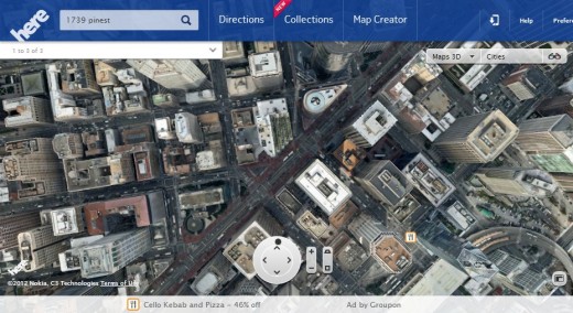
As a final note: did you see the ads? Look at the very bottom of the last two shots: there are ads, powered by Groupon, to be seen, advertising local deals. As far as search ads go, they are hardly obtrusive. Sure, they take of space, but I give Nokia points for how small and well integrated they are.
Android
And here we run into problems. I’m currently running a Galaxy Nexus, which is not the newest, or most powerful Android phone, but the darn thing isn’t 6 months old, so it should count as a fair representation of devices of its platform.
Here is a standard menu shot from HERE on Android:
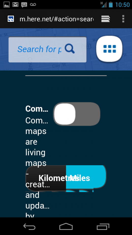
If you are a bit confused, so was I. Let’s try again:
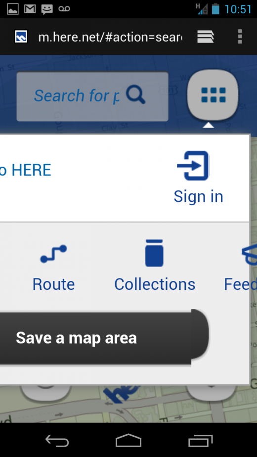
HERE, stahp, you are drunk. Also, you can’t scroll in that menu view, so even though you can’t see everything, you can’t get to the rest of it.
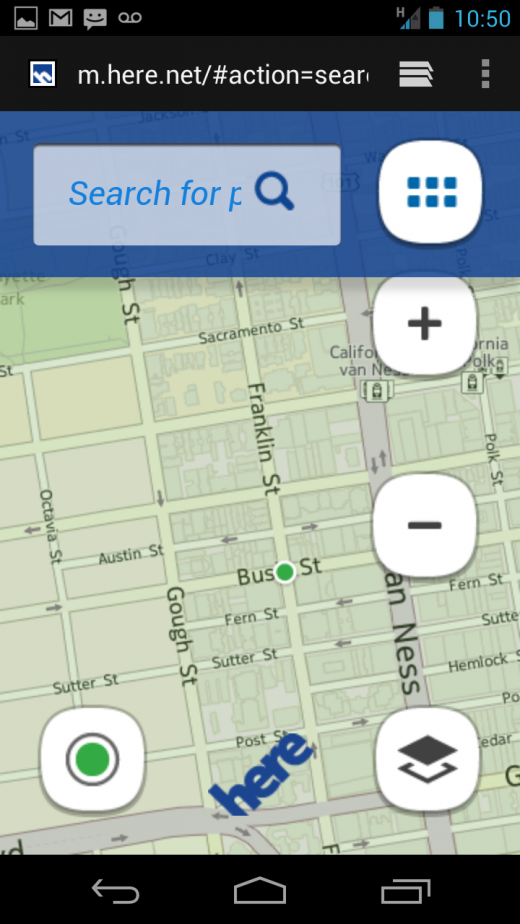
Next up, a map view of HERE on Android. As you can see, the interface – as with Chrome – is oppressive and stodgy:
It’s your turn. HERE is a big enough product that you owe it to yourself to test it. As the Internet goes mobile, mapping has moved from interesting feature to core capability.
Nokia is knocking on the Big Boy door. Once they clear up their UX design, it could have something great on its hands.
Top Image Credit: Wyman Laliberte
Get the TNW newsletter
Get the most important tech news in your inbox each week.


