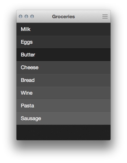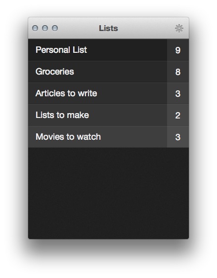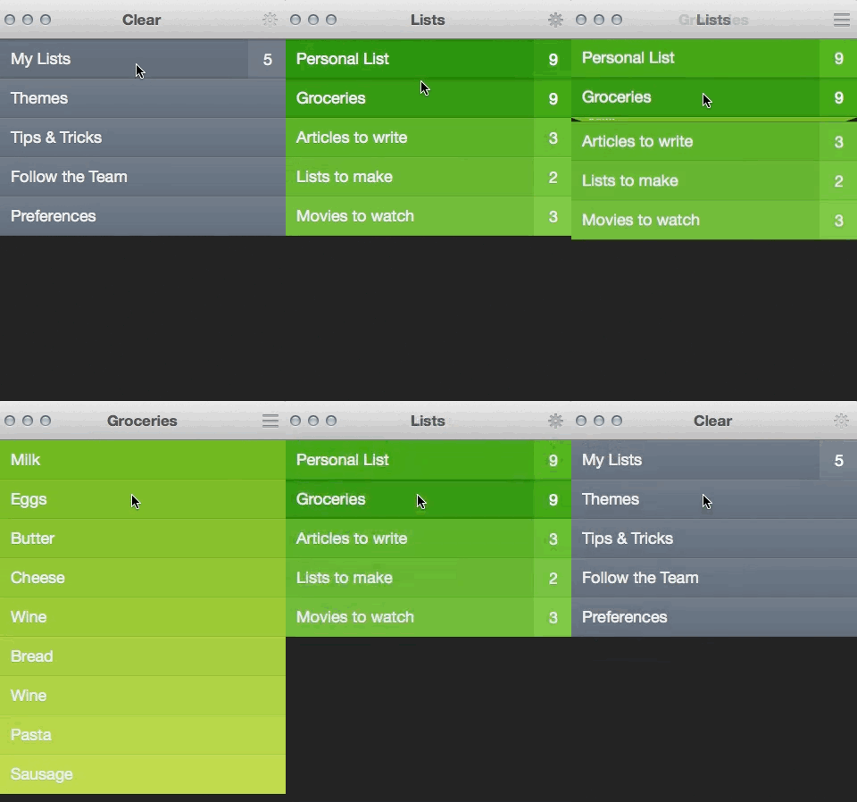
I still remember the first moment that Impending’s Phil Ryu showed me Clear for iPhone. At the time, it was very, very early on and one of the few things that was working right was the ‘pinch apart’ gesture that you use to add new items.
Even in its very rough form I knew instantly that it was going to be something special. I ended up loving the final version of Clear for iPhone, and felt that it could have a long-term impact on how we thought about gestures in iPhone apps. The app went on to have some very good success in the App Store and has now launched a Mac version that syncs via iCloud to the iPhone edition.
Clear for Mac is an unavoidably different animal than the iPhone edition. First, the app has to be translated from a gesture based interface to one primarily driven by the mouse (or in some cases, touchpad).
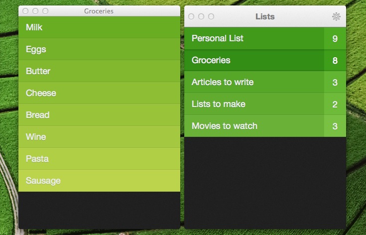
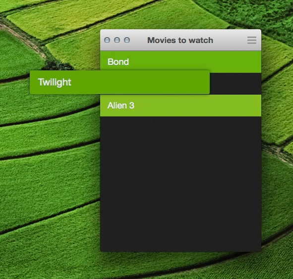
Also, there is the switch from a modal to non-modal interface. Making something work with edge-to-edge command of the display is one thing, making it work in a window is another. You can rip lists off in Clear, moving them to their own little windows, something that you could never do on the iPhone.
But, somehow, Clear makes the transition, and it does it while carrying over the inventiveness that so impressed me with the original. Instead of merely finding ways to map the gestures of the iPhone app to actions that you can perform with a mouse, the team has managed to translate the spirit of the app as well. By creating unique and clever mouse controls, the drive to push interfaces forward has been brought along for the ride.
“It was really important to us that we designed Clear Mac to be friendly for mouse users, keyboard only people, gesture addicts, and a combination of all three,” says Impending’s Ryu. “That was definitely the big design challenge on the Mac.”
In the process, says Ryu, they discovered ways to let people get to entering items even faster than in a traditional app built with the Mac in mind from the beginning.
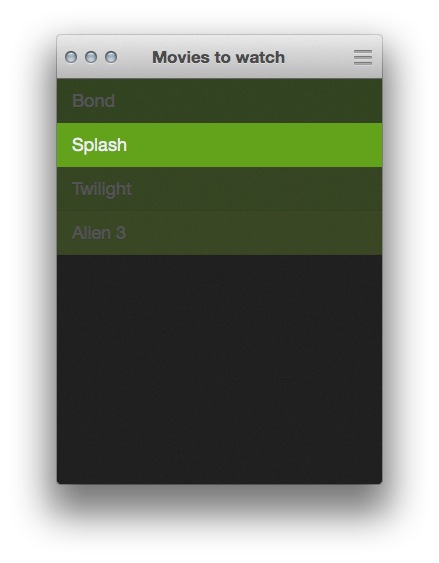
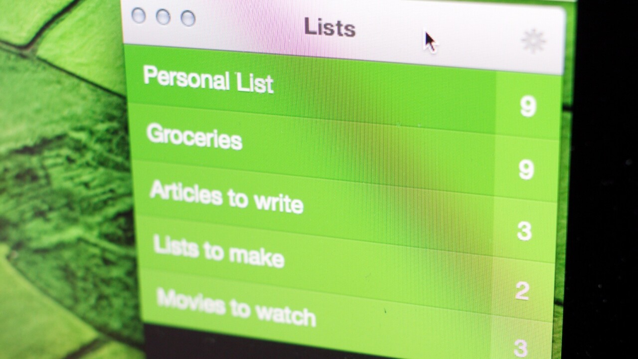
You’re presented with a list of slim items in a list that you can right-click to dismiss or click once to edit. But you don’t have to have an item active in order to craft a new one, you simply begin typing when the Clear window is in focus. A quick CMD+tab over to the window, a string of characters and a tab back to the app you were working in makes the process speedy and weightless.
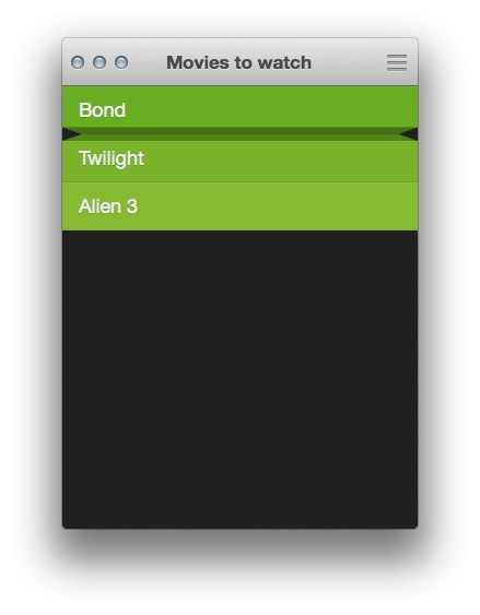
And that super clever ‘pinch apart’ action is still there if you use a touchpad, but you can also simply hover your mouse cursor over the gap between two items and start typing, a new item will be inserted between the two. It’s super neat, and works on click or hover.
Just as with Clear for iPhone, the project is a joint one. Dan Counsell and the other fine folks at Realmac, Impending’s Ryu, as well as engineers Milen Dzhumerov and Chris Emeryall contributed.
I asked Counsell about the process of getting those interactions just right. “We weren’t trying to replicate Clear just for the sake of it, like-for-like, on OS X, but make it so that the app screamed on OS X,” he says.
It wasn’t the swiping that was the hard bits, says Counsell, those were actually fairly easy to translate to the touchpad, or to create an analogue for with a mouse cursor.
“It was actually the things that you don’t need to worry about in iOS: keyboard shortcuts, multi-window support, even moving items between windows,” he says. “Mouse-interactions are harder still. Because of the nature of the cursor being an abstract representation of a user’s actions, we spent a lot of time figuring out what really worked: Bringing task-based actions to left and right-click, hovering between items, and then offering keyboard-shortcuts relating to where you’re hovering – finding the sweetspots there were actually much more challenging.”
And the effort shows. The keyboard shortcuts (you can find a full list here) are logical, and the mouse actions are simple, economical and fast. Drag and drop an item on the list, click once to edit, hit enter to confirm. Escape takes you back, as does a click of the settings button.
The iCloud syncing is seamless and quick, with the app updating in one location or another within a few seconds of an item changing. The app continuously polls too, so you don’t have to hit a refresh button.
iCloud integration hasn’t been the easiest for Apple developers, either. It’s consistently one of the big pain points that I hear chatting with them, and has driven some to distraction. Lack of documentation, fuzzy rules about what they can and cannot do and more continue to cause problems.
“Milen [Dzhumerov] might’ve lost a few years of his life stressing out over iCloud integration, or at least sprouted a few gray hairs,” says Ryu. “Apple definitely has some work to do there, to make the integration process a lot smoother. But we’re hoping the end result is worth it for our customers!”
Counsell says that Dzhumerov built a sync system on top of iCloud that would work out the “truth” of the information being synced by looking at the data from all the devices and determining the chronological order of the changes made by the user. It seems like something that would have been built into iCloud from the get-go, but wasn’t. And it’s up to developers to craft their own if they want the syncing to work right.
The sounds of Clear are just as interesting as the interactive elements of the app. There are pleasantly modulated clicks that run up and down a scale as you skim items in a list. The alert sound is a piano tone, rather than a customary buzz. It lends a crisp and intricate feel to the interface.
That rollover scale, says Counsell, was inspired by the original iPod click wheel sound.
“Sound design is a huge dimension of the user experience, especially with something designed to be touched and played with,” says Ryu “Just make sure to design them very carefully, to fit an overall theme and on the quieter side or else your app will turn into a clown car.”
“I bet in a few years, sound design in apps will just be status quo. You will open an app without sounds, and it will feel strangely mute and lifeless to the touch.”
And that’s kind of the theme of Clear for Mac. The little details and finesse points that make up the best features of the app are ones that you could easily see spreading out to other Mac apps. As the Mac App Store gets more mature, the offerings to customers are getting more polished and impressive. Clear feels right at home in this bunch.
Clear for Mac runs a none-too-svelte $14.99 on the Mac App Store, though it is on sale for $6.99 initially. This is a price that comes in well below huge planning apps like Omnifocus, but above other simple list apps like the free Wunderlist.
I asked Counsell about the pricing for the app, and why $14.99 felt fair. “We spent around 8 months developing Clear for Mac, that’s more than double the time we spent on the iPhone version. We knew we couldn’t sell it for 99¢,” he said. “Low prices only really work on iOS because of the sheer volume of users.”
They have had feedback about the price being too high, especially when compared to the iPhone version, but it is still cheaper than most of the for-pay to-do apps on the Mac App Store.
Counsell says that they’ve discussed Android support, but at this point they’re focused on the Apple ecosystem.
At this point, Clear for Mac is simply a list app that syncs to iPhone. If you have a preferred app that does this already, there really isn’t a compelling feature that might convince you to change. Instead, it’s a lot of small things that, cumulatively, give the app a sort of relaxed tension that is appealing to me.
Yes, it’s simple, but it’s held together by choices that were made with thought and care. And those choices make the logic of the app, and the feeling of using it, fantastic to experience. It’s not the best list app out there, but it just might be the most delightful.
Get the TNW newsletter
Get the most important tech news in your inbox each week.
