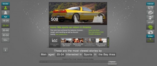
A new tool from Yahoo! gives you a glimpse of what’s being read on its homepage, as well as what’s popular from the last 24 hours. It’s actually a gorgeous display that lets you see different breakdowns of who’s viewing what, when, and why.
The visualization is a part of its C.O.R.E. project, which Yahoo! explains like this:
The Yahoo! Content Optimization and Relevance Engine (C.O.R.E.) data visualization reveals the many factors that influence the display of articles appearing in the Yahoo! Today module. Emulating C.O.R.E.’s ability to learn from visitor behaviors and return relevant and appropriate content, this data visualization allows visitors to quickly adjust several different demographic factors, as well as article criteria, to reveal typical reader habits and patterns.
On the backend, Yahoo! is taking many factors into account before it shows you news in its “Today” module, which you’re probably familiar with if you’ve ever visited the site:
According to Yahoo!, C.O.R.E registers more clicks on the Yahoo! homepage than there are words in the entire English language – every ten minutes. This visualization shows you how it’s doing it and what stories are the most popular:
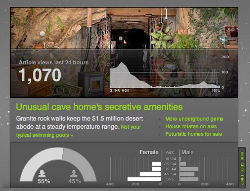
By changing the time-frame sliders, age demographics, and category of news, you can see what stories are being shown on the Yahoo! homepage and how they’re performing in real-time. Also, you’ll notice that little animated dots spin around on the visualization, and they represent a news story. You can click on any of the dots and you’ll be able to see the story, how many views it has, and a breakdown of who has viewed it:
While there’s a lot of data to digest here, the visualization makes it pretty easy for any user to interact with it. This is a tool that I’d love to see from Facebook or Twitter in regards to the activity in my streams. Sifting through links is difficult, and while Twitter is trying to change that with its “Stories’ feature, I’m more of a fan of this graphical and interactive approach from Yahoo!.
Get the TNW newsletter
Get the most important tech news in your inbox each week.


