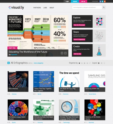
We love infographics here at The Next Web, so we were recently interested to hear about the impending launch of a hub for data visualizations. Today, Visual.ly goes live as a place for data visualizers to share their work and connect with those who want to commercialize them.
The site has launched with over 2000 visualizations to explore across a range of categories, from sports and technology to the economy. Infographic fans should be in heaven here – it’s a gorgeously designed social hub for fans of big data. The site is launching with a number of high-profile partners in the publishing world, including CNN, National Geographic, the Wall Street Journal and The Next Web.
In addition to being a hub for existing infographics, and allowing their creators to connect with potential publishers for them, Visual.ly’s Labs feature will be offering tools to create completely new visualizations. While the main features here are still to launch, the Twitterize Yourself tool is a great demo of what’s to come, letting you create an infographic comparing yourself to any other Twitter user. The result is a gorgeous, custom visualisation based on the data in your Twitter account.
Visual.ly is part of Dave McClure’s 500 Startups initiative and it’s got off to a promising start. Data visualisation is a huge growth are and we look forward to seeing where the site goes next.
Get the TNW newsletter
Get the most important tech news in your inbox each week.


