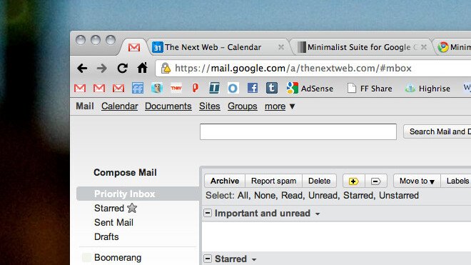
You might say that Gmail is already pretty minimalist, compared to some other services. That’s part of what I love about it. But with the addition of new features (which Gmail seems to do almost every month) comes a weakening of that minimalist overview. Minimalist Suite is a plugin for Chrome that’s helping you to get rid of the things you don’t want, while emphasizing the things that you do.

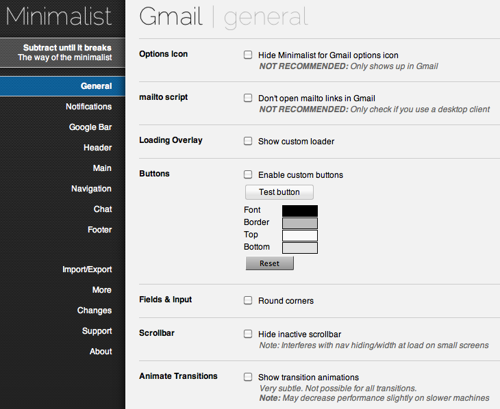
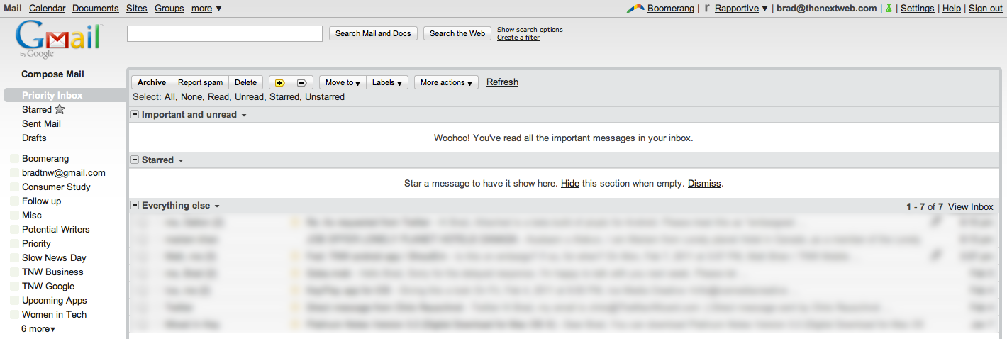
Mind you, I keep a wide variety of folders and options intact that you might not, yourself. My Gmail doesn’t look overly different in my final choice form than what it did before, though I do like the theme. However, if you’re feeling gutsy, you can really dig in and get a great amount of cleanup done in the basic Gmail UI. Just make sure that you select the Minimalist theme from within Gmail.
The Google Calendar version? It’s the same animal. It’s worth noting that it sometimes takes a restart of Chrome to get things up and running, but since my restart it’s been hassle-free. There’s even a handy button in your Omnibar in case things go awry.
Ansel Santosa, the developer of the Minimalist Suite, says that a Google Reader version is coming soon. Until then, give it a shot and let us know what you think. Just make sure to select the Priority Inbox button if you use it or you might scare yourself like I did.
By the way — You see how empty my Priority Inbox is right now? This would be a good time to drop us a line and pitch your amazing idea. If it’s good, you might be the next one on TNW Apps.
Get the TNW newsletter
Get the most important tech news in your inbox each week.


