 The only downside to covering technology is that eventually you know so many people that it is hard to not be slightly biased, the tech world just isn’t that big. So it is with Clicky Web Analytics: my friends run it, I’ve worked with them, and they are good guys.
We also employ it at TNW meaning that I use it every single day of the week. I’m writing from the perspective of a user today, you are just going to have to trust that I am acting fairly.
Clicky is one of the most popular non-Google Analytics traffic monitoring solutions online. It competes with Chartbeat, Woopra, and others for people looking for real-time traffic reporting.
That aside, Clicky launched their first major site refresh in what seems like a half decade over the weekend, and after testing the beta versions and using the final live product I have to admit that the Clicky team has managed to update their site in a large, good way on their first attempt.
This is not usually the case. Redesigns (such as Digg’s) often test well and launch poorly. If other Clicky users agree with me we will discuss farther down, but so far I have enjoyed the redesign. The new Clicky is slathered in ajax which has seemingly solved what was Clicky’s largest problem: lag between action and result. The entire site feels 50% faster, bringing you huge amounts of historical data with far less waiting.
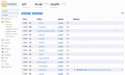
The new design is simpler to navigate after you become accustomed to it, allowing you to drill down in sections more quickly and to find sub-category options (such as searches, then keywords and so forth) in less time and with less fuss. The following screenshot is of GetClicky.com’s traffic for part of one day:

The best part of the redesign is that the core Clicky experience is largely the same. The way you interact with the data once it is served to you by the service is the same, just how you get there and how long it takes have been upgraded. Trust me, when you are working with the analytics for a site as large as TNW speed is a big darn deal.
What is not right in the design? The website is not centered, which was a conscious choice that the company made. Why is beyond me, on both of my main screens it looks slightly ridiculous all on the left with 10″ of dead screen space on the right. I understand that for the average consumer it is a correct standard setting, but give us the option to choose, please.
Also, the buttons that let you navigate between different websites that you track are hideous and might cut off the name of your site if it is too long. Oh, and some of their users are in tears over the change. The initial post announcing its launch received very negative comments, and the follow up post by the company received very positive comments. Given that people who are unhappy are the most likely to comment, seeing so many positive comments makes it hard to say what percentage of the Clicky userbase is unhappy with the redesign. Time will tell. Until then, tell us what you think about it in the comments.
Get the TNW newsletter
Get the most important tech news in your inbox each week.


