 If you are a heavy user of email, and specifically Gmail, I’ll bet that you have questions about your inbox. How much mail do you get on a certain topic, how much from that annoying coworker who spams you at all times of the day, and so forth.
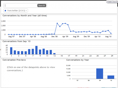
At long last, someone has taken the task in hand and has built a wonderful browser add-on called “Graph Your Inbox” that allows you to, well, graph your inbox. As I write this post, Graph Your Inbox (GYI) is parsing through all the messages stored on my Gmail account to find all the emails that Twitter has sent me. I’ll attach that graph at the bottom.
What can you do with GYI? “You can use it to visualize your communication with friends, your Facebook activity, when you purchased items on Amazon or how often you use certain words or phrases. We provide the same search functionality used by Gmail, but instead of a list of messages we show you graphs of email trends over time”
The extension works with very simple directions. For example, if you input from:URL.com the extension will bring up all emails from that URL, or label:somelabel will graph that specific tag over time.
As promised, this is my from:twitter.com graph. You can see that back in late 2008 and 2009 I really discovered Twitter and went nuts meeting people. Then I unfollowed everyone which led to a rather large slow-down in total emails to myself from Twitter. Oh, and auto-dms died out, which helped significantly.

There you have it folks, Graph Your Inbox. It’s quick, fun, and informative. You really should check it out. Thanks to @Atul for tipping us off.
Get the TNW newsletter
Get the most important tech news in your inbox each week.


