 If you’re not familiar with our love for third-party Twitter clients, then chances are that you’re pretty new around TNW. To say that TweetDeck is one of our favorites would be a huge understatement, but it’s fitting.
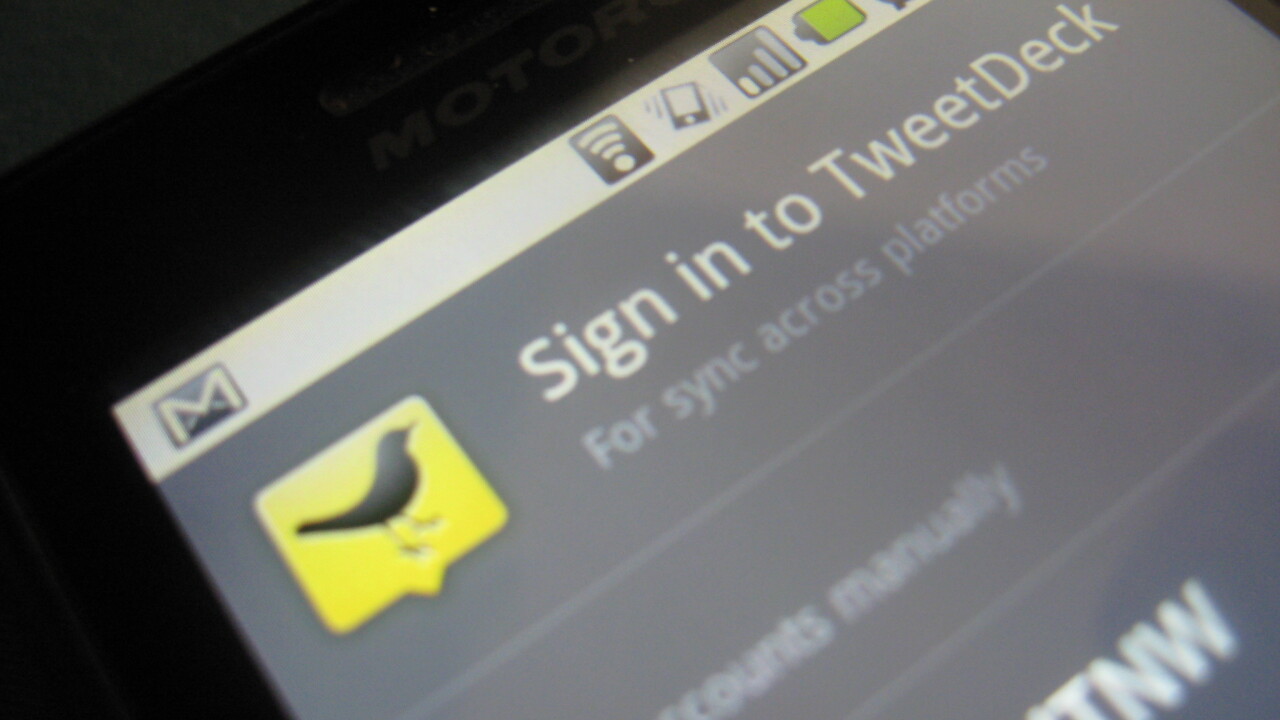
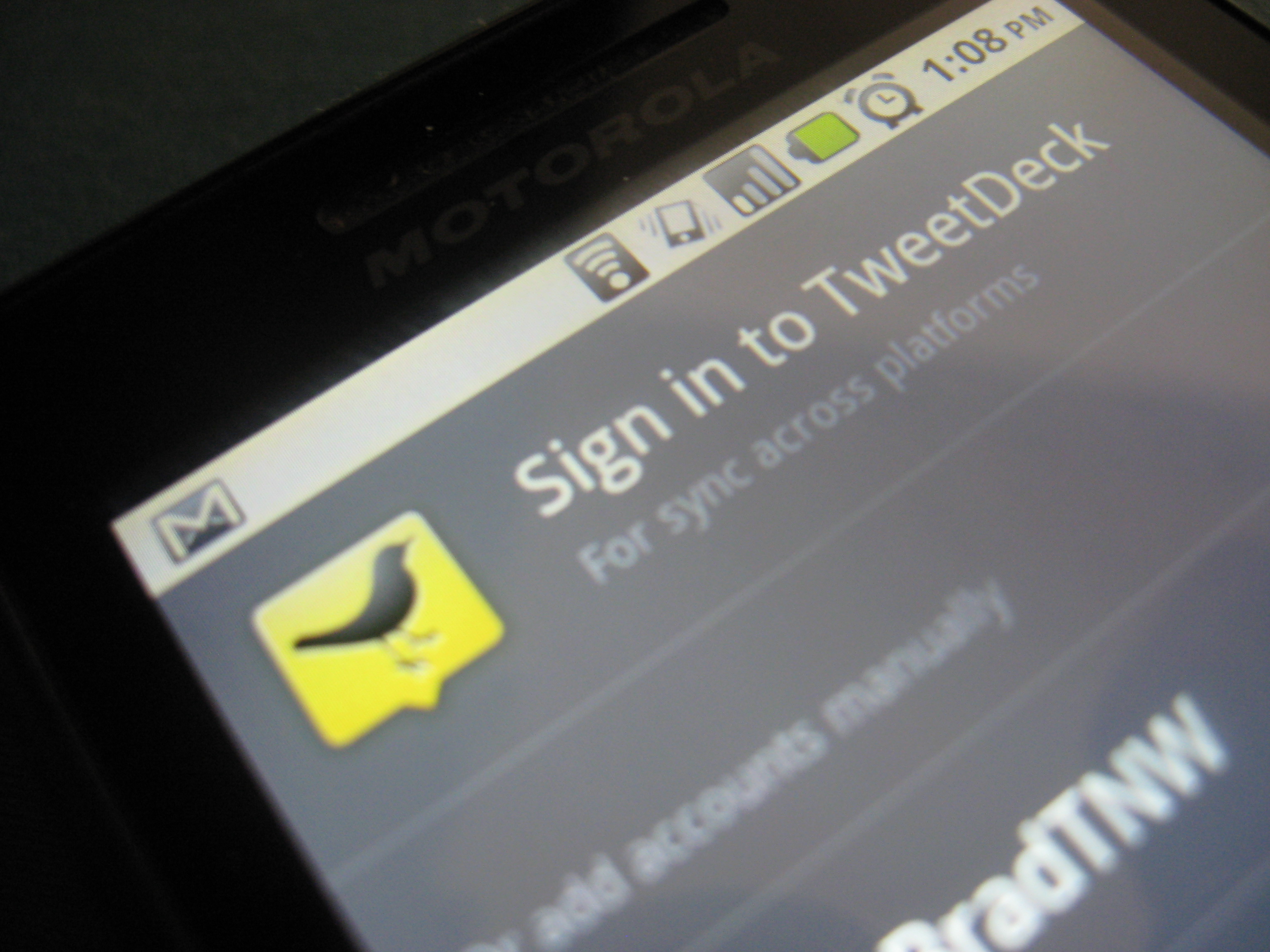
For quite some time, we’ve been waiting for TweetDeck to appear on the Android OS. Apparently, that wait is almost over. We got a first look, today, at the TweetDeck for Android that will be rolling out tomorrow, and we’ve gotta say that it’s pretty slick:
We’re assured that new features are going to be coming out in nightly builds, but for now, here’s what’s missing:
- Improved mapping
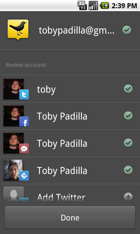
- Better handling of mutliple Twitter accounts
- Better error message handling
- Video uploading
- Deeper Android integration
- Account removal

The 💜 of EU tech
The latest rumblings from the EU tech scene, a story from our wise ol' founder Boris, and some questionable AI art. It's free, every week, in your inbox. Sign up now!
Beyond the missing parts, however, what you’ll find is a TweetDeck experience that you’re likely very familiar with, all on your phone.
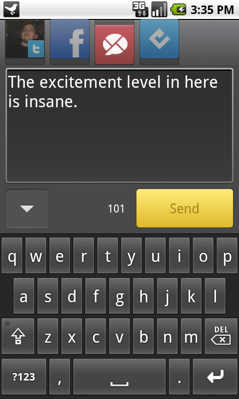
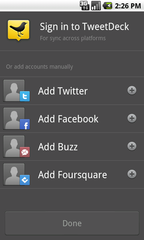
By default, TweetDeck gives you a blended home column that is color-coded for the service the message comes from:
- Black – Twitter
- Dark Blue – Facebook
- Light Blue – Foursquare
- Dark Red – Google Buzz
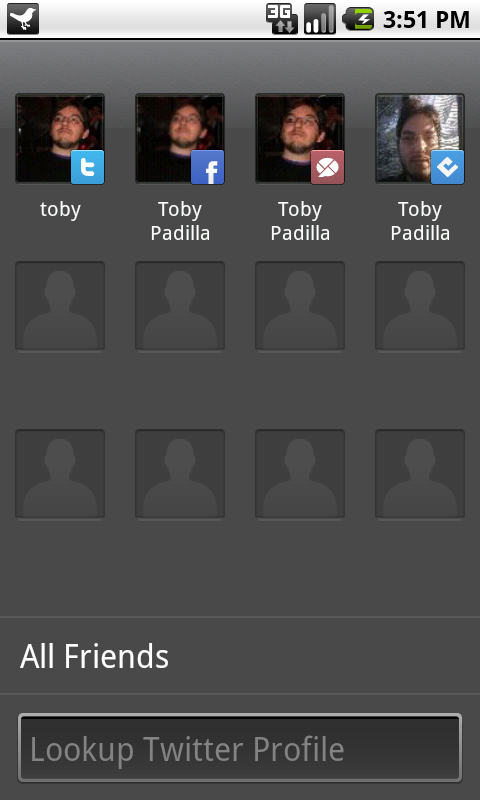
While this is the default, you can choose to ad new columns to your liking. The Me column, however, is pretty handy. It gives you an overview of anything that contains activity from you, whether that’s a Twitter reply, Facebook comments or Buzz activity, it’s all in a single column.
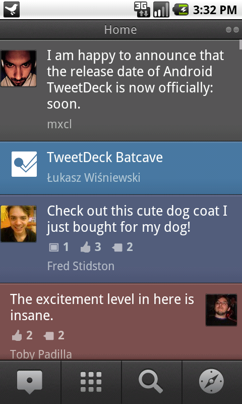
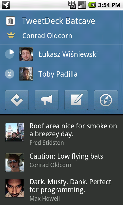
 Overall the look of TweetDeck for Android is clean and really minimalist. In fact, there aren’t even timestamps on Tweets. You’ll find a clock at the top of the screen that will tell you when a message hit, and it works across all columns.
Moving around and between columns is very clean without even a moment’s hesitation on my original Droid. I’m a big fan of the Home column mode on Mobile, and it actually might make me consider it on my office computer as well.
The detail view of each message is really handy, as well. Here’s what TweetDeck has to say:
In general, images, conversation, comments, attachments and geotags get decoded from Twitter, Facebook and Buzz updates and displayed below the update in the detail view. We’ve done this to provide a quick way to view all the cool content people are posting without having to dig deep with multiple clicks.
It really seems as if TweetDeck has come out full force with everything making sense. Contacts, Notifications, the Compose screen and even Maps all fall into place exactly where they feel like they should. Even while still in Beta, there aren’t any glaring omissions that we found. It will be really exciting, moving forward, to see how the application gets its finishing touches.
If you want to get in on the beta, make sure that you have a TweetDeck account. It takes little more than an email address and a few seconds of your time via the TweetDeck site.


Get the TNW newsletter
Get the most important tech news in your inbox each week.