Today, Apple announced its developer tools for its forthcoming Watch which included a number of resources and tools for developers to get started building apps.
Quietly included in the human interface guidelines is a new font dubbed “San Francisco” that’s designed for use on the Apple Watch.
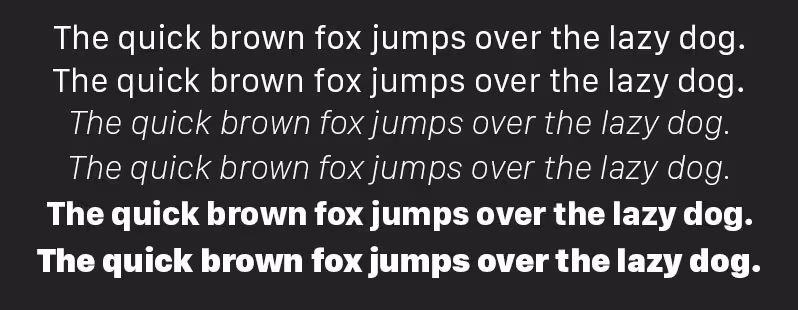
The font, which the company is giving away for free, is a Sans Serif typeface designed with the Apple Watch in mind. On the company’s human interface page, it says:
The system font was designed specifically for legibility on Apple Watch. At large sizes, the font’s slightly condensed letters are set tight to take up less horizontal space. But at small sizes, they are spaced more loosely and have bigger apertures in glyphs like ‘a’ and ‘e’ to make these easier to read at a glance.
Punctuation is also proportionally larger when the font gets smaller. And as text size changes, Apple Watch dynamically switches between fonts to maintain clarity and legibility at all times.
The font comes in two styles, “Regular” and “Display” which Apple recommends switching between based on what size will be used on the Watch display.
Whether by coincidence or intentionally, Apple had another font called San Francisco previously that was one of the first fonts to ship with the Macintosh.

The 💜 of EU tech
The latest rumblings from the EU tech scene, a story from our wise ol' founder Boris, and some questionable AI art. It's free, every week, in your inbox. Sign up now!
➤ WatchKit [Apple]
Read Next: Apple Watch will offload most tasks to paired iPhone, comes in two resolutions
Get the TNW newsletter
Get the most important tech news in your inbox each week.