If you caught Apple’s iOS 7 presentation on Monday or have followed any of the numerous bits of coverage, then you know that the home screen icons have quickly become a point of contention. They’re certainly a radical departure from the deep and allegory-heavy icons of iOS 6 and they contribute to an overall lighter, brighter and more youthful aesthetic this time around.
In fact, the designs are so different that you might even have been surprised that they came out of the same teams that were behind the home screen on iOS 6. Well, you’d be right. We’ve been talking to people all week about the new designs of iOS and multiple sources have given us a better picture of how it went down inside Apple in the last few months.
First of all, many of the new icons were primarily designed by members of Apple’s marketing and communications department, not the app design teams. From what we’ve heard, SVP of Design Jony Ive (also now Apple’s head of Human Interaction) brought the print and web marketing design team in to set the look and color palette of the stock app icons. They then handed those off to the app design teams who did their own work on the ‘interiors’, with those palettes as a guide.


The 💜 of EU tech
The latest rumblings from the EU tech scene, a story from our wise ol' founder Boris, and some questionable AI art. It's free, every week, in your inbox. Sign up now!
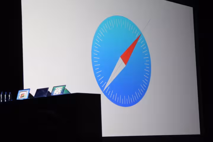
We’ve also been hearing that there wasn’t a whole lot of communication between the various teams behind say, Mail and Safari. And that there were multiple teams inside each group that were competing with various designs, leading to what some see as inconsistencies in icon design. Those may well be hammered out in days ahead.
The thought process appears relatively easy to divine here. Apple needed a stylistic and psychological break with the design language of its past, and Ive used ‘new’ blood to create that break.
The result is a strikingly different, if divisive, take on a new set of iconography for iOS 7. Though the designs of the apps are also very important, the icons are iOS 7’s first impression and calling card. That’s why it was important to have them trend downward in age and upwards in vibrance.
It’s also clear from what we’ve seen and heard that what we’re seeing of iOS 7 right now is a ‘mid stride’ snapshot. The work on design and development is still going full tilt, and what was presented this week is firmly a ‘work in progress’. We’re told, for instance, that some builds of iOS used onstage at the conference by presenters are already newer than the ones pushed out on Monday.
Of the various aspects of iOS 7, the design of its icons and other visual cues are the most in flux at the moment. There are still refinements and conversations going on around them. I don’t know but would expect there to be a lot of fixes for the inconsistency we’re seeing in things like gradients and design language on the home screen.
Also, there seems to be a good chance that the confusing up arrow on the lock screen — which has tricked everyone I’ve seen try it into swiping up to unlock, rather than to the right — will be ‘fixed’ (removed?) before iOS ships in the (probably) fall.
I don’t know any of the following for sure, obviously, but I get the feeling that we’ll be seeing more changes in the iOS 7 beta period than in any previous. Which makes a lot of sense, given that it’s the biggest change in iOS, well, ever. Just to pull some completely random numbers out of the air to illustrate this: If iOS 6 beta 1 through the release version of iOS 6 saw a (totally made up) 15% change in function and design, I’d expect iOS 7 to see maybe a 35-40% change. Mostly in visual design though.
The trick now is for Ive to leaven the work of the new design talent with the experience and depth of understanding of its established interaction designers. Marrying the fresh take of these new voices with the sure hand and user empathy of the stalwarts could create a fresh new voice for Apple that’s perfect to take it forward into its new era.
Note: A reference to Apple’s acquisition of Color has been removed as we’ve heard most of those designers went on to other companies and it appears that the individual(s) who are at Apple didn’t work on the icons.
Get the TNW newsletter
Get the most important tech news in your inbox each week.