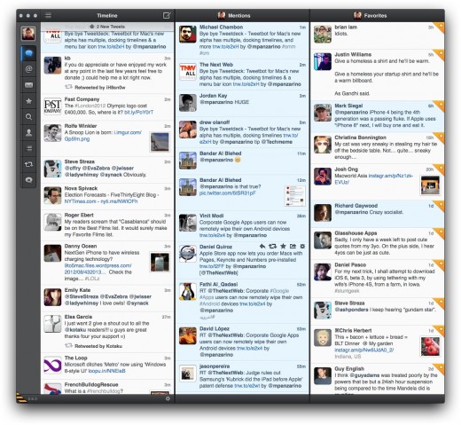
Tweetbot for Mac Alpha has been updated to version 0.6.3 with some fantastic new features, including the ability to pop out separate timeline windows and dock them together, crafting an interface that looks a lot like Tweetdeck.
To pop out a timeline, you click the small gear icon in the lower corner of the main Tweetbot window, choosing the ‘open in new window’ option. Whatever current timeline you’re looking at will be duplicated in a slimline new window without the user interface attached.
You can spawn several of these new windows if you like, and move them wherever you please, allowing you to monitor any portions of your feed that you want simultaneously. If you want to monitor a list, split out the lists window, choose a list, then hit the gear and pick ‘View List Tweets’ instead of followers.
If you’d like to create a large Tweetdeck-like interface that lets you move them all around at once, you’re in luck, because you can now dock the windows together. To do so, hover a window next to the right edge of the one previous and let go, they’ll snap right together. To pull a window off, move your cursor to the bottom of the rightmost timeline and grab the undocking handle, dragging it off and to the right.
Note that you can mix and match accounts by opening another account (click the profile image in the sidebar) and choosing to open one of its streams in a new window. Then dock it and return to your first account. Brilliant.
The multiple timeline support has been one of the main things keeping Tweetdeck alive as an option for many of us here at TNW, and this is the perfect excuse to get rid of it once and for all.
Design-wise, I personally love the much thinner top menu bar, which gives the interface a sleeker overall look. Greatly improved. You can also make each column a bit narrower than they were previously, if you prefer a slimmer window. In a nice touch, dragging on either side of a docked interface splits the growth between all columns at once, letting you resize them as one window.
Tweetbot also gets some notifications improvements, with alerts from all accounts now showing up in OS X 10.8 Mountain Lion, rather than just the one you’re viewing at the moment. Sound effects for new tweets, mentions and more are all up and running as well. Including a location also now works in 10.8.
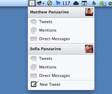
A new Menu bar icon lets you keep track of new tweets, mentions and DMs for each of your logged-in accounts, and offers up a ‘New Tweet’ button, for those who like to keep their client window closed until they need it.
For those of you who don’t like Twitpic, you can now also use custom image, video and URL services like Milkshk and others.
The alpha of Tweetbot is free to Mac users, but will be a for-pay app when it is finally released. To snag the latest version of the beta, hit ‘check for updates’ under your Tweetbot menu or hit up the Tapbots site below.
Did you know? Only an estimated 23% of tweets are posted using third-party Twitter clients
Get the TNW newsletter
Get the most important tech news in your inbox each week.


