![Confirmed: Facebook design refreshment in the works [Screenshots] (updated)](https://img-cdn.tnwcdn.com/image?fit=1280%2C720&url=https%3A%2F%2Fcdn0.tnwcdn.com%2Fwp-content%2Fblogs.dir%2F1%2F%20files%2Fplaceholder-bg-1.png&signature=83cc58a24aa22af8c0e1ef6c71478141)
 Update from Facebook at the foot of this post
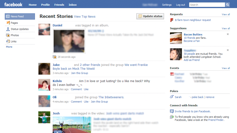
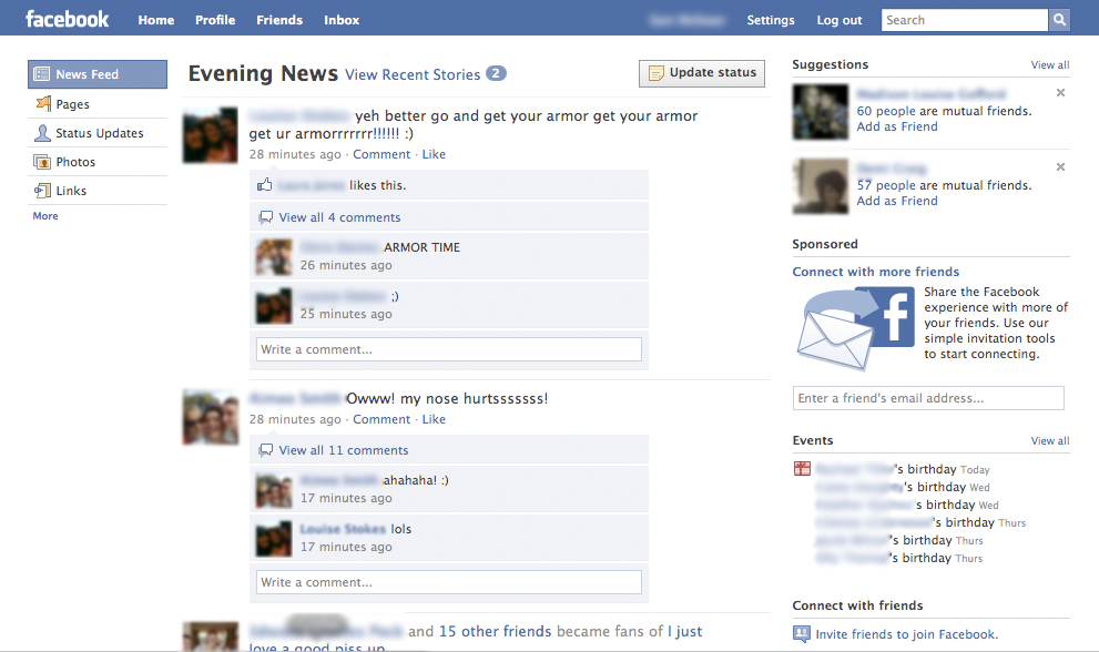
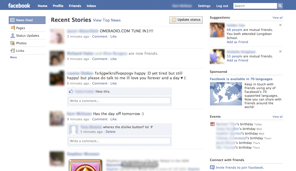
We have been tipped off that there may be an “improved” version of the Facebook news feed in the works. The new feed is not very different from the current one available, but it does lack Facebook’s signature “Publisher” box by default and instead simply features an alternating title and a button (positioned to the top right of the news feed) with the text “Update Status” which when clicked, displays the publisher box.
The design also features a new “Top News” link (The link then switches to “Recent Stories” once you have clicked the “Top News” link) which shows an overview of the top news on your news feed (this seems to filter the feeds that have received the most comments/likes).
The refreshed design reminds us of the new Facebook Lite design in terms of the new grey buttons and subtitles at the top of the news feed. We are currently unsure if this is a site-wide change or if it is only being tested on a select few accounts. Do you see these changes on your news feed? If so, how long have you experienced the new design and what are your thoughts on the changes?
Do you miss the Facebook publisher showing by default or do you prefer the new “lighter” design? You can find several screenshots of the design changes below.
Recent Stories
Top News
Another screenshot of the new recent stories view
Thanks to Sam for this tip!
*Update:* I have seen these changes for myself and we can absolutely guarantee that the above screenshots are not a hoax and are genuine.
*Update 2:* We have received confirmation from Facebook regarding the news feed and pass on the following statement:
“We are currently testing different designs of the News Feed and the home page with select users. The tests help us understand if we can make it easier for users to balance both the most important and the most recent information from people they’re connected to.”
Get the TNW newsletter
Get the most important tech news in your inbox each week.


