In case you hadn’t noticed, Google got a facelift. Yep, the tech giant’s search page received some rather fancy new icons. Slap your peepers on this:
While before there were just words, now there are words and images. Truly, we live in exalted times.
Now these have been rolled out globally, we knew what we had to, nay, what we must do: a ranking, a definitive ranking of these items. Our fans demanded it. Probably. We think they might’ve.
The next question was how we’re going to rank these symbols and — after some head scratching — it became clear. We had to rank them by level of evilness. What else could we do for a company whose original (but now abandoned) motto was ‘don’t be evil’?
So, yes, welcome one and all to the most definitive – and probably only – ranking of Google’s new search icons from least to most nefarious. Strap on your devil horns and let’s get into this.
…NINE…

Look at that little fella! It’s so adorable with it’s cute ol’ bookmark! What’s possible evil about that? It’s my thorough belief that no one’s ever done anything bad while in possession of a bookmark. If you own a bookmark, wrong is something you’re incapable of. Ergo, this is the least evil search icon. Next.
…EIGHT…

On one hand, that ‘play’ symbol sorta looks like an arrow head, which — if Saint Sebastian is anything to go by — is an evil object. Then again, there’s something positive about that arrow. It suggests things to come, a future, and, therefore, hope. Things might change. Things might get better… in the future.
Yeah, they could also get worse, but fucking hell mate, take a long hard look at yourself, when did the joy ebb from those eyes, what happened to you? When did it all change?
Anyway, this ‘Video’ search icon isn’t that evil.
…SEVEN…

Nothing weird about a sun and mountains, right? Just a normal, next door neighbor, everyday ball of flaming hydrogen and the earth’s sheared crust. Normal.
But… look again. Is that a landscape? Or is it really a one-eyed, moustachioed gentleman? Whichever way, having a single eye is good (eyepatches and Odin = +1), but having a moustache is bad (Hitler and Tom Selleck = -1), so it actually balances out. I’m going to call the ‘Images’ search icon almost evil.
…SIX…

On the surface, this is simple. What could possibly be wrong with a tag? It just expresses a discount and we all love a good deal — it’s why Poundland exists as a concept.
Thing is, morticians (a slightly untrustworthy breed of human, we can all agree) also hang these sort of tag around toes of the deceased in lots of movies I’ve seen and if there’s one thing I’ve learned in my life, it’s to implicitly trust what I see on the big screen. Mildly evil.
…FIVE…

No, this isn’t going to be some sort of pithy comment on the state of truth and influence within the news industry. What am I, some sort of amateur? A hack? A down and dirty scumbag? Well, yeah, pretty much, but that doesn’t mean I’m not in possession of a far more refined, intellectual, and subtle take.
It looks like a robot and robots are dumb. Evil.
…FOUR…

Zero effort here. Really bottom-of-the-barrel stuff. I can just imagine the design meeting:
“Right, we need an icon for the Flights search, something like an airplane, but… you know, cleverer.”
[CHOOSES AN AIRPLANE ANYWAY]
This lack of effort is criminal — definitely evil.
…THREE…

Nah.
…TWO…

I’ve got nothing against the finance industry per se, but… well, actually, I unreservedly have a load of gripes with the sector and think it’s a cesspit. And — my opinion is infallible, honestly, try to prove me incorrect here — this automatically makes the ‘Finance’ search icon pretty evil, but actually look at that image. Look at it.
You done looking? Notice how it includes both a rising bar chart and a rising line graph. Why both? Each of them makes it clear there’s an upward trend, there’s no need to double down. Or up. Whatever. It’s a poor design and it’s evil and I hate it.
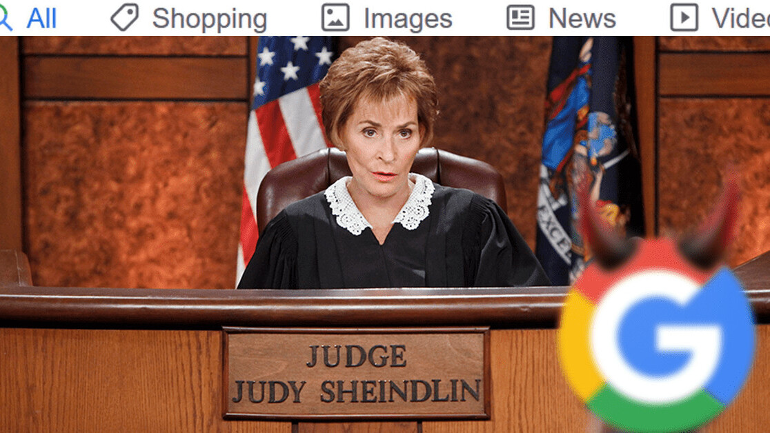
…ONE!
That symbol looks might familiar… Maybe something like a vertically flipped version of this:
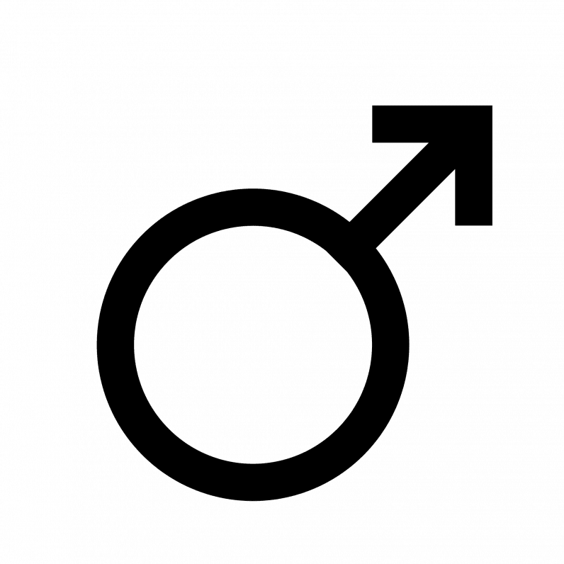
UGH, I KNEW IT.
Basically, there’s nothing more evil than men, so we have a clear winner: take a bow the “All” search icon.
So, there you have it, a comprehensive breakdown of the Google’s new search icons, from least to most evil. I’m glad we’ve all learnt something today.
Get the TNW newsletter
Get the most important tech news in your inbox each week.