Data visualization is a technique that allows data scientists to convert raw data into charts and plots that generate valuable insights. Charts reduce the complexity of the data and make it easier to understand for any user.
There are many tools to perform data visualization, such as Tableau, Power BI, ChartBlocks, and more, which are no-code tools. They are very powerful tools, and they have their audience. However, when working with raw data that requires transformation and a good playground for data, Python is an excellent choice.
Though more complicated as it requires programming knowledge, Python allows you to perform any manipulation, transformation, and visualization of your data. It is ideal for data scientists.
There are many reasons why Python is the best choice for data science, but one of the most important ones is its ecosystem of libraries. Many great libraries are available for Python to work with data like numpy, pandas, matplotlib, tensorflow.
Matplotlib is probably the most recognized plotting library out there, available for Python and other programming languages like R. It is its level of customization and operability that set it in the first place. However, some actions or customizations can be hard to deal with when using it.
Developers created a new library based on matplotlib called seaborn. Seaborn is as powerful as matplotlib while also providing an abstraction to simplify plots and bring some unique features.
In this article, we will focus on how to work with Seaborn to create best-in-class plots. If you want to follow along you can create your own project or simply check out my seaborn guide project on GitHub.
What is Seaborn?
Seaborn is a library for making statistical graphics in Python. It builds on top of matplotlib and integrates closely with pandas data structures .
Seaborn design allows you to explore and understand your data quickly. Seaborn works by capturing entire data frames or arrays containing all your data and performing all the internal functions necessary for semantic mapping and statistical aggregation to convert data into informative plots.
It abstracts complexity while allowing you to design your plots to your requirements.
[Read: ]
Installing Seaborn
Installing seaborn is as easy as installing one library using your favorite Python package manager. When installing seaborn, the library will install its dependencies, including matplotlib, pandas, numpy, and scipy.
Let’s then install Seaborn, and of course, also the package notebook to get access to our data playground.
pipenv install seaborn notebook
Additionally, we are going to import a few modules before we get started.
import seaborn as sns
import pandas as pd
import numpy as np
import matplotlib
Building your first plots
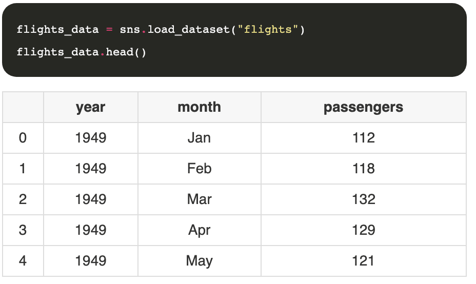
Before we can start plotting anything, we need data. The beauty of seaborn is that it works directly with pandas dataframes, making it super convenient. Even more so, the library comes with some built-in datasets that you can now load from code, no need to manually downloading files.
Let’s see how that works by loading a dataset that contains information about flights.
Scatter Plot
A scatter plot is a diagram that displays points based on two dimensions of the dataset. Creating a scatter plot in the Seaborn library is so simple and with just one line of code.
sns.scatterplot(data=flights_data, x="year", y="passengers")

Very easy, right? The function scatterplot expects the dataset we want to plot and the columns representing the x and y axis.
Line Plot
This plot draws a line that represents the revolution of continuous or categorical data. It is a popular and known type of chart, and it’s super easy to produce. Similarly to before, we use the function lineplot with the dataset and the columns representing the x and y axis. Seaborn will do the rest.
sns.lineplot(data=flights_data, x="year", y="passengers")

Bar Plot
It is probably the best-known type of chart, and as you may have predicted, we can plot this type of plot with seaborn in the same way we do for lines and scatter plots by using the function barplot.
sns.barplot(data=flights_data, x="year", y="passengers")

It’s very colorful, I know, we will learn how to customize it later on in the guide.
Extending with matplotlib
Seaborn builds on top of matplotlib, extending its functionality and abstracting complexity. With that said, it does not limit its capabilities. Any seaborn chart can be customized using functions from the matplotlib library. It can come in handy for specific operations and allows seaborn to leverage the power of matplotlib without having to rewrite all its functions.
Let’s say that you, for example, want to plot multiple graphs simultaneously using seaborn; then you could use the subplot function from matplotlib.
diamonds_data = sns.load_dataset('diamonds')
plt.subplot(1, 2, 1)
sns.countplot(x='carat', data=diamonds_data)
plt.subplot(1, 2, 2)
sns.countplot(x='depth', data=diamonds_data)

Using the subplot function, we can draw more than one chart on a single plot. The function takes three parameters, the first is the number of rows, the second is the number of columns, and the last one is the plot number.
We are rendering a seaborn chart in each subplot, mixing matplotlib with seaborn functions.
Seaborn loves Pandas
We already talked about this, but seaborn loves pandas to such an extent that all its functions build on top of the pandas dataframe. So far, we saw examples of using seaborn with pre-loaded data, but what if we want to draw a plot from data we already have loaded using pandas?
drinks_df = pd.read_csv("data/drinks.csv")
sns.barplot(x="country", y="beer_servings", data=drinks_df)

Making beautiful plots with styles
Seaborn gives you the ability to change your graphs’ interface, and it provides five different styles out of the box: darkgrid, whitegrid, dark, white, and ticks.
sns.set_style("darkgrid")
sns.lineplot(data = data, x = "year", y = "passengers")

Here is another example
sns.set_style("whitegrid")
sns.lineplot(data=flights_data, x="year", y="passengers")

Cool use cases
We know the basics of seaborn, now let’s get them into practice by building multiple charts over the same dataset. In our case, we will use the dataset “tips” that you can download directly using seaborn.
First, load the dataset.
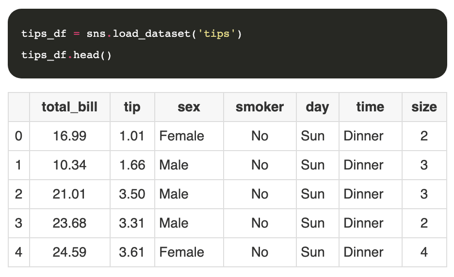
I like to print the first few rows of the data set to get a feeling of the columns and the data itself. Usually, I use some pandas functions to fix some data issues like null values and add information to the data set that may be helpful. You can read more about this on the guide to working with pandas .
Let’s create an additional column to the data set with the percentage that represents the tip amount over the total of the bill.

Next, we can start plotting some charts.
Understanding tip percentages
Let’s try first to understand the tip percentage distribution. For that, we can use histplot that will generate a histogram chart.
sns.histplot(tips_df["tip_percentage"], binwidth=0.05)

That’s good, we had to customize the binwidth property to make it more readable, but now we can quickly appreciate our understanding of the data. Most customers would tip between 15 to 20%, and we have some edge cases where the tip is over 70%. Those values are anomalies, and they are always worth exploring to determine if the values are errors or not.
It would also be interesting to know if the tip percentage changes depending on the moment of the day,
sns.histplot(data=tips_df, x="tip_percentage", binwidth=0.05, hue="time")

This time we loaded the chart with the full dataset instead of just one column, and then we set the property hue to the column time. This will force the chart to use different colors for each value of time and add a legend to it.
Total of tips per day of the week
Another interesting metric is to know how much money in tips can the personnel expect depending on the day of the week.
sns.barplot(data=tips_df, x="day", y="tip", estimator=np.sum)

It looks like Friday is a good day to stay home.
Impact of table size and day on the tip
Sometimes we want to understand how to variables play together to determine output. For example, how do the day of the week and the table size impact the tip percentage?
To draw the next chart we will combine the pivot function of pandas to pre-process the information and then draw a heatmap chart.
pivot = tips_df.pivot_table(
    index=["day"],
    columns=["size"],
    values="tip_percentage",
    aggfunc=np.average)
sns.heatmap(pivot)

Conclusion
Of course, there’s much more we can do with seaborn, and you can learn more use cases by visiting the official documentation. I hope that you enjoyed this article as much as I enjoyed writing it.
This article was originally published on Live Code Stream by Juan Cruz Martinez (twitter: @bajcmartinez), founder and publisher of Live Code Stream, entrepreneur, developer, author, speaker, and doer of things.
Live Code Stream is also available as a free weekly newsletter. Sign up for updates on everything related to programming, AI, and computer science in general.
Get the TNW newsletter
Get the most important tech news in your inbox each week.