A button is an interactive element that results in the action described on it. If it says “save” on a button, clicking it will most likely “save” something. It’s also one of the most important interactive elements of any digital product.
It can lead to a purchase, download, send, among other important actions. Digital buttons are also descendants from real-world buttons, like on a TV remote, record player, or game controller.
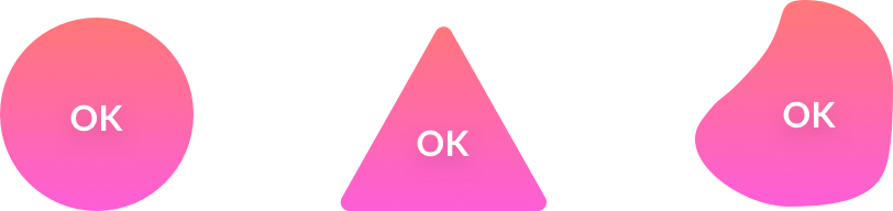
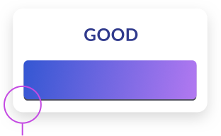
The most important thing to know is a button should look like a button, and the most important rule for designing a button is to make it stand out enough so it won’t be confused with anything else.

Familiar = good
We are used to certain shapes and forms that are normally associated with an action. The more our button looks similar to what we associate with buttons, the better. This is why a rectangle (or a rounded rectangle) is always the safest choice for a button.


The <3 of EU tech
The latest rumblings from the EU tech scene, a story from our wise ol' founder Boris, and some questionable AI art. It's free, every week, in your inbox. Sign up now!
Other shapes and forms (triangle, circle, organic) are not as recognizable to the user. Proceed with caution, and use them only when the general style of your product requires deviating from the norms.
Button dissection
While designing buttons think about each element and choose wisely. Using the company in question’s brand or style guide as a baseline, think about what kind of buttons will match the brand and fit well within the interface.
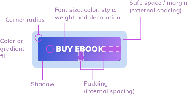
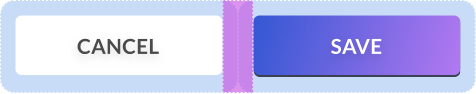
You should set the padding and safe space using grid base numbers. In the above example, the left inner spacing is twice as big, as the vertical spacing, which is a safe ratio choice for increased readability.
Spacing and alignment
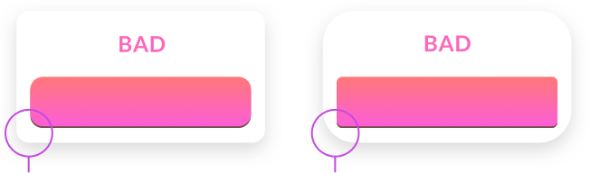
Unevenly spaced buttons are one of the most common problems of interfaces. Double-check if your button labels are centered both horizontally and vertically. Create guides if you need to be sure.
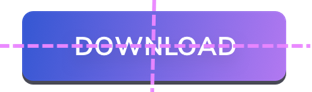
Aside from grid-based methods, a safe way of choosing button spacing can also be done with the uppercase “W.” If at least one “W” fits on each side of the button label, you’re safe. On the sides, it’s even better to use double the “W” rule for increased readability.

Don’t forget about the safe space of, or space in between, your buttons. If you have a group of them, the safe space should be individual for each one — don’t overlap it!
The right size
Both web and mobile buttons should also have the right minimum size. If your buttons are too small, it will be difficult to tap or click on them. That results in frustration and can lead to users uninstalling your app. The best way is to start with 44 x 44 pixels for all interactive elements on mobile devices.

The sweet spot is somewhere around 50 pixels for mobile buttons. In the case of cursor-based devices, 32x 32 pixels should also work. Remember that even on desktops, the larger the button the easier it is to use
Good practices
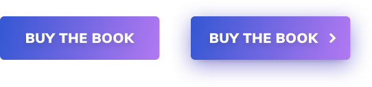
Important buttons also work well with icons. A checkout is quickly identified by a basket or a cart icon, but only as long as the word “checkout” also appears.

A right arrow or chevron placed after the button label makes the resulting message stronger. The user is more compelled to click and “proceed.” This works well if you’d like to strengthen your CTA.

Buttons with shadows are also more “clickable” and noticed much faster than flat ones. Add a subtle drop shadow in the button to make it stand out from the background more.
Rounded corners
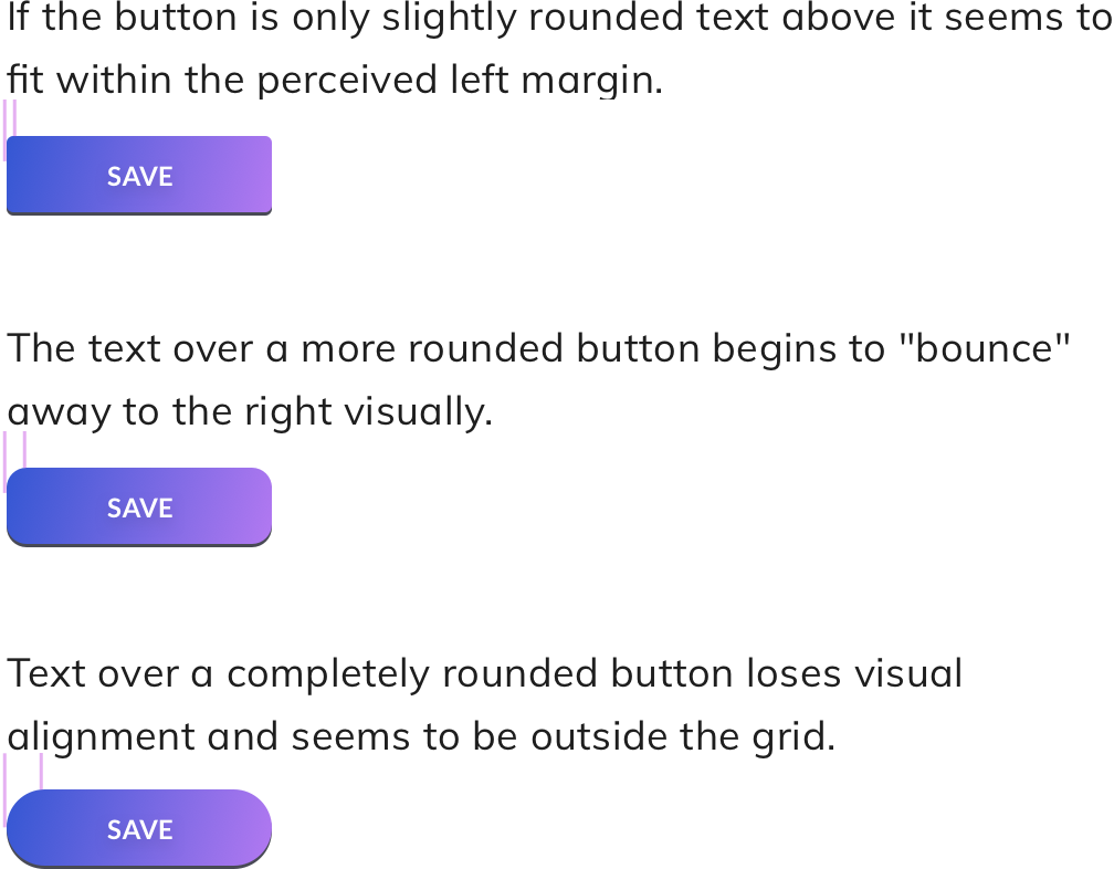
Rounded buttons are considered more friendly and positive than sharp edges. At the same time, they make it a lot harder to design content around them. If you have left-aligned text just above the button, the more rounded the corner the less that text will visually fit — it’ll make you feel as if the left margin is in two places at the same time.
Aligning icons
Good icon alignment on buttons is one of the hardest things to do. In many cases the relation between font-weight and icon-weight is specific to them. There is however a simple and useful rule that works in most cases.
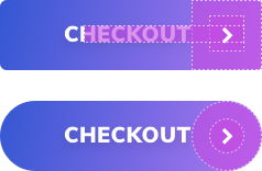
Depending on our corner radius, we create a circle or a square the size of the height of our button. Inside it, we create another shape to house the icon. It should have a padding inside the larger shape which is the same size as our text height. Then we place our icon inside the smaller shape.
In the case of a chevron, it’s best for it to be text-height. You can also check the line-width against the font width — the more closely matched the better the end result.
Edge balancing
If you’re using rounded buttons, keep in mind to have the same rounded corner ratios as other onscreen elements, otherwise, there will be imbalances in the margins.
Summary
When you start building out your primary, secondary, and tertiary buttons, try to remember to check them against a couple of factors every time. Even small inconsistencies or bad alignments can lead to lower conversion. When it comes to buttons, conversions and clicks are all that matter.
In summary, remember to:
- Make your button look like a button
- Have the label centered both vertically and horizontally
- Have enough space (padding) inside the button
- If you’re using an icon choose the right size and alignment
- Set your border radius depending on where the button will be used
- And then check if that radius matches your other on-screen elements
- Make it the right size! The bigger the button the easier it is to use. That includes desktops!
Good luck!
This article was originally published on UX Collective by Michal Malewicz, a designer with over 20 years of experience in building digital products. CEO of the HYPE4 agency and author of the “Designing Interfaces” book.
Get the TNW newsletter
Get the most important tech news in your inbox each week.