Often overlooked in favour of its younger, sexier cousins, email is still a powerhouse in its own right.
More than 90 percent of the world’s 2.4 billion email users checked their email at least once a day last year and received over 180 billion emails, according to vero. How are you going to make sure you stand out from the crowd? Marketing is a science and email marketing gives you access to a wealth of data that you can use to grow your results.
Every step in the process – including database segmentation, send number, time of send, subject line, content of email and landing page – is up for testing and analysis.
Targeting
At the end of the day, it’s all about the numbers and making sure you are targeting your campaign at the right people.
Whether it’s with your own database or as a third party campaign, you need to look at personal interests, age, location, salary bracket, recent engagement and a whole raft of other factors that relate to your product.
For example, if you are selling premium holidays in Italy to British tourists, you may want to segment your list along the lines of: Country: United Kingdom, salary: 30k+, age: 26 and up
Although, don’t get bogged down by going too granular with your targeting and try to keep your net as wide as possible – the more fish the better. Always ensure you are attempting to target the right people.
Larger send emails that are not targeted suffer from lower open rates, lower click through rates and a higher scrub percentage. Sending to more people doesn’t always equal more leads or sales. Balanced management of data will allow you to run more campaigns over a longer period of time.
It’s also the correct way to run your database, and you are treating your customers with the respect they deserve.
Keeping scrub rate in mind also ensures you are not penalised by your email service provider – ESP. Campaign Monitor is a great ESP that promotes good quality email management.
If you are prone to rinsing your database, sending out poor campaigns and have a high scrub rate, Campaign Monitor don’t want you using their platform and will quickly let you know.
At your disposal is information on open rate, click through, scrub, bounce, individual link clicks, email open time, geographic location and more.
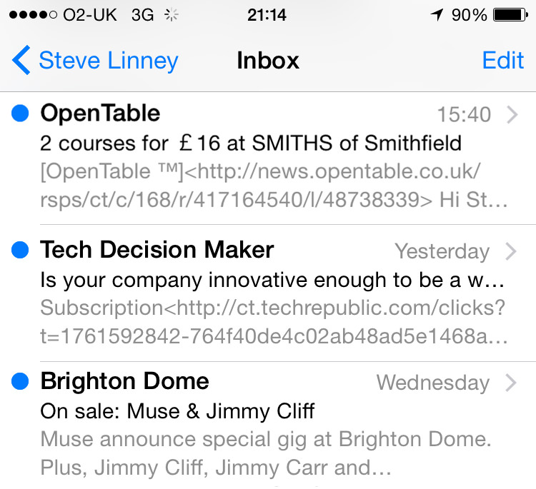
Here’s an example of one of the Learning People’s – specialists in project management and IT certifications – monthly newsletter, the Certified, and the response we got.

This provided us with all the information we needed to outline our plans for future campaign content, focus, offering, subject line, send time and what we would AB test.
Ask Yourself
Have you properly segmented your audience? Have you got the send time right?
- Is your third party list bought from a reputable source? Do they flog their database too much with other partners?
- Is your email genuinely of interest to your send list?
Subject Lines and Preheader
Subject lines are oh so simple, yet can be oh so hard to get right. This is your first opportunity to impress and a high open rate can do wonders to your final campaign numbers.
The Certified example above achieved a great open rate of 26.9 percent, but that still meant 73.1 percent of people either didn’t see the email or they didn’t bother to open it. Even with a good campaign, you will lose a high proportion.
If your campaign doesn’t perform well here, it will be a lot higher – meaning you will have little chance of getting the positive results you want. Be emotive, enhance a person’s fear of missing out and create urgency – all within 55 characters.
To finesse your subject line and give you the best chance at success, AB testing principles can be implemented with ESP’s giving you the option to send two subject line variations.
The winning subject line is chosen from which had the most opens or clicks. Many companies, small and large, misuse the pre-header text – compiled from the first text portion of your email – which you’ll read on your phone.
Instead of wasting it with copy such as “can’t read this email, click here” and giving off a negative vibe before the email is even opened, use the space to enhance your message and increase open rate.
Which one of these are you most likely to click on?
Ask Yourself
Would you open this email?
- Have you created a sense of urgency and intrigue?
- Is the text to long? Have you got to the point, quickly and clearly?
Breaking news… mobile is king… As with all areas of the web in 2015, it’s all about your smartphone and email is no different.
It was a couple of years ago that we realised our emails had to be optimised for mobile. Our partner’s stats and our own were showing an organic increase in mobile visits and we wanted to capitalise on this.
Through trial and error, we shifted our email design to being fully mobile friendly. At the time there weren’t many resources around to lean on and we had to do it the hard way and learn from our mistakes.
If your message can’t be read quickly, easily and accessibly on mobile then forget it and start again. Use visually appealing images that don’t have a large file size – no more than 100kb for a large image.
Customise them as much as you can in Photoshop and then use a compression tool like ImageOptim – or JPEGmini – to squeeze out that last 5 to 10 percent of file size, without harming image quality.
Litmus is the place to check out how your email will perform across multiple platforms and devices.

It’s also a great resource and community for email tech heads across the globe, who share ideas and help problem solve. Your content is an extension of the subject line, there to enhance your message. But, don’t give it all away.
Give people a reason to click on that gorgeously designed call to action that jumps out from the page and screams “click me”. Get to the point, less is more and jargon is your enemy. Fear of missing out and creating urgency are essential – have I mentioned that already?
Keep in mind that your brain is hard wired for information that is given in three digestible chunks and even read three times. Alt text is also great for boosting conversion. If you design this well you can deliver a good message before a viewer needs to click on ‘download pictures’.
Ask Yourself
- Is your email to the point? Are you overloaded with content and not enough direction?
- Do you have clear call to actions?
- Is your message / voice authentic?
Landing Page
Fear of missing out and creating urgency is essential on your landing page too – third time is a charm.
Landing pages are an art form in their own right and should be tailored to your message, what you want to achieve, your product and your target audience. As emails need to be adaptive, your landing page needs to be responsively designed to give you the best results on mobile.
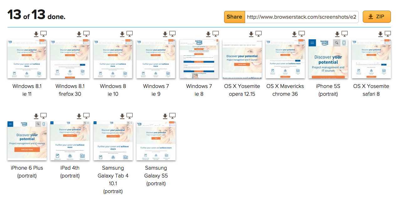
When checking browser and device compatibility, Browserstack is your key tool here. Browserstack will show you how your landing page will look on Android, Windows, OS X, IOS for mobile and IE, Firefox, Safari, Chrome, Opera and Yandex on desktop.
We are all more alike as humans than we realise and we respond to the same emotive indicators and visual clues – although to varying degrees – and colour is crucial to this.
Blue gives you a feeling of trust, just look at how many web giants use blue in their logo. Facebook, Twitter and LinkedIn being three examples. Red elicits excitement and I’ve put it to use many a time when highlighting hooks. White creates a feeling of calm and is another elicitor of trust.
When coupled with subtle design, white gives your website a high end feel. Just ask Apple. See our color guide for more.
Ling Cars have definitely not gone for this option… I’d place a bet that a great number of their visitors are developer agencies showing clients what not to do. To find a good combination of colours that holds true to the quality of your brand, keep things simple.
You can also use colorsontheweb.com if you need a bit of inspiration on complimentary colours. Your brain likes smiling faces, even when there not even there and are formed from the froth in a coffee mug.
Smiles help people feel happy and positive. If your landing page visitors are happy and positive your message will be better received. We also incorporated a smile into the new Learning People logo and her – used in social media only – wee sister.
![]()
![]()
Get to the point on your landing page too and concentrate on the essential benefits. We don’t have time to read chapter and verse on each product we want to purchase; so don’t expect your visitors to have the time either.
Content wise, it should follow on from your email and you can afford yourself a good level of repetition of the message within the email. But do make sure to give a little bit more to fully hook them in.
Layout of your landing page, as well as your email is key, and you need to make sure your message is in the correct place in terms of how a visitor views your page.
Visual Website Optimiser is essential for AB testing landing pages and tweaking content. Their heatmaps are also great indicators on what is working on your page and what isn’t, but will take time to compile as it’s formed through visitor data.
If you want to get an indication of what will work, and get it quickly, a fantastic tool to use is EyeQuant which, through a powerful algorithm, will show you how effective your landing page is in terms of visual clarity.
Heatmaps of a previous Learning People landing page show the magnificent effect of a smiling face looking towards our big, bold and red hook.

The natural flow of a person’s eyesight on a landing page is to go from left to right and then down the middle. The following heatmap shows that the layout we used for our page used this to our advantage.
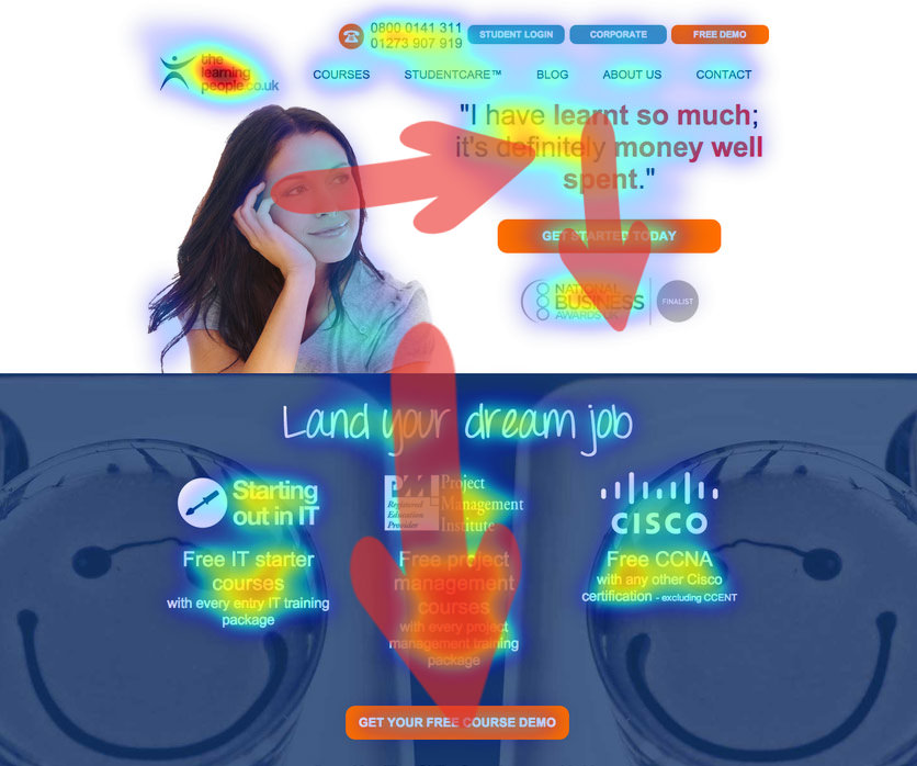
This campaign improved conversion rate by over 180 percent.
Ask Yourself:
Is your content informative, emotive or entertaining?
- Are your calls to actions in the right place?
- Would you leave your details? As a user, would you trust the journey you’ve just been on?
The Numbers
The trend is your friend, it’s all about the numbers behind the numbers and other marketing jargon like that – but it’s true. Statistics vary from industry to industry, and company to company, so getting to know your own stats over time is the main benchmark you should measure yourself against.
Google Analytics is the most essential piece of the puzzle as you analyse your final results here.
Data is key in knowing what is working and what needs to improve. Google Analytics will give you as much data as you can handle. Stick a Google tracking code on everything that you do and adjust it for each link. Through doing this, you will be able to see all your hard work come to fruition.
You will be quickly see where you are succeeding and, importantly, where you need to get better. The Learning People heatmaps – highlighted earlier – followed through to a very positive Google Analytics trajectory.
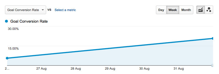
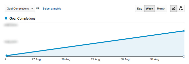
If your progress looks like an upward ski slope, you’re doing something right. The world of email growth hacking is a moveable feast and the above advice is merely the start.
Immerse yourself in the world of growth hacking and conversion rate optimisation and watch your business grow.
Read Next: The email hot or not list
Get the TNW newsletter
Get the most important tech news in your inbox each week.