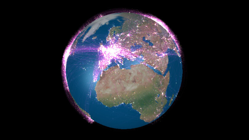
It’s easy to forget just how many planes are in the skies above us. Flight Stream, a startling WebGL visualization of global flight data, is a good reminder. Created by San Francisco-based British developer, Callum Prentice, it maps flights as pulsing dots on a zoomable, rotatable world.
The Web app allows you to change the speed and size of how flights are represented and the opacity of the trails they leave as they criss-cross the globe.
Prentice says the map currently shows routes based on data from Open Flights but hopes to use live info in a future version. Devs can take a look at his code and some other cool projects on GitHub.
Read next: Google’s Hobbit Chrome Experiment Gets Peer-to-Peer Battles
Get the TNW newsletter
Get the most important tech news in your inbox each week.