
When Google first introduced navigation gestures with the Android P beta, I applauded the move. It was a long overdue evolution of the old-school Android navigation buttons.
But now that I’ve spent over a month with the Android P, the experience has soured some. I still think gestures are the way forward, but Google’s implementation has in some ways complicated multi-tasking rather than improved it.
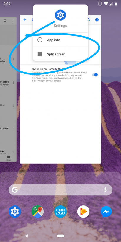
First, the thing that prompted me to write this post: Google made activating split-screen mode more tedious.
In Android Oreo, there were two easy ways of accessing split screen. You could long press an app within the ‘Overview’ menu and drag it to the top or bottom of your screen. That’s pretty intuitive, especially considering it’s similar to how such features work on Windows, MacOS, and Chrome OS.
For faster access – and my preferred method – you could simply hold down the Overview button and immediately enter split screen mode.
Both of these features have been removed in Android P, even if you’ve disabled gestures. Instead, you need to tap on an app’s icon within the Overview screen. feels like a clunky replacement to the previous two options.
I realize most people don’t run split screen apps on their phone, but the feature is there for a reason, and I use it all the time. Whether its to write articles, cross-reference documents, or copy an address into a conversation, I really miss having quick access to split screen.
But the bigger problem with gestures is that they do little to actually improve Google’s Android experience.
On virtually every other phone with the feature, gestures at least help save some real estate. On the iPhone X, it helped Apple get rid of the home button. On OnePlus, Motorola, and Huawei devices, it means you can get rid of the navbar altogether.
But Google’s implementation takes up just as much space as the regular navigation bar, without adding much in the way functionality nor being any easier to use.
The most useful thing about activating gestures is the ability to slide the home button to the right to scroll through a few of your most recent apps, but it’s a marginal benefit. As far as I can tell Google could have just added that feature to the current set of navigation buttons. Heck, it could’ve added optional swiping gestures to each of the navigation buttons for extra functionality.

I’m not even sure the gesture UI is an aesthetic improvement, given the odd asymmetry in having the back button on the left side of the navbar but nothing on the right.
Don’t get me wrong. I don’t think gestures are a dealbreaker, and I appreciate that Google at least keeps them optional. But I can’t help but feel the current gesture implementation is more of a reaction to the iPhone X than a clear improvement to Android navigation. It’s a missed opportunity, and as it stands, you’re probably better off sticking to the old button trio.
Get the TNW newsletter
Get the most important tech news in your inbox each week.