In August last year, I decided I’d had enough with smartwatches. I didn’t swear off them forever, but I did find them too distracting to be worth the interruptions.
Add in the mostly clunky, oversized designs, interfaces that were difficult to navigate and functionality I just didn’t value enough.
With more than a year now passed without regularly wearing a smartwatch, and the opportunity to put the new Samsung Gear S2 through its paces, I decided it was time to get back on the metaphorical horse.
Why now?
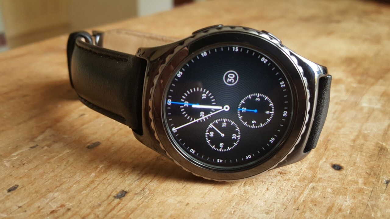
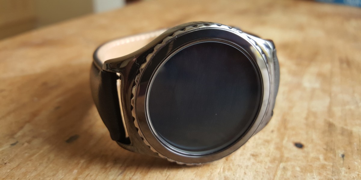
Part of the reason I’m willing to give Samsung’s newest smartwatch a chance is the new approach to design – it comes in a few different versions but they all have a rotating bezel reminiscent of a regular watch.
The model I’ve been wearing for the last 24-hours is the S2 Classic with a regular 20mm pin watch strap, which means you can take any standard watch strap and swap it out.
Unfortunately, due to the proprietary connector on the non-Classic versions, you can’t swap these bands out with regular straps.
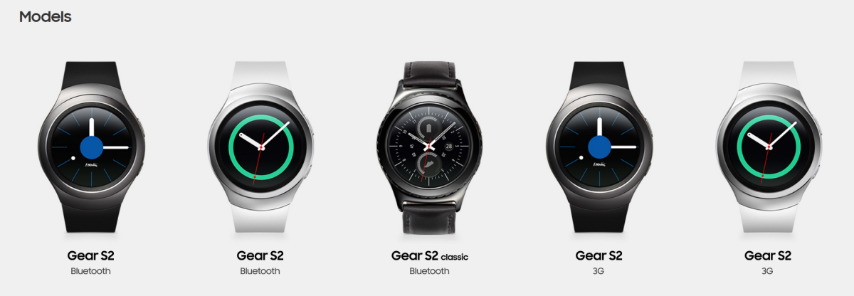
I wasn’t given a choice of model to test, but had I been, it would have been the Classic, as I prefer the leather strap and the notched edge of the bezel. People who want a ‘sportier’ looking smartwatch would perhaps prefer to opt for the S2.
Given that I’ve only been using it for a short time, I obviously can’t comment on things like reliability, battery life and the other sorts of niggles that only arise once you’ve been using a device for a while, but it makes one hell of a first impression.
Part of my frustration at early smartwatches was functionality for the sake of it, at the cost of design.
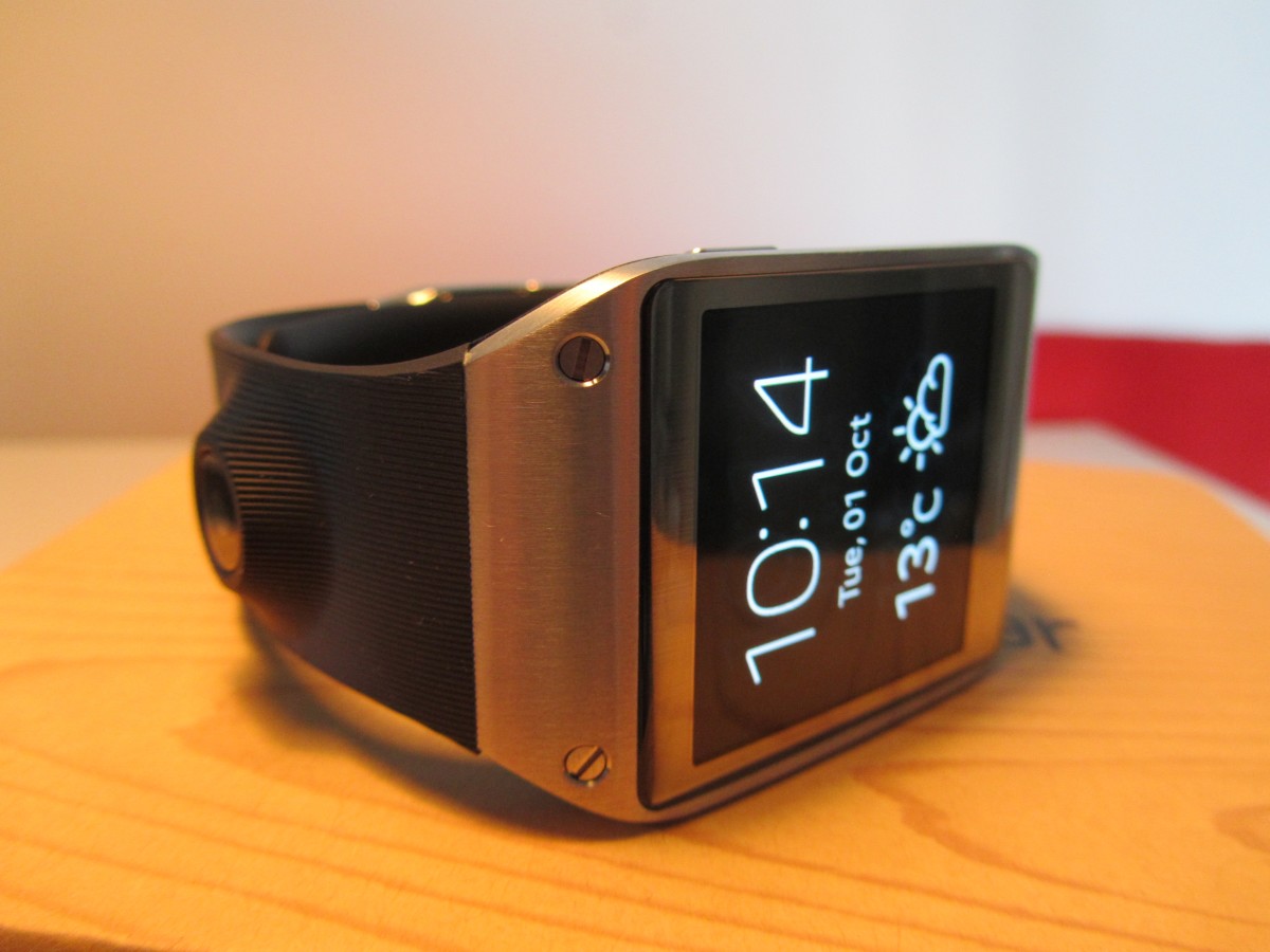
Take the original Galaxy Gear, for example, it had a freaking camera on it. Yes, it was sort of cool to feel like a spy for a couple of minutes, but taking a photo with your wrist makes you look like a total weirdo – no exceptions. The other side of that is that including a camera module pushed up the price and compromised the overall design, as it had to be incorporated into the strap.
There’s none of that sort of excess here but it still provides the sort of functionality you might want from a smartwatch, like activity tracking, the ability to personalize watch faces to your heart’s content and support for other apps to extend its use. This isn’t the Gear S2’s strongest point, however, as it runs Samsung’s proprietary Tizen platform, rather than Android Wear.
While this will put some people off, it also allows Samsung to do a few things that it says wouldn’t be possible if it ran Android Wear.
That rotating bezel that lets you scroll beautifully through different options and information would be a whole lot more clunky if it was running Google’s wearable OS; at least, that’s what a Samsung exec told me. Without another manufacturer trying to implement it on Android Wear, it’s hard to really tell.
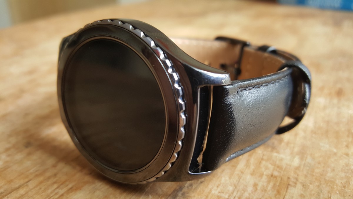
Either way, what Samsung has created with the simple addition of a rotating bezel control is a method of interaction that feels a whole lot more ‘natural’ for a watch – you can, of course, still use the touchscreen to navigate too if you prefer.
Perhaps it’ll be a generational difference. Perhaps anyone who’s grown up in the last 10 years or so will instinctively go straight for the touchscreen, but for me – a child of the 80s – the bezel really makes a huge difference to how I feel about using it.
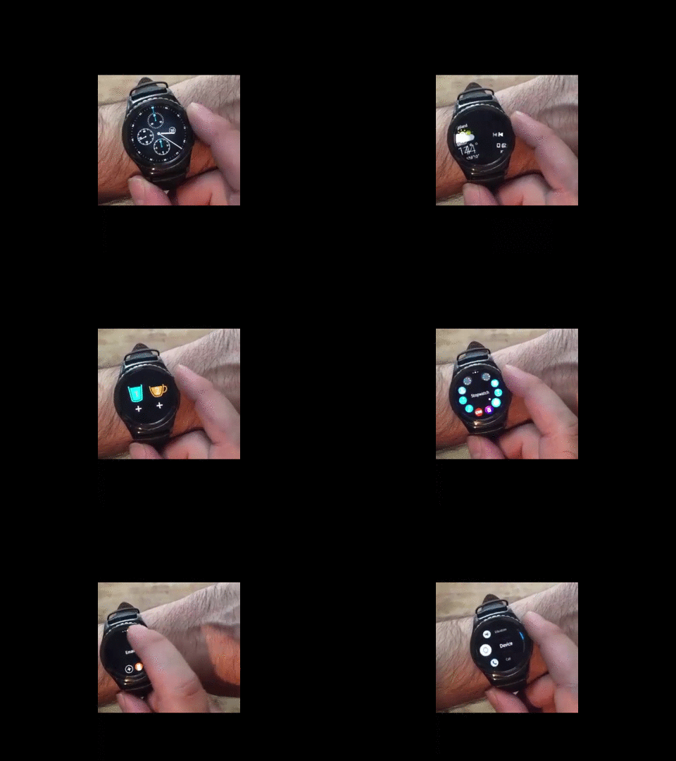
It’s weirdly addictive to sit there and just keep spinning it.
Less, not more
Part of my issue with using earlier smartwatches is just how efficient they are at their primary purpose – keeping you in touch with all your notifications.
It’s really handy to catch a glance of that super-important email while you’re in a meeting without having to interrupt everything. It’s a lot less pleasing to have that reminder while you’re in the middle of cooking or eating dinner.
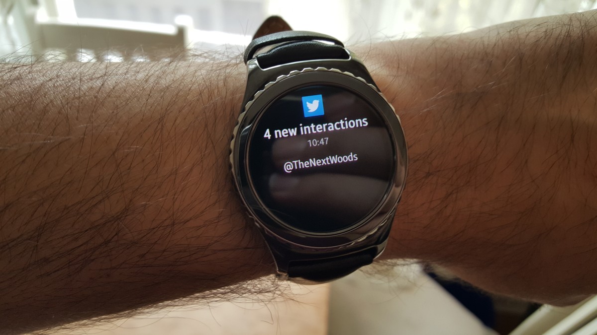
With no way to really control what got through, turning off all notifications was the only way to fix the situation. And a smartwatch with no notifications is a watch.
The S2 goes a long way to sorting out that particular problem by allowing you to control (via the Gear Manager app) the notifications that are allowed to interrupt you.
Clearly, this isn’t a full ‘review’ or anything approaching it; I’ll have to live with the Gear S2 for a little longer than one day to see how much real-world use it gets but first impressions are good, which isn’t always the case for smartwatches.
Being based on Tizen will likely throw up problems of app availability and support, but Samsung has made sure there are a couple of big names pre-loaded out of the box.
At $300 (or £299) it’s hard to think that the Gear S2 is a must-have from what I’ve seen so far, but for people who like the flexibility of notifications on their wrist, this is the best smartwatch Samsung has made so far.
Get the TNW newsletter
Get the most important tech news in your inbox each week.
