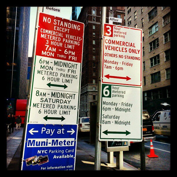
The fine folks at Pentagram have teamed up with New York City to redesign Midtown’s commercial parking signs. Like we expected, given Pentagram’s prestige, the results are quite beautiful. As Matt Chaban of The Observer notes, no longer are parking PhDs required.
Yes, the term “beautiful” may seem like a stretch to some when describing a parking sign, but the logic involved truly is beautiful — especially when you compare the new design to the old.
In short, now Midtown’s commercial parking signs actually make sense, take far less time to read and cut down on clutter. If you’ve ever tried to park in NY, you’ll know how helpful these adjustments will be to millions of drivers.

Our hope now is that this trend will continue, with Pentagram refining parking signs across Manhattan and NY’s four other boroughs. For more on the city’s decision, head here.
Pentagram created Microsoft’s Windows 8 logo, which was met with mixed opinions at first, but has since grown on us.
Image credit: Medioimages / Photodisc /Thinkstock
Get the TNW newsletter
Get the most important tech news in your inbox each week.


