Early-stage founders often struggle with prioritizing and structuring their brand work – and admittedly, the feat can seem pretty overwhelming if you’re building your entire visual identity from scratch.
Color choices, fonts, and imagery can seem like petty details when you’re simultaneously building your product, fundraising, and headhunting for key roles, but overlooking your brand can be an expensive mistake for a startup with only one shot to woo a potential investor or customer.
At the same time, no matter what your investor, board member, or brand agency tells you, early-stage startups don’t need to have their ducks in a well-branded row as neatly as Coke or Apple.
Having worked with over 100 organizations on their brand, design, and visual identity, I’ve seen the sweat break on far too many founders’ foreheads as they try to prioritize their limited resources in a world of business cards, merchandise, and fancy brand videos they don’t yet need.

The <3 of EU tech
The latest rumblings from the EU tech scene, a story from our wise ol' founder Boris, and some questionable AI art. It's free, every week, in your inbox. Sign up now!
Here are five things every early-stage startup should do to make the most of their visual identity with limited resources:
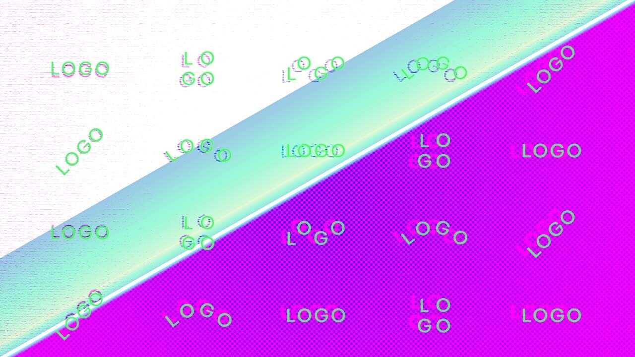
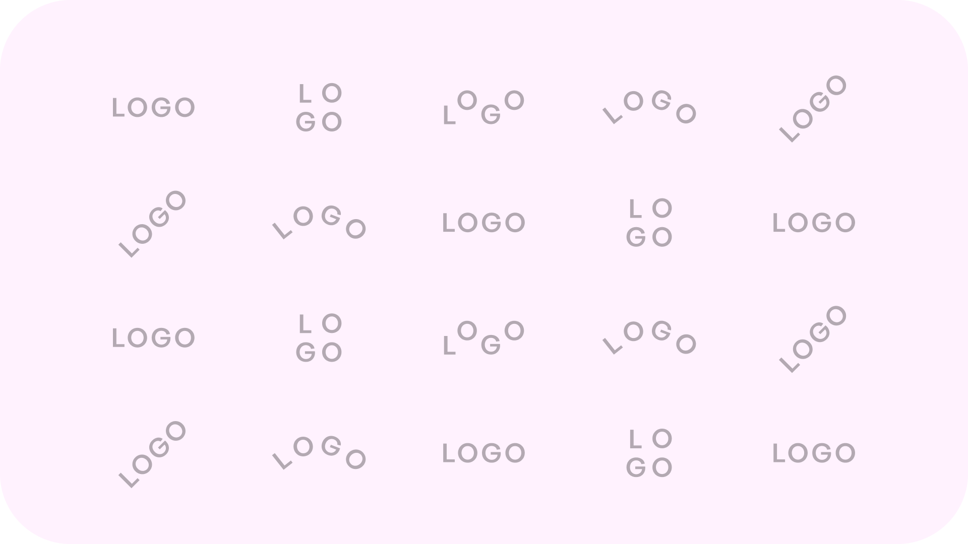
1. Text logos are underrated (and all logos are overrated), so stop obsessing over them
So, I’ll be frank: spending time perfecting your logo is a huge waste of time, creativity, and cash.
The world is so saturated with logos that it’s near impossible to create one that’s completely unique and identifies your startup from the moment it’s created. Much more important than trying to recreate the iconic McDonald’s or Nike symbols for your B2B startup is getting people to remember your name – and for that, simple text logos can bring some much-needed repetition.
If you don’t believe me when I say simple is beautiful, just look at companies like Burger King, Toyota, and Warner Bros who are jumping on the debranding bandwagon and simplifying their logos to their bare bones.
2. Don’t pay for staged photos that look like they’re stock

Even real photos taken at your office using your own employees often end up looking fake – because let’s be real, no one sits five inches from their closest colleague pointing intently at the same screen.
Instead of paying for a custom photo shoot, there are great free image banks like Unsplash where you can get started, and cropping photos differently or adding colored layers can help customize them for your brand.
But a word of warning: don’t just go through the first five pages ranked by popularity, unless you’re going for the same look as your five closest competitors.
3. Only customize where it matters most
For a SaaS company with a technical product, it’s imperative you have a high-quality image, animation, or video explanation of the real solution and how it works – not an oversimplified cartoon or artsy brand image – whereas a D2C brand will probably want to invest in packaging for the perfect unboxing experience.
And no matter what your brand agency tells you, unless you’re Coinbase or Spotify, you don’t need to pay thousands for a customizable icon bank or fonts (check out existing templates from Google, Streamline, or Fontawesome instead).
4. Buy templates instead of material production
However, when it comes to repetitive content like visuals for a social media post, paid campaign materials, or one-pagers, you can save a lot of resources and brief time by commissioning templates that someone on your team can reuse and freely modify.
Rule of thumb: if you need more than one version of something, a template is a must. If you need 20 versions of the same design, the first one might take you an hour to get right. The rest should be over in a couple of minutes, and if not, you’re doing it wrong.
5. Accept that your identity will expire in the first 2-3 years
Startups tend to have limited resources to start building their brand, so it’s likely that you’ll want to amp up your brand once you have more learnings about your market-fit to do so.
More importantly, startups’ growth cycles are short, so it’s unlikely that the same visual identity will serve its purpose for over three years. As you enter new markets, broaden your focus from early adopters, or introduce new products or verticals, your brand will require a different approach.
Just think about Oura, whose entire vibe recently changed from performance-heavy biohacking to a more wholesome lifestyle approach, or Dropbox, who metamorphosed from a somewhat generic blue SaaS brand to a more consumer-centric and colorful brand.
Get the TNW newsletter
Get the most important tech news in your inbox each week.