Anyone who’s tried their hand at designing a typeface will know it’s a wildly difficult process, and to actually come out at the end with something attractive takes an extreme amount of skill, taste and patience.
 Type design isn’t for everyone, but typography is, and nearly every designer works with it every day. This is exactly why Type Release creator Sean Mitchell is here to share with you a list of 32 beautiful typefaces, all of which were released over the last month. See his findings, only on TNW:
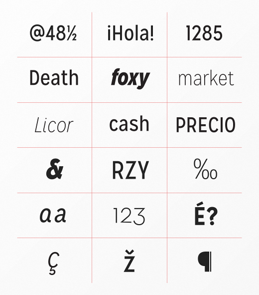
ReType: Medusa
Ramiro Espinoza’s homage to one of the most renowned masters of Spanish calligraphy, Ramón Stirling, who was active in Barcelona during the 19th century.
Rosetta Type Foundry: Huronia
A text face with flavour, suitable for recording oral literature and for extended reading in books and academic texts.
Kimmy Design: Station
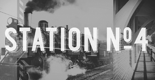
A bold headline typeface inspired by old train station type and graphics.
Typetanic: Transat
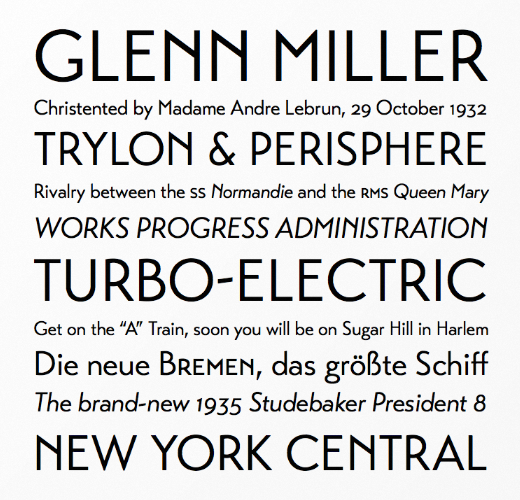
A geometric sans serif typeface, with caps inspired by Art Deco signage found inside the “Gare Maritime” ocean liner terminals in both Le Havre and Cherbourg, France, in the early 1930s.
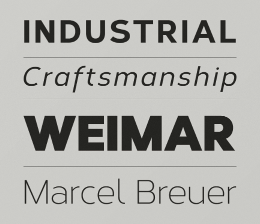
Scribble Tone: Analog
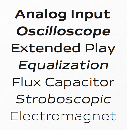
This new take on industrial sans serifs embodies the spirit of the solid state electronics revolution. Its energetic, generously wide proportions are balanced by confident, efficient strokes with minimal contrast.
Rene Bieder: Quadon
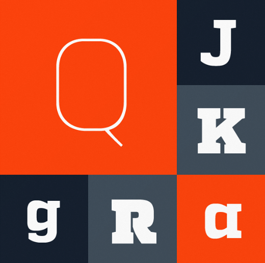
A modern, clear and infinitely flexible interpretation of slab serif fonts. Designed to fill the gap between traditional serifs and the lasting trend of using sans serif fonts for contemporary design.
Outras Fontes: Directa Serif
A text type family designed to save space with the maximum redability. Because of its general forms and proportions (a little bit condensed, big x–height, low contrast) it can be used in smaller sizes than usual for body text.
Lost Type Co–op: Mission Gothic
A relic; a ghost from an era where letters were hand–painted on wood and glass. Made up of five weights and two styles, Mission Gothic is one of the most expansive type families available from Lost Type Co–op.
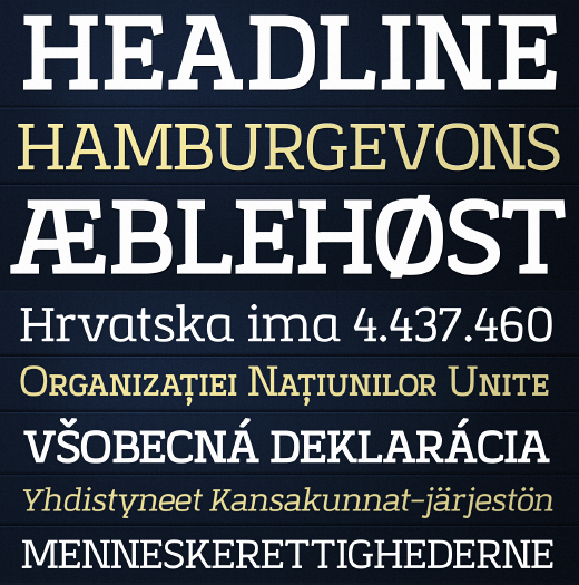
The Northern Block: Corbert
A geometric sans serif typeface influenced by Bauhaus and the early modernist era. Precise circles are optically adjusted to create a clear, natural typeface with great legibility.
The Northern Block: Hapna
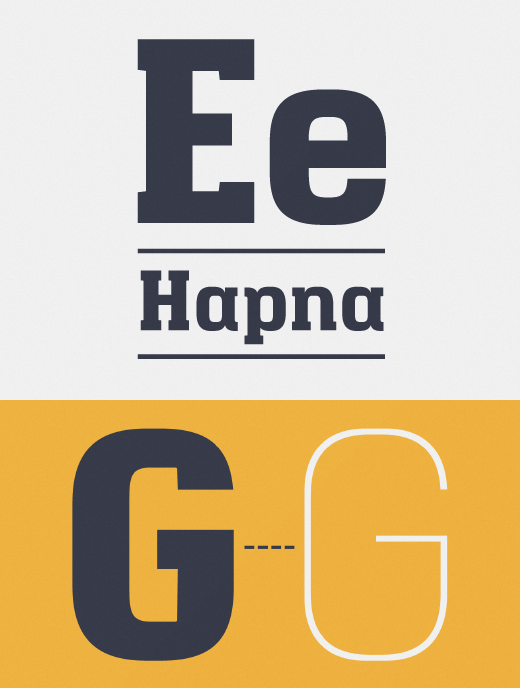
A geometric slab serif designed as an alternative to other slab style fonts available on the market. Hapna was inspired by the baseball culture and the graphic language of the early 1950s.
Symbolset: Gizmo
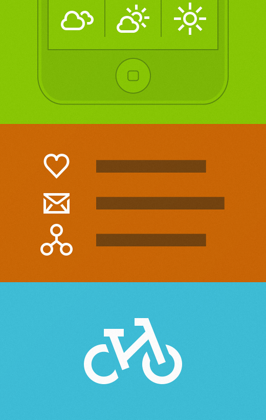
Balances professional, technical, and user interface needs with fun icons for food, weather, and coffee among other areas. Its lines begin and end in unexpected, yet well considered ways resulting in a fresh, unique take on the established outline icon style archetype.
Calderon Estudio Type Foundry: Letrista Script
A product of observation and sensitivity of sign painter artists not only from United States but from other parts of the world.
Fenotype: Bonbon
A delicious script family of three weights with at least four alternates for each letter.
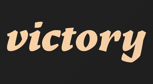
Kyle Wayne Benson: Tide’s In!
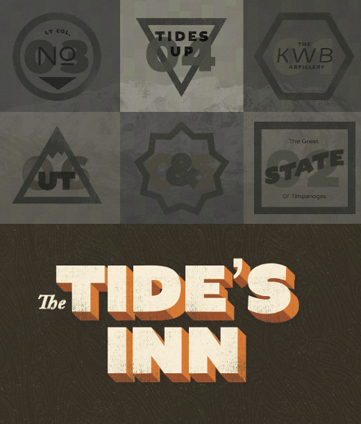
Inspired by the hand painted art born during the golden days of surf. Tide’s In!’s fresh, carefree, look makes you almost forget that you are staring at a monitor and not on the beach.
Type–Ø–Tones: Arboria
A hybrid grotesque with nods to the XXII century, consists of six weights and matching italics.
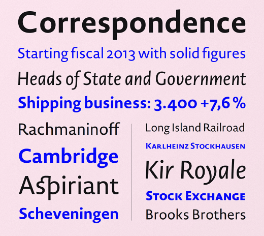
Type–Ø–Tones: Karol
A collection of eight styles with high readability, strength and character.
Rosetta Type Foundry: Eskorte
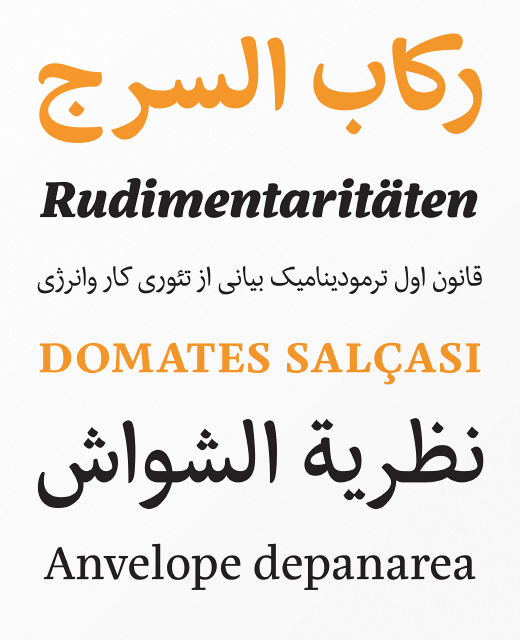
A hardworking Latin–Arabic type family with an uncomplicated, regular appearance that conveys a crisp, businesslike tone.
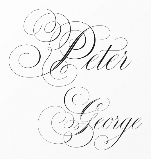
Sudtipos: Heraldica Script
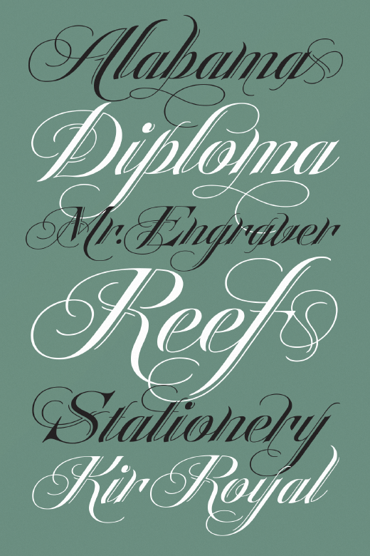
Attains the very definition of deluxe by conjoining the classic thin–and–thick script treatment with thin–only counterpart strokes, then it goes the extra mile with a varied complement of overlaid flourishes.
Borutta: Korpo Serif
A serif type family with a friendly feel. The low contrast and high x–height is perfect for longer text and headlines.
Hold Fast Foundry: Bourbon
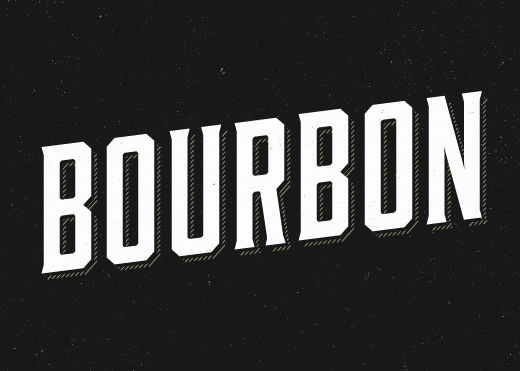
A condensed display typeface inspired by the likes of whiskey bottles and vintage serifs. It likes to take long walks with subtle, distressed textures or a nice, good-ole script.
Fountain: Taca
A typeface built around a shape that Portuguese designer Rúben Dias calls a “squircle” — neither square nor circle. Taca is warm and rugged, as if it was molded from clay or carved from stone.
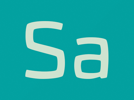
Plau: Guanabara Sans
A classic, timeless look, swinging elegance, and joyful attitude.
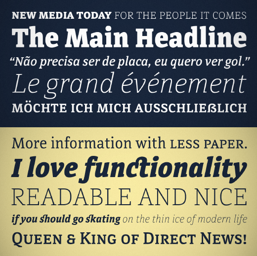
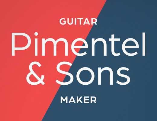
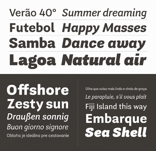
Atlas: Novel Sans Office Pro
The humanist grotesque typeface family optimized for office environments within the largely extended award winning Novel Collection.
Eager for more? Check out our lists for, January and Winter ’12. They’re worth it — we promise. You can also take a peek at our dedicated Design & Dev channel.
Get the TNW newsletter
Get the most important tech news in your inbox each week.