
Before Nokia unveiled the Lumia 2520, almost every tablet on the market looked the same. A thin, lightweight slate in either black, white or silver. Most are understated and beautiful to hold, but few challenge our expectations of how a tablet should look, feel and function.
The Lumia 2520 does exactly that. It’s unashamedly bold and set to launch in either white, black or a far more striking shade of red and cyan. The design is in keeping with Nokia’s current range of smartphones, but on a device this large the impact of these bright colors is even more startling and profound.
“We wanted it to be a part of the Lumia family,” Stefan Pannenbecker, head of product design at Nokia told TNW. “So that needed to be expressed in the way that we designed the product. It’s bold but in a way, everything we do is pretty bold these days.”
Metal? Curved glass displays?
Nokia spent a long time experimenting with materials and manufacturing processes that could be used to build such a fearless device. Some of the designers considered using metal to construct the body at one point, in addition to curved glass for the display. “We decided not to do it at the time, because the thickness of the glass would have added to the weight,” Pannenbecker reveals.

The <3 of EU tech
The latest rumblings from the EU tech scene, a story from our wise ol' founder Boris, and some questionable AI art. It's free, every week, in your inbox. Sign up now!
“So we said: ‘No, let’s keep it flat glass.'”
Nokia, more than any other manufacturer, has been able to successfully marry the distinct aesthetic and simplicity of Windows Phone 8 with its own apps and smartphones. In a similar vein, the cyan and red color options for the Lumia 2520, while lavish, feel appropriate alongside the Windows RT 8.1 platform.

“You could argue that sometimes, the device looks like someone invented the frame and someone else invented the content,” Pannenbecker explains. “Almost like TV. If you build a TV frame, you don’t have any influence about what goes on inside. We work very closely with Microsoft in terms of managing the consistency in the UI and the physics of the design. Then, when we build apps on top we really, very clearly, make decisions based on how the software and hardware integrates, and how the UI character is reflected in our designs.”
Why Lumia?
The Lumia 2520 is Nokia’s first tablet and as such, there was an opportunity for the company to go even further off-piste. They could have dropped the Lumia branding entirely or tweaked the design even further, as it has done with the latest set of petite, bubblegum Asha feature phones.
From the outset, however, Pannenbeckers says the team wanted to create a tablet that embodied the same design principles as the company’s Lumia smartphones. Nokia’s first tablet was always going to be an evolution of that vision, rather than a product that abandoned these well-established and instantly recognizable aesthetics.
“We wanted it to be a part of the Lumia family, so that also needed to be expressed in the way we designed the product,” he says.
That philosophy also meant challenging some the widely held beliefs around tablet design. Pannenbecker says he approached the Lumia 2520 as a mobile product first and foremost – it needed to be more than “just a tablet”.
“Does it feel like it’s supposed to be carried around with you? Do all of the key elements, such as the display, really work in super bright light? Can I take it outside? Is it LTE ready, and does the battery life last longer than 10 hours? All of this come on top of the challenge of building the thing; building it in a meaningful way which makes it a truly mobile device.”
Ignoring the competition
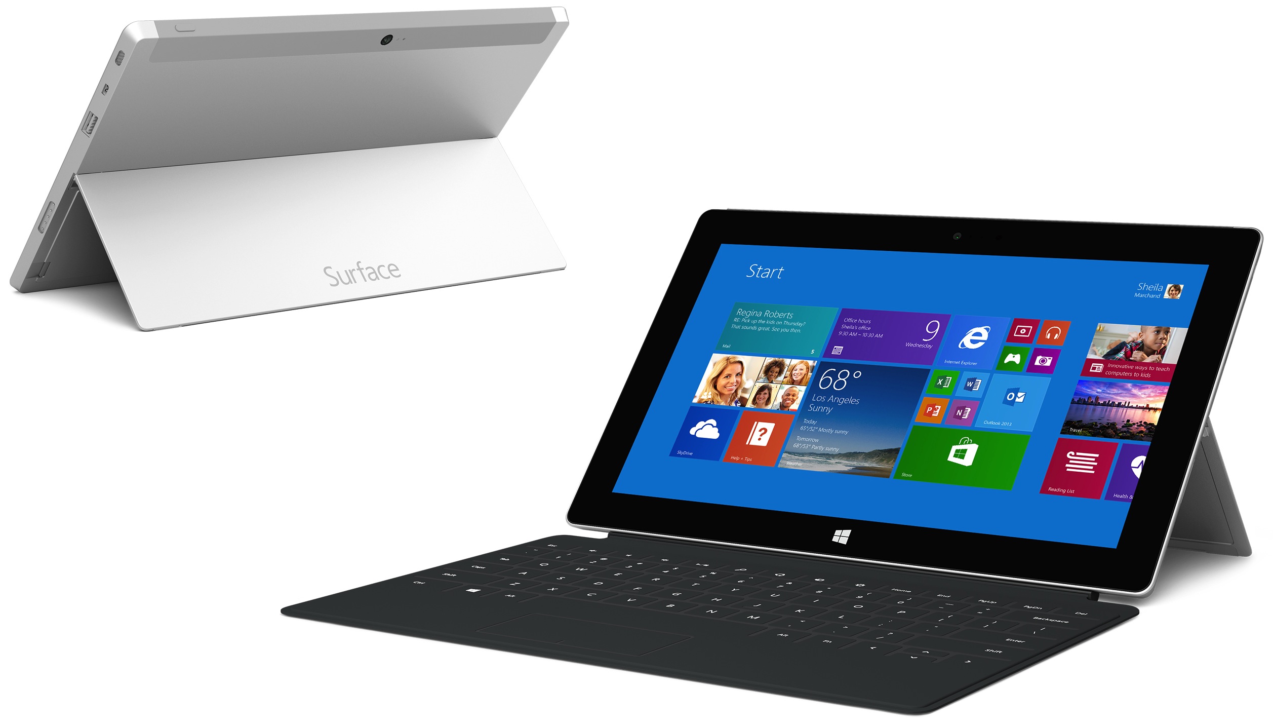
Despite this unique DNA, it’s hard not to compare the Lumia 2520 with Microsoft’s latest venture into consumer electronics; the Surface 2 (be sure to read our review). Both tablets run on Windows RT 8.1 and can be fitted with an optional case that serves as both a keyboard and kickstand.
The two slates were unveiled within a short period of each other – almost a month to the day – suggesting that there was some form of planning or collaboration between Nokia and Microsoft. That wasn’t the case though, according to Pannenbecker.
“We didn’t think about what Microsoft or anyone else was doing,” he says. “We don’t worry much about that and we don’t lose sleep over what the other guys are doing. Basically, we have defined a design strategy and we’re quite consequent in the way that we execute. We’re not blind to what’s happening around the world, but we don’t worry about it either.”
The future with Microsoft
In September, Microsoft announced a $7.2 billion plan to buy out Nokia’s phone business. It represents a clear opportunity for Pannenbecker – the rest of the design team – to marry the software and hardware of its products to even greater effect. Just like Apple, Microsoft and Nokia should be able to control the end-to-end experience as it does with the Surface line.
“I’m not going to speculate so much about what’s going to happen in the future, but I think that would definitely be an opportunity,” Pannenbecker says. “Ultimately, we want to build better products. So we will decide on how we work together based on that.”
More: Nokia Lumia 2520 hands-on: Does this 10.1″ Windows RT 8.1 tablet deserve your attention?
Image Credit: ANDREW COWIE/AFP/Getty Images
Get the TNW newsletter
Get the most important tech news in your inbox each week.