 UX people are taught to embrace the medium / device when designing applications. For this reason, the best mobile apps typically don’t look like their desktop counterparts – they take into account the limitations and opportunities afforded by the phone as a medium.
With the recent introduction of the iPad, a new medium has been introduced, bringing with it new opportunities and challenges. As there isn’t much data yet as to exactly how and when consumers are using their iPads, app designers are left to their hunches.
Which brings me to Gowalla and their new iPad app. More than any of the emerging geo players, Gowalla is known as a design driven company. Here’s a quick look at some of the design decisions they made in bringing Gowalla to this new medium.
First View
When you fire up Gowalla on your phone, the first view is a list of nearby venues so you can check-in.
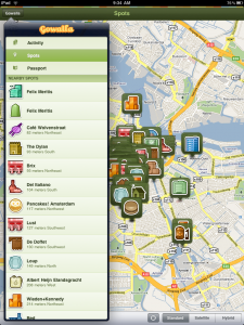
On the iPad however, first view is a map overlaid with the faces of where your friends are checking in.
There is no map view of friend activity in the Gowalla iPhone app. It’s inclusion as the primary view of the iPad app would seem to be a nod towards A) the larger real estate afforded by the iPad; and B) the fact that the iPad is better for consuming than publishing; and C) the unlikelihood of users whipping out their iPad on a regular basis in order to check in.
Navigation
The primary navigation in the Gowalla iPhone app is the tabs at the bottom of the app. Sub page navigation seems to prefer vertical scrolling over tapping.
On the iPad app, Gowalla makes use of the vertical, overlaid sidebar (like the one used in default mail client). Tapping any of the main navigation links (Activity, Spots, Passport) updates the underlaid (this is not a word) view. Activity and Spots both utilize the map as the main view – in city locations, the Spots map gets pretty busy.
Checking In
While you are able to check in with the iPad App, the functionality is buried under a number of clicks. You need to fire up the app, click the “Gowalla” tab opening the vertical navigation, click spots, find your location on the main view, and then check in.
Again, this would seem to reflect an assumption that people won’t typically be using the iPad app to check in.
Final Comments
The two prominent geo check in companies that have already built apps specifically for the iPad – Loopt and Gowalla – have both chosen to use the map as the primary metaphor. This makes a lot of sense – as a user, it’s a great way to quickly absorb what’s going on nearby. This view starts to break down when there is too much data however.
Emphasizing consumption over publishing on the iPad app is an interesting call, given that conventional wisdom would say that the larger the device, the easier publishing should be. As an iPad user however, it’s hard to disagree with this design decision. Publishing on the iPad is not a particularly pleasant experience, and when you are talking about one tap publishing – like a check in – the phone is far more practical.
So Gowalla is telling us this: check in with your phone, see what’s going on nearby with your iPad.
You can get the Gowalla iPad app here.
[nggallery id=1]
Get the TNW newsletter
Get the most important tech news in your inbox each week.
