This essay was originally published on Capiche, a secret society for SaaS power users, building a new community of people who care about software to make the SaaS industry more transparent, together.
Did you know we have an online conference about product design coming up? SPRINT will cover how designers and product owners can stay ahead of the curve in these unprecedented times.
When the team that built Wunderlist set out to build something new, its whimsically designed landing page got all the attention.
Wunderlist itself was a final hurrah to the skeuomorphic design that the early iPhone popularized, launched only a couple years before iOS 7 decreed flat design was the next big thing. With paper-like notes, bubbly buttons, and background photos of brick and wood, Wunderlist felt more like a real-world thing unconstrained by silicon and screens.
Pitch, their team’s new presentation app, didn’t bring back digital felt and paper. Instead, it showcased the newest thing in software branding: 3D, clay-style graphics that look more like kids’ toys than digital tools.

The <3 of EU tech
The latest rumblings from the EU tech scene, a story from our wise ol' founder Boris, and some questionable AI art. It's free, every week, in your inbox. Sign up now!
Art, so often, reflects the technology of its day. Charcoal on cave walls. Bronze cast in clay. Pigment infused parchment. Letters pressed.
And so it has been with software landing pages, where form followed function and changing technology enabled new design styles. But who would have foreseen software’s switch to subscriptions changing today’s state of the art?
Is this the real world?
“This is the BBC” was branding enough for decades of radio news. Simple technology, simple branding.
Television required show and tell, an identification logo or ident as they came to be known. Thus it fell to WWII-era poster designer Adam Games to decide how the BBC should “identify itself to viewers” with “something more exciting than a selection of test cards in between the programmes.”
Technology inspired —“The symbol must move”—and limited. Screens of the time showed only 405 lines of detail, and animation tools were decades away.
So the poster designer teamed up with a sculptor to build a wire and wood model, with a motor and lights to fake animation. Just enough to create the bat wings logo—BBC’s first moving ident.
Technology marched on, and with it the state of the art. The BBC welcomed color TV nearly two decades later with a motorized globe in a mirrored box, color added during the broadcast. And by 1985, computer technology finally matched the BBC’s ambitions as the first digitally rendered globe proceeded the nightly news.
And then software-powered design was everywhere, following the same progress as the BBC’s logo with increasingly better designs as technology made it possible.
Scissors and glue: 1990’s
Technology had influenced print design for decades before the personal computer. Print design, in turn, influenced software branding.
Before you could crop photos and mash them up in Photoshop, designers were clipping art from paste-up books and manually building page layouts on paper. Xerox machines and later digital scanning duplicated the work, but the original always started with layers of paper.
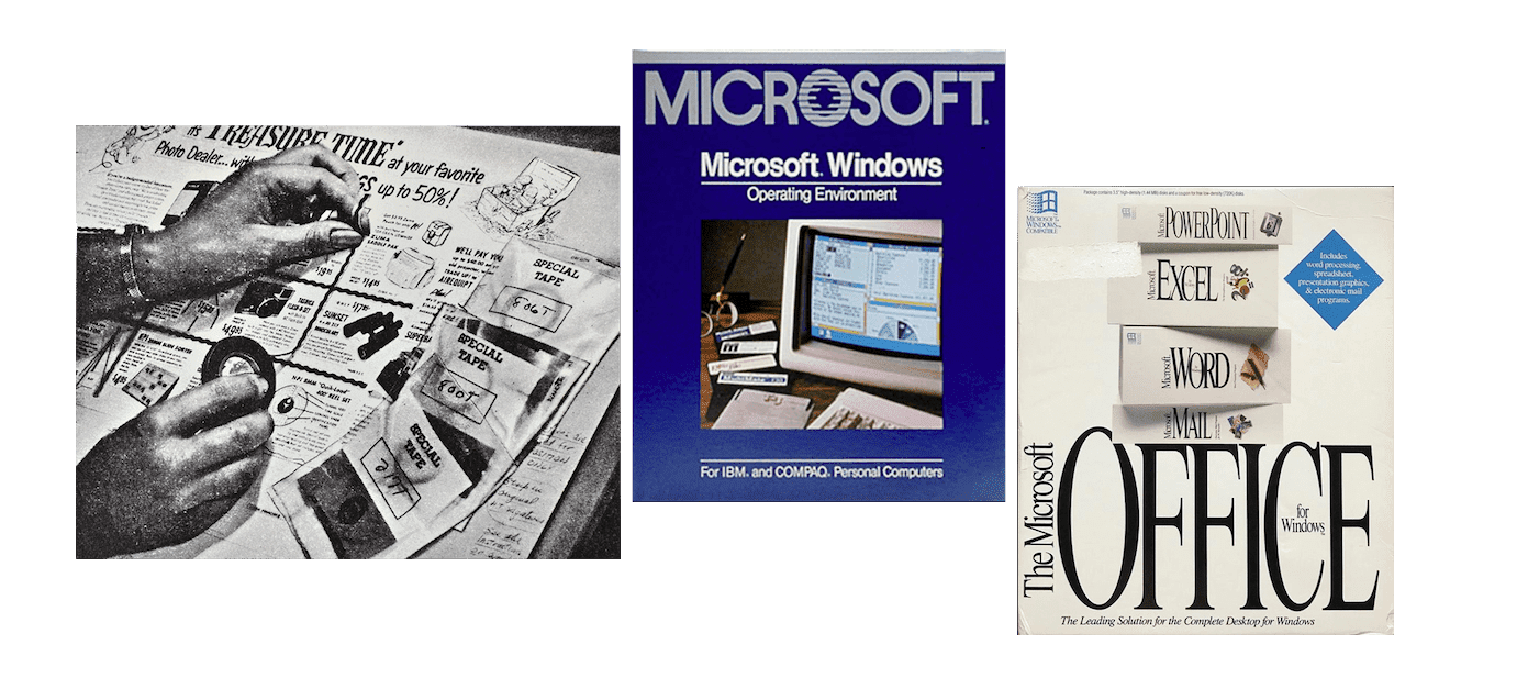
Software branding on boxes and disks arrived when paste-up was still state of the art. The first Microsoft Windows box—released the same year as BBC’s digital globe—was closer to a collage with a photo of a computer framed in blue. Early Microsoft Office box art featured box inception, with boxes for each included product with its own digital clip art icon.
Flat and fast: 2000-2005
Box art changed faster. Office boxes showed clouds (to match Windows 95’s iconic background), photos of actual offices, and bubbly 3D icons. Adobe put paintings and photo mashups on their boxes, educational software included cartoons. With print design and loading screens, there were few technological restrictions to hold you back.
For nascent web apps, though, simple flat designs weren’t as much an aesthetic choice as a necessity. When your average user has dial-up internet and a browser like Internet Explorer 5 with limited CSS support, you kept things simple.
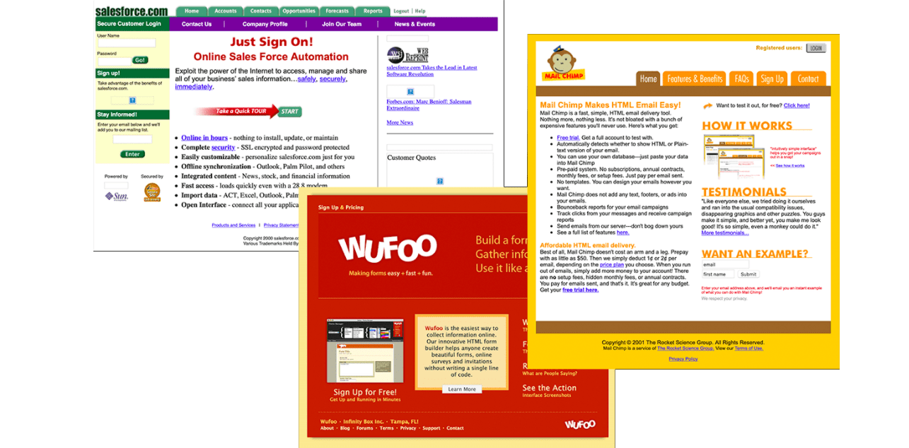
Thus the flat, boxy designs that dominated early web apps such as Salesforce’s site in 2000, MailChimp in 2002, and even Wufoo in 2007. Strong colors, detailed copy, and grid-based layouts defined early SaaS startup’s design language.
Screenshots everywhere: 2005-2015
In the grand tradition of BBC’s fake-animated logo, web designers used detailed image layouts to get around the early web’s limitations. Product companies like Apple built their sites around images, with product photos and detailed typography patched together from Photoshop slices. You couldn’t copy the text, and the sites took longer to load, but the web’s design limits didn’t hold you back.
SaaS startups had to take the slower route. Their customers would load their landing pages daily, and every second mattered. As internet speeds increased, though, that became less of an issue, and suddenly photo-heavy sites were everywhere.
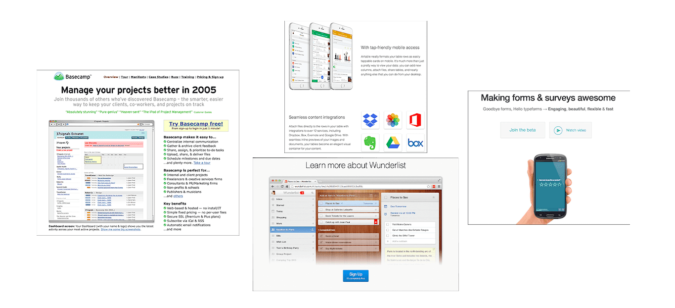
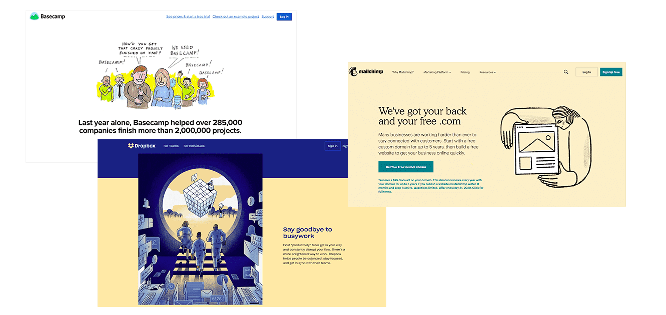
Basecamp switched earlier than most SaaS to a screenshot-heavy design in 2005, before newer startups like Typeform and Airtable put a modern takes on the design a decade later. Wunderlist put their efforts into designing the software—and let it speak for itself on the landing page. Software’s design was what mattered now; the landing page stood merely to showcase it.
Sketchy designs: 2012-2018
Then came touch, with smartphones and tablets and the digital apps they enabled. Wacom tablets had been around for decades, but the iPad gave everyone a chance to try their hand at sketching.
So when analyst Ben Thompson launched Stratechery in 2013, he used the Paper drawing app on iPad to illustrate his first article. “For me, it was honestly a feeling I really didn’t anticipate: I drew something, and it didn’t suck!” relayed Thompson. Years later, it’s still how he illustrates his blog posts.
A similar sketched style of illustrations took over SaaS landing pages around the same time, prompted by similar apps. Basecamp in 2012, Airtable in 2016, and both Dropbox and Mailchimp in 2018 redeigned their sites with a more organic, sketched design.
There was “a huge wave of illustration” prompted by the new drawing apps, shared freelance designer Valentin Galmand who’s worked with Lattice among others. “For me, it was Procreate that made me an illustrator now. I was an Interface designer and developer before, and when my agency I worked for got an iPad and Procreate, a long love story began.”
“It probably wouldn’t be far off-base to assume that a lot of these illustrations were done … by product designers who also have some illustration talent themselves,” surmised designer Koi Vinh in an essay on illustration-style designs. “They designed the app and while they were at it, it was faster and cheaper to just have them create the illustrations too.”
Sketched designs were easier to make—and gave brands more life than screenshots alone. They “illustrate your message a lot more than photos and are so much lighter.” Sketches made websites faster, too. Retina displays made photo-heavy designs need increasingly large images, while sketched designs in SVG files let websites load faster while having perhaps more of an impactful design than screenshots and photos allowed.
Tools as toys: 2018-2020
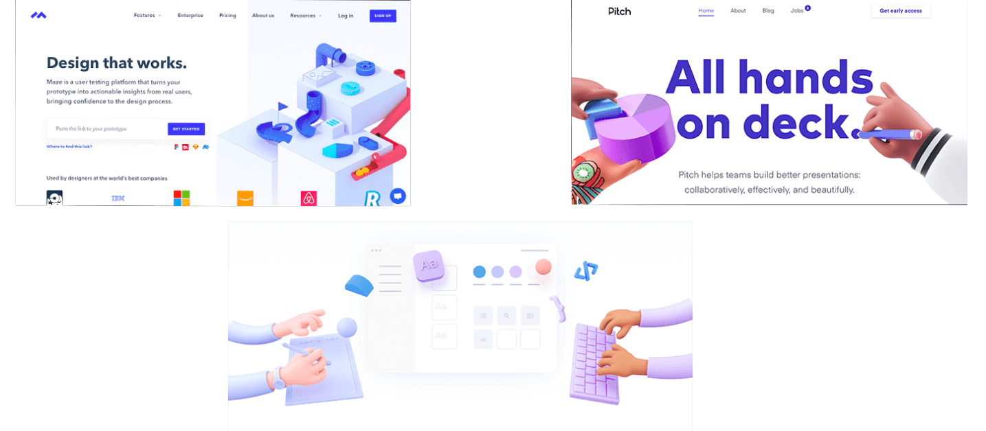
Then Pitch showed up in late 2018, and with it a new wave of startup sites with bubbly 3D graphics.
“There’s no official name for it,” said Romain Briaux, the designer behind Specify, Swile, Evolt, and other startups with the new 3D graphic design. “Clay-style” perhaps, or “plastic-toys.”
It’s in sharp contrast to what Galmand had described as “classic SaaS illustrations” with flat colors, screenshots, and sketched artwork. These new designs looked like they walked off a Pixar set.
“Startup websites were a bit stuck with the same illustration style and everything was looking the same,” said Briaux. “3D graphics brought something fresh and new.”
“Claymation-style 3D hands imply our design tool is our friend,” said designer Tobias Van Schneider in a recent essay about design trends. “Circles and squiggles say our form-creation app is here to party. The muted colors and lack of sharp corners signal safety. It is approachable. It is charming. It’s Kawaii.”
Realistic, 3D graphics were formerly the domain of studios, requiring thousands of dollars in equipment and software. Then, seemingly overnight, even new startups with limited budgets had animated characters selling their products.
This time, two innovations changed the state of the art: Software and subscriptions.
First, software. The biggest change is that most 3D renders—Octane, Redshift, and Blender’s Eevee—are now live, a shift enabled by GPU advances over the past few years.
“Before live rendering,” Braiux explains, “the process was tedious. Imagine that you had to do all your settings for lighting, material, etc., and then wait 10 minutes to see that the result was not as you expected.” Live rendering means today’s 3D design software makes it easy to experiment through trial and error and ship something more quickly. “You can see what you are doing without waiting and it changed everything,” said Braiux. “It’s easier for beginners to learn and achieve nice results.”
Then, subscriptions. “One of the main reasons is the fact that design tools have become more widely available,” explained 10Clouds designer Igor Kozak, something that helped both traditional and 3D design tools spread. “Thanks to various subscription options, almost every designer can afford to use Photoshop. Other tools such as Cinema 4D are more expensive, but you can still purchase a license to use it for $100 for a month without being tied in”—something that cost $3,495 before subscriptions. Even as subscriptions helped inflate software costs over time, as you may pay more over time for subscriptions than you would have paid with one-time purchases, their lower per-month fee makes it far easier to use software for a limited-time project.
Then there are increasingly powerful free tools. “Blender is free, super advanced, has been completely redesigned and now the UI is more ‘designer-friendly,’” explained Braiux. And last year, Blender gained a live rendering engine, Eevee, that’s made 3D design even more approachable. Designers can start for free in Blender, then upgrade to subscription rendering tools like Octane (a 19.99€/month subscription today, versus 299€ before) as their skills improve.
Subscriptions mean you don’t even need a powerful computer to render 3D graphics. Instead, you could run Blender or Modo in the cloud with tools like RenderStreet from $3 per hour, or even use Pixar’s RenderMan in Google Cloud from 53¢ an hour.
Subscriptions made advanced design tools accessible to everyone. And now, they’re everywhere. As Briaux said, “Technological barriers almost disappear and designers have now the freedom to create more easily.”
“Technology is constantly evolving,” says Kozak, “and as a result, we can now create something faster and at a higher level of quality for $100 than we could for $200 a couple of years ago.” As designer Sheldon Drake wrote, “It’s the difference between nearly impossible and just press OK.”
It’s now entirely feasible for startups to commission 3D designs for their homepages, thanks to the combination of better tech and subscriptions.
Future design
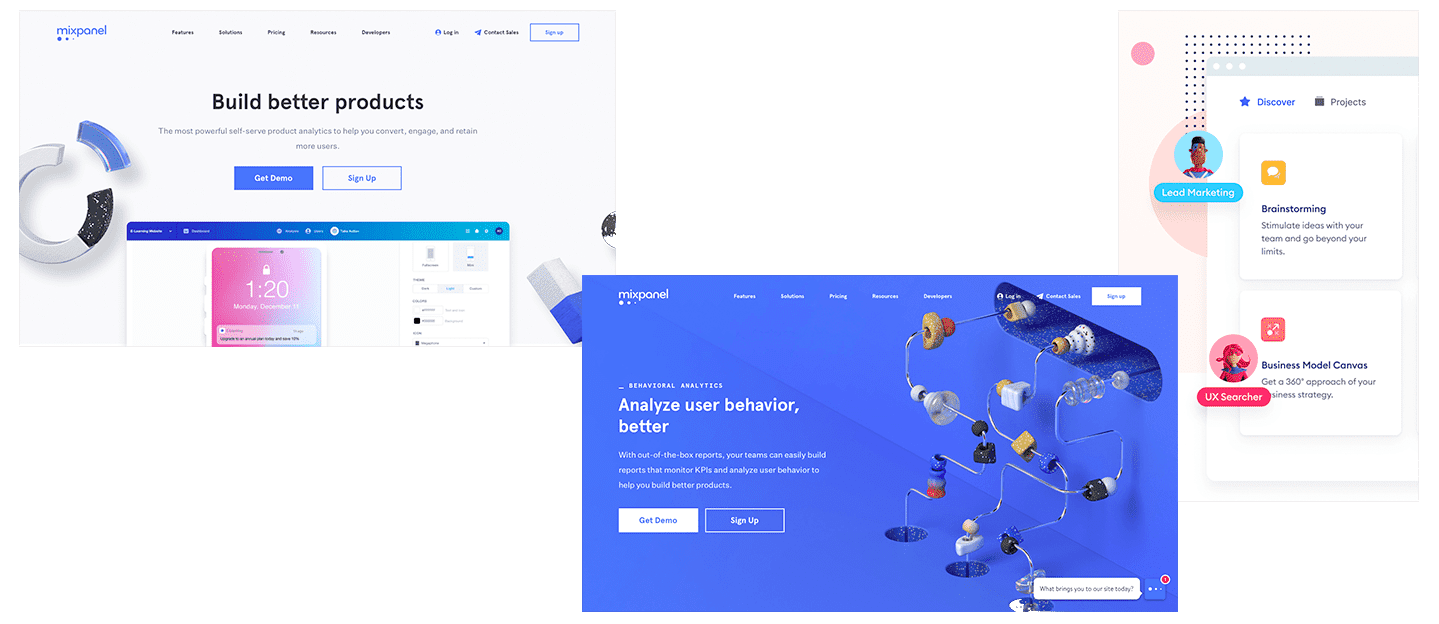
Already the styles are merging. Notion and Airtable mix sketched designs with screenshots. Lattice’s landing page combines 3D graphics with photos; Mixpanel put screenshots and 3D material elements together. Luc Chaissac’s sketches mixed with 3D graphics for Lattice and Romain Briaux’ 3D animated line sketches for Firekast that blur the lines between the two styles.
“Design can be compared to fashion, which is cyclical,” said Igor Kozak. Flat, then 3D, then something in the middle, then something new again.
The software that enables Pitch-style 3D graphics also enables everything from animated sketches to hyper-realistic models. And it’s not just the tools to build 3D graphics that are changing—the web is changing too. Tools like Airbnb Lottie render After Effects in real-time in the browser—no video or GIFs needed. Sketchfab lets you embed 3D models in a site today; tomorrow, it could power more creative landing pages.
It’s not software holding design back anymore. We’re far beyond wire and wood. Imagination’s the limit—and for today, that seems focused on designing the most graphical landing pages possible.
“There’s a saying in Russian: ‘When you meet a person, you judge them by their clothes. When you leave them, you judge them by their mind,’” relayed 10Clouds’ Igor Kozak.
“I think the answer here is that startups need to learn how to present themselves as you only have one chance to make a first impression. Effective illustrations, along with the right messaging, will provide a strong user experience, guiding prospective customers through their journey on your website.”
It just might be an animated character that guides you on your next user journey. Clippy may at last have its revenge.
This article was originally published by Matthew Guay, Capiche‘s founding editor and former senior writer at Zapier. You can read the original piece here.

Get the TNW newsletter
Get the most important tech news in your inbox each week.