The most common mistake for new app designers is to give in to the urge of trying to innovate every part of their app. They believe that’s the only way for their mobile app to succeed.
- “How can I do this in a unique way?” This question is not always necessary and may actually hurt the UX.
- “How about we replace all of our icons with colored dots with absolutely no text on them?” Please don’t ever do this.
Conventions are important in every field and are just as important in UI UX design.
[conf-ad-unit status=”off”]
The automobile example
Think about when you get into a car in the US. You can always expect the driver seat on the front left side and a steering wheel in front of you.

The <3 of EU tech
The latest rumblings from the EU tech scene, a story from our wise ol' founder Boris, and some questionable AI art. It's free, every week, in your inbox. Sign up now!
If you know how to drive a car, you can pretty much drive any US car. If you drive automatic, you’ll feel confident in driving any car that follows convention. There’s no training involved right? You already did what training you needed in Driver’s Ed.
Imagine if a car designer broke convention. Imagine if they decided to put the driver seat in the back right seat instead of the front left. If they break convention with no rhyme or reason behind it, then you won’t know what to do when you get in the car.
Breaking established design conventions can even put your users in danger. One of the many celebrity deaths that occurred in 2016 was Anton Yelchin. He was most well known for his role as Pavel Chekov in the new Star Trek movies.
Yelchin’s Jeep SUV that was supposed to be in park, ended up rolling down his driveway. The actor didn’t see it coming. He was pinned against his security gate and mailbox and died shortly after.
Anton’s SUV was being recalled on a global scale because gear shifts were often being confused by drivers, causing many vehicles to roll away unexpectedly, just as Anton’s did –HollywoodLife.com
The 27-year-old actor’s life could have been spared. Imagine if someone on the team had enough sense to go with convention. Instead, they fixed what was not broken.
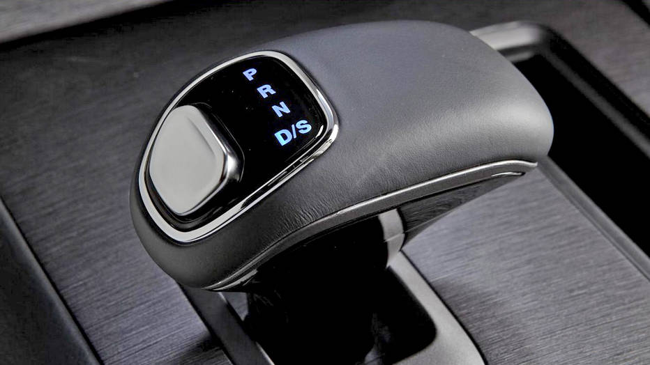
I mean, look at this gearshift! Would you be able to know how to use it right away?
They made unnecessary changes under the veil of making themselves different. And, this is an extreme situation but, someone paid the ultimate price for it.
Design conventions for mobile
The same thing applies to mobile design. There are certain expectations. You wouldn’t use a navigation app that told you to turn when it’s too late to do something about it.
That’s why Google Maps is the standard because they let you know these things in advance. Google Maps has good enough UX to let you know what lane you should be in, and if there’s a turn coming up soon. They set the convention themselves by caring about their user first. Funny how that works.
Another example:. A login screen has a username/email field followed by the password and a sign-in/login button. That’s a common design convention.
What would happen if you broke convention and switched the password and email fields?
The order of operations for signing in on an app is a convention ingrained in most users. This means you’ll get a lot of people who will follow the convention of entering email and then password. Just pure muscle memory with no thought to it.
So if you try switching those fields for the sake of switching, you’ll just get a lot of failed sign ins.
When to break design conventions
Obviously, you can break a design convention when you have a good reason to do so. There are practices that go unquestioned for too long. There comes a point where time has moved on and things are no longer applicable.
That’s when you should break convention.
A good convention to not break is the back button, which is usually placed on the top left of the screen. It’s a habit for many users. If you’re on mobile pages on both Android and iOS, they’ll usually have it on the top left.
They might place it on the bottom left on some mobile browser apps. But what if you put the back button on the bottom right?
You will have a lot of confused people looking for the back button and they don’t know where to look. They’ll just think that bottom right back button goes forward because of the placement. They never seen otherwise.
A convention that is good to break is something old and outdated. So antiquated that it no longer applies to the new generation.
Take a look at the save button, which sometimes has the icon of a floppy disk.
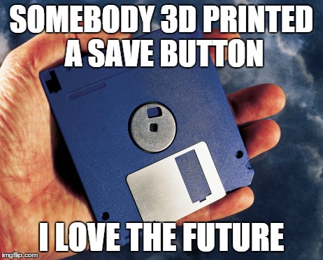
Even for us, Impekable has hired young design talent before who have never seen a floppy disc.
An app that still uses a floppy disk to symbolize save may not resonate with the younger generation. In that case, it’s okay to break convention. People still use pen and pencils, so the icon for creating or writing something can be a pen.
Another example. In messaging services, the phone call icon is still shaped like old rotary phones. Most people don’t have those phones anymore. They have phones that are rectangular and flat, but it’s still the convention right now.
I’ll be surprised if in 30 years that was still around. Maybe it’s time to break that.
There are reasons to purposely break a convention other than outdatedness.
Within an industry, things are done a certain way because that’s how it’s always been. We look at new products with a fresh set of eyes, knowing nothing about the industry at times. With that outsider perspective, we challenge some of these industry conventions.
We show clients examples of what we see from other industries and what they do for a similar task. If an app has a lot of steps we want to address that because usability transcends across all industries.
Here’s a set of procedures that match well with what you’re trying to do. Here’s how the design patterns are. Would you be open to replacing your old convention with this new convention?
Sometimes we have to challenge the perspectives of people who come to us. For example, we’re trying to improve the UX of something for our client in the fashion industry.
The client would argue that it’s always the way they’ve done it because the industry thinks like that.
Is this something we can win on if we try to change how people do this?
We may simplify it and propose it. But if it’s not how people in the industry think about it, we could just accept it. Sometimes people accept what we propose, sometimes they don’t.
That is something we have to explore and test as UX designers on a case by case basis. We always keep an open mind when clients propose any better methods that work in the context of their industry.
Having an antagonistic relationship with everything tried and true will stunt your app’s growth. It may even hurt your users depending on the app you’re making. Yet, it is important to know when you should break outdated design conventions. And at least question whether they can be replaced with new and improved conventions.
Get the TNW newsletter
Get the most important tech news in your inbox each week.