
Access to better internet connections and design tools are giving designers more flexibility to use techniques – such as video, custom typography and animation – that were off-limits a few years ago.
We are already starting to see some of the tactics that are likely to dominate the design scene, and the themes are oversized elements and mobile-inspired concepts that bridge the gap between devices.
But these techniques are not necessarily unique just to 2016. Web design and app design have influenced each other heavily for the past five years.
Based on what we’ve seen in the past few years, the techniques that will persist into the future are rooted in UX fundamentals. Trends certainly evolve with time. For instance, what started as the parallax craze in 2013 has now settled down into a simple long-scroll technique.

The <3 of EU tech
The latest rumblings from the EU tech scene, a story from our wise ol' founder Boris, and some questionable AI art. It's free, every week, in your inbox. Sign up now!
Let’s explore the trends in recent years that are starting to become best practices. Expect to see these techniques far beyond 2016.
Even bigger video and cinematography
High definition video is the new hero header. And we’re not talking about simple loops. The new video technique is full-on cinema-style with a video that includes a story.
As explained in the free 2016 Web Design Book of Trends, this practice would have impossible even just two years ago, but better compression methods for video, high-quality recording options with almost any mobile phone and faster internet connections are making it possible. HD video only works when it streams flawlessly.
You can bet that Internet speeds are only going to increase, which means higher resolution design in the years to come.
Let’s look at two different approaches. The examples below each showcase this cinematography style in different ways.
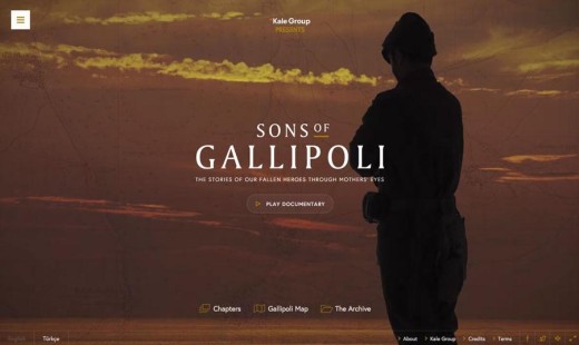
Sons of Gallipoli allows you to start the video on your own and move through the site.
Here the viewer is given complete control of the viewing experience. Viewers have the ability to skip chapters through a off-canvas navbar, play or pause the current chapter, or explore the archive. Here the experience isn’t dictated completely by the design, but rather how the viewer wants to consume the content.
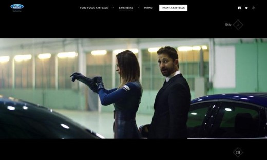
Ford, however, takes their viewers for more traditional ride. They use a movie-style format that automatically plays once the site is loaded. Once the brief video ends, menu options pop up asking viewers which track would they prefer to explore. However, viewers are given the option to skip the video — which is a good option for those who visit the site more than once. Other sites opt away from sound because it can be tricky to pull off without frustrating users. (Sound should always, at a minimum come with a toggle off/on switch.)
In any case, video will continue to improve in the coming year and will be an integral part of the user experience.
Interactions everywhere
Users want to engage with websites. And websites want users to engage with content. This symbiotic relationship will hold true until the end of time.
Expect to see this principle manifested as more gamification and more micro-interactions between websites or apps and users.
The trick to executing this technique is making it seamless. Designers are creating games that don’t look like games at all, where the lines between micro-interactions and gamification are blurred. One thing to remember about micro-interaction is the best ones are tiny, simple and become part of a user’s everyday life. Let’s look at one example.
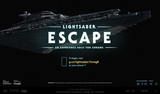
Star Wars Lightsaber Escape is a game that’s more movie than game.
And it’s a perfect example of where gamification and micro-interactions mix. Before playing the game, you’re instructed to log into the site on phone. You have to use your phone in combination with the site to play the game. The Force is in your hands, as your phone controls the lightsaber on screen. Integrated scrolling features and fun imagery and typography add to the movie experience.
On the other hand, there are others that are blending micro-interactions more into the way we interact with other people.
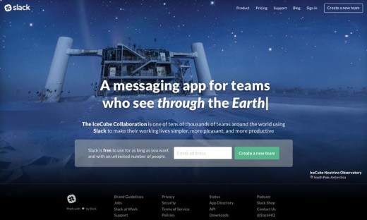
Slack has mastered the art of the micro-interaction. The messaging app and website helps users communicate across teams and devices. Slack has developed a pretty substantial following – so much they recently launched a Slack Shop to buy everything from stickers to socks – that relies on tiny notifications, file sharing and more for work and play.
But what makes them popular is that they keep the lines of communication open amongst your team. With both desktop and mobile apps, you can connect with coworkers easily on a variety of projects regardless of whether you’re in the office. Notifications help bring you back into the application, becoming as common in our daily lives as text messages.
Interactions have and will continue to be just part of how we interact — pun fully intended — with the world.
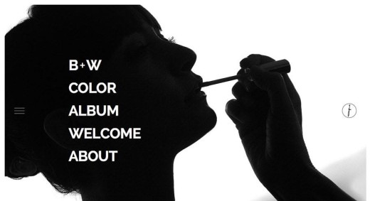
Full-screen navigation
Full-screen navigation seems like a logical evolution for websites thanks to the popularity of pop-out menus.
The hamburger icon has evolved from a swing down, traditional form of navigation to a full-screen navigation tool. What’s especially nice about this is that websites can truly design the navigation so that it looks less like an afterthought.
The one caveat to this technique is making sure users understand where and how to find the navigational elements, because this concept may not feel familiar to everyone. Add a little animation or splash of color to bring focus to the click (or tap) action.
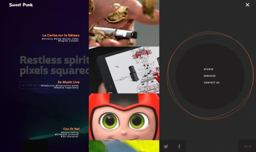
The sites of Mario Frigerio and Sweet Punk each use pull screen navigation styles that are bold and fun. The look is almost an evolution of the smaller mega navigation design that was popular before touch-based interfaces became a must-have.
The simple designs and focus on visuals makes users want to click deeper into the sites.
Card-style interfaces
Cards were one of the biggest trends between 2013 to 2015. At this point, they’ve become an almost default UI pattern for any content-heavy site.
What makes cards so popular is that they are so easy for users to understand. We’ve all played with physical cards at some point, so the digital metaphor is instantly understood.
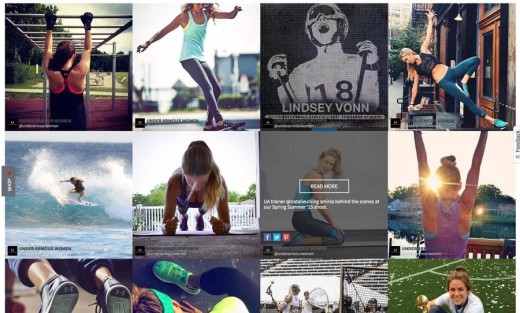
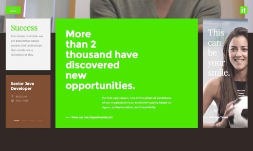
Every element is created in a container that relates to a specific action, such as activating a link, filling out a form, sharing on social media or watching a video. While the first cards looked very much like playing cards in terms of design, newer card-style interfaces are much sleeker, such as Under Armour Women and Prime It, above.
Cards are digestible chunks of information. They work best when each one is a single thought, or primary action. And they work well with any form of content. You can use cards to create narrative or aide in discovery (like in the examples above).
If you want to learn more about using cards, check out the free guide Web UI Design Best Practices.
Split-screen layouts
One of the quickest emerging techniques since 2013 is split-screen design.
In most cases this split screen falls into vertical panels for smaller devices, making it a good fit for responsive frameworks.
The technique is a natural evolution of classic decisionmaking psychology: Hick’s Law. In the right context, you can actually help your user by narrowing down the homepage choices to two primary paths.
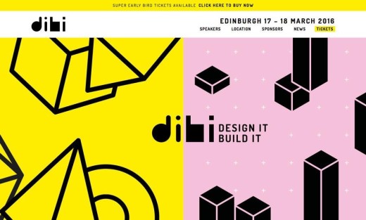
Think of split screens as an expansion of the card concept as well. Instead of many containers, the screen is divided into two content containers, each associated with a user action. But the tactic can be purely aesthetic as well (and that’s ok) with a split screen visual, such as Dibi Conference above.
Si le Soleil uses split panels in the vein of cards. Each box is a clickable element that takes the users to a new bit of information. The design uses a variation of the split screen concept with a vertical divide with one panel facing a pair of panels. Breaking up the two-by-two split screen default creates even more visual interest.
The key to using the split screen is taking the use of space into account. It’s not as easy as drawing a line down the middle. You must consider the relationship of the elements and text with each other. The rules of good visual design should still apply.
Personalization
Users have always wanted to visit websites that “get them.” Thankfully, our technology has finally caught up.
Amazon has been using this concept for years with personalized shopping options, lists and suggestions. More sites, particularly retail, are using personalization to appeal to customers.
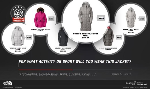
Personalization options can be something as simple as remembering a customer’s name, preferences or cart or as intuitive as helping someone make a decision. The North Face has a tool powered by IBM’s smart computer that will help you buy items based on how you will use them.
Watson, as the super-computer is named, actually helped me pick out a jacket based on my location, season of the year and style in a matter of minutes.
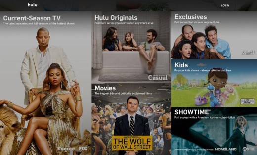
Music and video streaming are in the middle of personalization. Sites such as Hulu (above), Netflix, Pandora and Spotify live off delivering custom preferences to users. The sites with the most robust personalization tools do this without the user even really knowing it. Hulu tracks the shows you watch to make recommendations, so users don’t get stuck in long loops of forms.
More and more, we’re going to see products that tailor to us as individuals than to all of us collectively.
Bigger typography
From increased body copy to oversized headlines, users have acquired a taste for creative typography.
Growing type sizes is a carryover from mobile app design, where readability standards require fewer characters per line and greater space between lines of text. As users have grown more accustomed to this look, it is becoming more common on other devices as well. (And it sure does make reading easier!)
Tennent Brown uses huge type styles to draw users in, but look closely at the body copy as well. It is bolder and larger than you might find for other blogs or sites with large text blocks. The result is highly readable; something users of all ages will like.
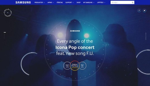
While Samsung’s Circle of Sound site is not all that text heavy, all of the lettering is a little larger than you might expect. Note the site of navigational elements and secondary text. Here’s a design tip to take away from this site: Close editing and a well-organized structure make it easier to do more with fewer words.
Return of the scroll
After years of discussing the demise of the scroll, user are embracing scroll in a major way thanks to effects such as parallax, animation and familiarity because of mobile usage.
The trick to making scroll work is that it has to be more than just function, it needs to be visually intriguing and include some type of delight for users. The “move an object down an adventurous path” gimmick from 2013 parallax sites doesn’t cut it any more.
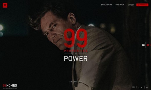
The scroll effects for 99 Properties of Power is just fun, which helps to keep users engaged. Each flick of the mouse wheel takes users to a new profile of a character from the movie. The “screens” are perfectly proportioned and contain just enough information to read quickly and move to the next page.
The scroll delivers information at the perfect pace.
Continued flat evolution
Flat design is here to stay.
Whether you prefer to call it Almost Flat, Flat 2.0 or something else, this simple style is the mainstay of plenty of designers. The biggest steps in the evolution of flat will come in the form of Material Design, thanks to the large adoption rate of the Google-based design pattern.
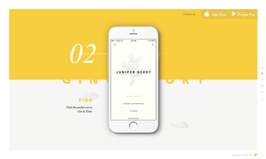
Sites, such as Ginventory and Todoist, have embraced the flat/material style across platforms. The key difference between simply flat and material is mostly in the way a site or app works. Interfaces with more physical interactions are closer to material, while more limited usage as a whole of effects is mostly flat.
While Material Design initially started as a Google/Android design interface, it is being embraced across the Android-iOS divide.
Tiny animations
Animation is a big deal. Tiny animation is an even bigger deal.
Successful movement in website design does not have to be in your face. Subtle actions are the best uses of movement in design. Think things like hover states, loading animations or just plain surprises hidden in hero imagery.
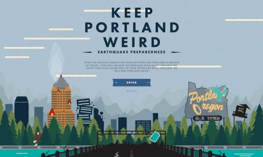
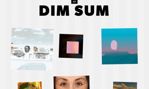
Keep Portland Weird and Dim Sum use animation in quite different ways.
Portland’s illustrated page includes little bits of movement throughout to help users focus on specific bits of content. Dim Sum uses animated containers to encourage clicks for new bits of information, in what is otherwise a super-simple design.
Animations don’t need to be grandiose to make an impact. Sometimes the tinier, the better.
Takeaways
The line between apps and websites is dissolving. Early indicators show that more designers are pulling concepts from apps and small-screen website design into all of their projects.
In the years to come, design will be bigger, bolder and more app-like across devices. Better technology has made it possible for more users to have greater access to higher quality, more bandwidth-intensive designs. And they seem to like it.
In closing, we’ll offer some final advice from the 2016 Web Design Book of Trends to keep everything in context:
Treat design trends as just another tool in your design toolbox. Only apply them if they actually help your users. If you apply a trend just because it’s ‘hip’, you won’t know if you’re following a fad or best practice.
Read next: 5 secrets to awesome user design
Get the TNW newsletter
Get the most important tech news in your inbox each week.