
Sujan Deswal is an inbound marketing and AdTech enthusiast. He is part of the marketing team at AdPushup – an online A/B testing platform that optimizes banner ads for efficiency. An edited version of this post first appeared on AdPushup.
Myth #1: “Faces always & instantly draw attention.”
Myth #2: “Large text instantly draws a lot of attention.”
Myth #3: “The magical word ‘FREE’ always pops out.”
As EyeQuant’s 200 Website Eye-Tracking Study eloquently concluded (and busted the above myths):

The <3 of EU tech
The latest rumblings from the EU tech scene, a story from our wise ol' founder Boris, and some questionable AI art. It's free, every week, in your inbox. Sign up now!
“Don’t rely on rules of thumb. Testing always beats guessing.”
So with this post I’ll give you 22 reasons on why you should get your own eye-tracking website usability testing done instead of following the said “best practices.”
1. To know what your website visitors see first (and last)
Whenever visitors comes to your site, what is the first page element that they see? The text copy, your brand logo, the top of the fold image, a specific site feature/offer etc. Knowing this gives you the information to better present the content on your website which can affect page-views, user sessions and conversion rates.
Also, by checking what they see last, you can find if there is a specific page element that might be influencing visitors’ departure. Consequently, you can remove the disruptive element and replace it with an incentive that could encourage them to hang around.
2. It’s automatic, accurate, fast and real-time
- Yes the process is automated (which increases reliability and reduces variability).
- It is accurate because the eye-tracking device is following the exact gaze of the user on the webpage.
- It records the travel path of the central vision of the user’s eye in real time which makes the resulting data more precise.
In the following picture, you will see the step-by-step procedure of how Tobii Technology carries out its eye-tracking testing.
![]()
3. Understanding user behavior (and hacking it)
Analyzing the natural interaction between the visitor and the webpage gives invaluable insight on user behavior. You can see which elements on the page are capturing the user’s interest and then use this information to either show more or less of such elements.
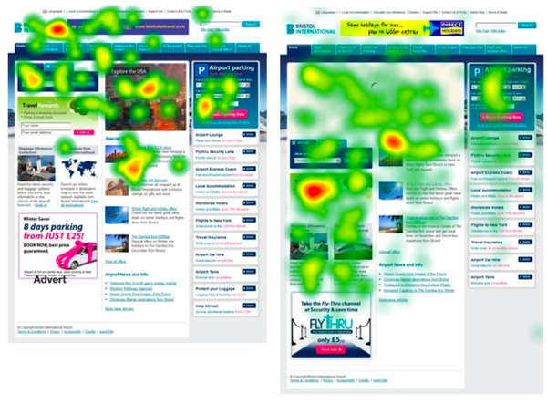
Joe Leech, from CXPartners, gave this brilliant example where eye tracking on Bristol Airport’s website showed how users explore the page if there is less content placed above the page fold. He writes in the post –
“The image below shows some recent eye tracking work we did with Bristol Airport. The screens show two different design treatments for the hero slot (the large, prominent image area) on the homepage.
The surprising thing we learnt was that actually having less above the fold (one large content block as opposed to 2 smaller ones) encouraged exploration below the fold.”
4. Scrolling pattern/speed/trigger
Eye tracking helps in gauging how much time a user is spending between clicks and how quickly is he/she scrolling before task completion.
- Are they scrolling to the bottom of the page or just interacting with the top visible half?
- Are they open to the idea of scrolling left/right instead of just up/down?
- Do they scroll right past an important feature element in the middle of the page?
As Neil Patel says in his blog post 8 Powerful Takeaways from Eye Tracking Studies –
“People do scroll down. When they do, they go straight to the bottom of the page, where the scrolling stops. That’s where you want to hit them with your call to action.”
“It actually gets 39 percent more clicks than the call to action button in the middle of the membership page.”
5. Gauging user attention span
Based on the time the user’s eyes spend on a particular part of the website, it becomes evident what holds his/her attention for a considerable period. This attention span is a window of opportunity to hook them, encourage them and engage them.
Such acute information helps in developing a consensus that allows a webmaster to make smarter decisions regarding resources and features allocation.
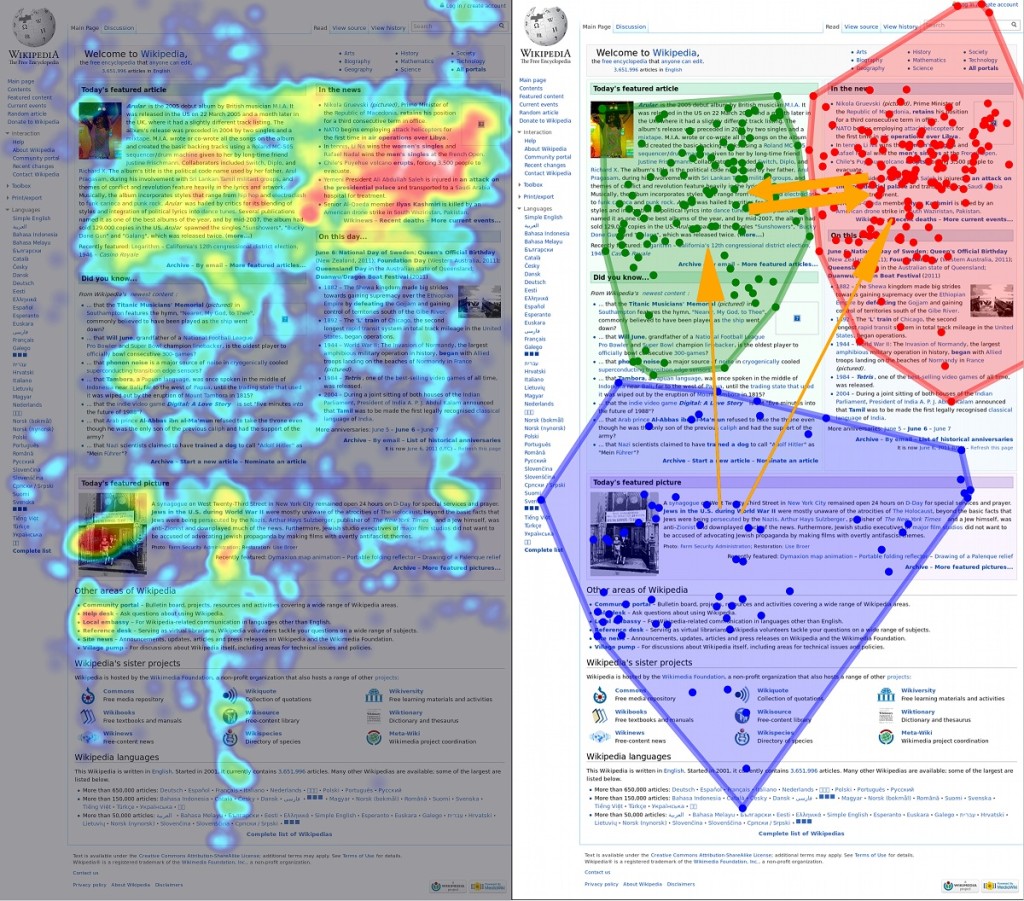
6. Understand user concentration areas
This is different from the above point because attention span is “time duration” and concentration areas are “places of interest.”
Concentration areas are above the fold, between the fold and bottom of the fold (fold: content). Based on eye tracking results you can efficiently place discounts/special features/banner ads/subscription forms.

GazeHawk share this image on their eye-tracking usability blog from one of the case studies. The image highlights advanced visualization of eye tracking data on the WikiPedia’s home page showing users do scroll below the fold.
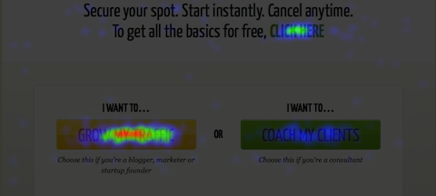
7. Images vs Text vs Videos
It helps you measure which type of content is attracting more attention. Attraction is not necessarily always good. While it is valuable to know what is interesting your user and increasing engagement; it is also critical to understand what is driving a user’s attention away from, let’s say, a Call-T0-Action button.
8. Your website’s usability
One of the most fundamental uses of eye tracking among web publishers is to test how easy it is for the visitors to use their site. Are they able to easily move around the site and understand menu options? Do they quickly understand how the site functions and is it easy for them to find the information they were looking for?
From Tobbii’s case study on Spotify –
“The eye tracking uncovered several obstacles in the subscription and payment processes, and showed that many users had difficulties getting started with the application.”
You can find the link to the complete case study here.
9. Improved visual communication
You have the opportunity to optimize the visual content on your site to be more informative and appropriate to perform in sync with your business goals.
In the example below, Dmitry Fadeyev wrote in his article on SmashingMagazine:
“Here’s an eye-tracking study that demonstrates this. We’re instinctively drawn to faces, but if that face is looking somewhere other than at us, we’ll also look in that direction. Take advantage of this phenomenon by drawing your users’ attention to the most important parts of your page or ad.“
10. Guessing visual patterns
When a visitor (unique and returning) comes to your site, how does he/she go about reading your website. Unique visitors concentrate on the top of the fold first and take a look around the website to guess its functionality and ‘what is where’.
Returning visitors will however immediately find their way towards what they were specifically looking for and might (and do) completely ignore other page elements. You have to find that distinction and design the content on your website to be able to handle both kinds of visitors/customers.
In his post on CreativeBloq, UX and Web-design expert Chris Bank reminds us about the F-reading pattern (first mentioned by Jakob Nielsen in this research) –
- “Users will rarely read every word of your text.
- The first two paragraphs are the most important and should contain your hook.
- Start paragraphs, subheads, and bullet points with enticing keywords.”
![]()
11. Understanding which features are confusing
If seeing, “what is eye catching” is necessary, so is knowing, “what is confusing”.
When users don’t understand a particular page element then they might choose to completely ignore it or spend too much time on it trying to make sense of it. Both of which can be devastating to your website’s user-experience and monetizing efforts.
12. …and which features are ignored altogether
A feature like “Free trials” might be getting completely ignored because it is embedded within an image or below it (Note: Both of which are bad practices).
Think of it on the lines of the “iamnotgoingtospoilitforyou experiment”. The video below will explain it better (go ahead! It’s a fun exercise) –
Note: It’s actually called the invisible gorilla experiment :P
13. Improve website navigation
Along with usability, seamless website navigation is what is critical for web publishers. Clear flow of content = higher engagement.
In his UXMatter ‘Feature‘ article (and one of the first articles in the industry relating to the technology of eye-tracking), UX Designer & Researcher Jim Ross explains the importance of navigation with an example of the Beijing 2008 Olympics beach volleyball schedule web page –
“Figure 4 is an example of how eye-tracking can show whether a design guides participants effectively through an information seeking task—in this case, finding the dates of the beach volleyball finals on the 2008 Beijing Olympics schedule.
The gaze plot in Figure 5 shows the common and extended visual paths of multiple participants as they tried to find the dates on this confusing schedule.
Clearly, the design of this schedule needed major improvements.”

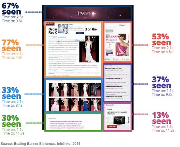
14. Increase efficiency of website banner ads
A research study carried out by the ad network Infolinks found out that 86 percent of visitors completely ignore all the banner ads on a website. This conditioning is attributed to a phenomena called ‘banner blindness’. Now, I don’t need to repeat the fact that this severely affects the revenue generated from your website, but I just did because it does.
Eye tracking can show you, subject to your website’s design/theme, which areas on the page get user attention. You can then use this information to optimize your ad placement and hopefully drive the revenue scale up.
Below is an image which shows the results of eye tracking carried out on a web page to test content vs display advertising –
15. Understand what is working and what needs to be replaced or optimized
Again, you weed out:
- what is working vs
- what is not vs
- what has to work in order complete business goals.
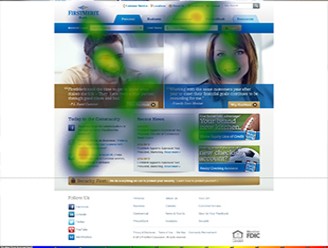
Like how SMIVision found in its web-design usability testing for FirstMerit Corporation that:
“- Users struggle to identify the difference between ‘business’ and ‘commercial’ banking.
– Users do not clearly understand ‘PrivateBank.’
– Users struggle to identify the difference between ‘business’ and ‘commercial’ banking.”
As a result of this eye-tracking analysis, FirstMerit has now incorporated a more robust visual design into their website.
16. Improved E-commerce and reduced cart abandonment
Cart abandonment can happen due to any reason (lack of interest/assurance, delivery charges) but to find that exact pain-point is what eye tracking facilitates.
For example – In 2014, Thomas Storgaard Grønne along with Baymard Institute’s Christian Holst, used eye-tracking for conducting a research to understand user behavior on e-commerce websites.
I’ll share two of their findings as examples to better illustrate the point:
Place the guest-checkout as the most prominent option.

Don’t display objects in a time limited drop down window, which require or encourage the user to interact with it.
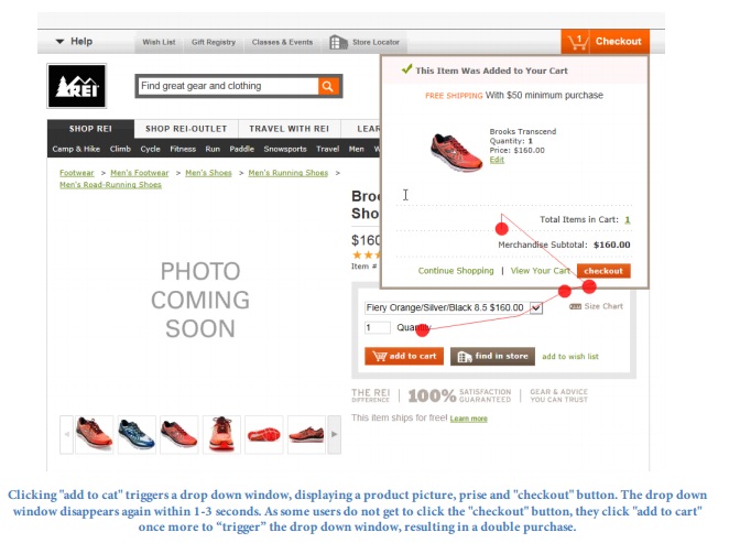
Note: Their study will be published in parts at Baymard.com in a more readable format where all of the eye tracking study findings will be expanded upon to cover the full context and practical implementation consequences.
Until then, you can see Christian’s webinar on ‘8 Checkout Optimization Lessons Based on 5+ Years of Testing‘ hosted by VWO.
17. Understand how the size of ad units affects user interaction with them
Too big an ad and the user might just get irritated and bounce from your site. Too small an ad and it will affect click-through rates; eye tracking can help in uncovering the sweet spot.
In the video below, you can see how users interact with multiple size ad units across desktops, mobiles and tablets:
“This eye tracking study of the effectiveness of different ad formats on an iPad vs. a desktop PC shows that the leader board format is still the most effective in reaching consumers.
On the iPad, leader boards performed significantly better than other ads with users fixating 44% longer than the next best performing ad, and holding consumer attention 22.5% longer than a PC.
On both platforms, leader boards were seen quickest and had the highest percentage of people noticing them.”
18. Effective brand exposure and re-call
Through eye tracking testing you can see the extent to which your brand is visible and can be made out as soon as a visitor arrives on your webpage or while he/she is navigating it.
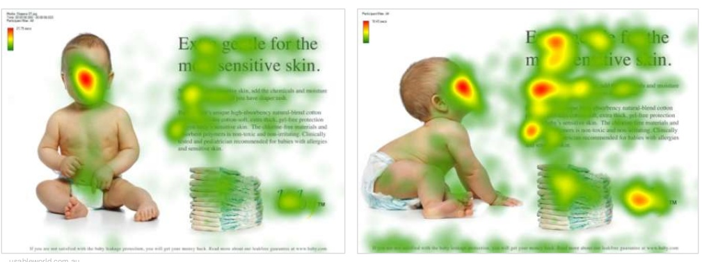
Below is a popular, admittedly overused, example where with the help of eye-tracking marketers were able to hack consumer attention away from the female model’s face and direct it towards the brand and product.

Brand exposure is important because of the concept of ‘brand-recall’. That moment when you’re not able to recollect a specific person/service/content and out of nowhere it just hits and you click your fingers and go like, “oh yeah! that’s the one” – that’s brand recall. A psychological response triggered by a logo, picture or company name.
In a case study for market research, SMI tested if there was a correlation between product placement in a Lady Gaga music video and brand recall. One of the conclusions was that frequency of branding is more important than size.
Jesse Aaron points out another example of how eye-tracking data can influence branding and website re-design in his post on GetBusyMedia. He writes –
![]()
‘The older version shows that visitors ignored the middle stream of logos – which is prime “real estate” – so it was replaced with a stream of featured products in the new version. The “select your vehicle” feature was maintained and moved into a more detailed sidebar in the new version.
Interestingly, the “specials” section in the older version was frequently seen. In the new/current version, we can see a variation of the special has become a header – a sort of self-advertorial. All of these big design decisions are rooted in eye-tracking data.”
19. More accurate heatmaps
Heatmaps count and collate mouse movement, clicks and scrolling (speed and time). You can add more accuracy to your heatmaps with eye tracking because sometimes a person takes his/her mouse farther from a picture or a button because they want to see it better. They are removing the mouse pointer’s distraction which therefore does not mean that they do not intend to click on the button or find it uninteresting.
20. Gauge consumer spontaneous reactions
A keen insight taken from real-life eye-tracking solutions offered by companies –
“Eye tracking gives you the only valid way of measuring shelf visibility, because it’s fully a behavioral measure. If you ask consumers attitudinally what they saw on shelf, you’re not going to get accurate information, because recall is biased by brand familiarity. If a shopper sees a soda shelf, she will ‘remember’ seeing Coke and Pepsi, even if they weren’t actually on the shelf.”
– Scott Young, president at Perception Research Services (PRS)
Similarly, for e.g. – eye tracking can help marketers and web publishers see how visitors react to pop up notifications like email capture boxes, feedback boxes and offers. Are their eyes automatically looking for the “Close” button or do they actually read the information.
21. Enhanced mobile units page usability and advertising
SmartInsights reports that 80 percent of internet users have smartphones which they use to access and search the internet.
I don’t have to say it out loud that this a huge market share of current and potential consumers and if web publishers haven’t developed websites with responsive designs then they’re in for a nasty surprise. Not only this, smartphones and tablets require tailor made –
- usability and navigation
- task completion guidance
- content
- display advertising
- interface elements
- user interaction
- apps
Eye tracking facilitates an insight on which interface and page elements on your website are acting as a hindrance in usability and which are catching the user’s interest.
Essentially, you have to ask yourself this – “Is the purpose and functionality of my service/product seamless and crystal clear?” It is a business and competitive necessity to optimize the designs of your web services and products for mobile consumption.
The image below gives an example of how eye-tracking on mobiles work (source video) –
![]()
22. Keep an eye out for the competition
It might (and does) come to happen that your website has a functional leak due to which an alarming portion of your traffic is bouncing off. And even though you have optimized all the page elements for max performance and experience, something is still off. In such a case, it helps to look towards your competition.
Getting your primary competitors’ websites tested with eye tracking can reveal usability or content consumption flaws in your own website. The resulting information enables you to pick up what is working for them and give it a go on your website.
It pays to keep an eye out for the competition not only when you’re in trouble but as strategic market knowledge too.
Extended resources:
Eyes are the Prize: Evaluating the benefits of eye-tracking equipment (UXMagazine)
10 Useful Findings About How People View Websites (ConversionXL)
Leveraging Eye Tracking to Create an Engaging User Experience (UXMagazine)
9 Simple Yet Effective Tips to Capitalize on Eye-Tracking Insights (CrazyEgg)
[Slideshare] Eye Tracking & Design (OptimalUsability)
Conclusion
Eye tracking provides the only 3 benefits your website needs, which are –
- making it easier to navigate (increased traffic, page-views, engagement and sessions)
- higher monetization (more conversions, effective and targeted display advertising)
- give a beautiful user experience (crystal clear flow of information and a UX tailored to your website’s needs and not just a generic feel)
Image Credits – FoodieBlogRoll, FreeWritingTips.Wyliecomm, 451Heat, IAB, GazeHawk, UsableWorld, SiliconAngle, GetBusyMedia, SMIVision, Prodality
Read Next: Practical tips for Web and mobile usability tests
Get the TNW newsletter
Get the most important tech news in your inbox each week.